Enter your keyword

Communications Design Industry Discussion, Inspiration, & Tutorials

Dec 7, 2013

The Two-Column Resume Option

By On 06:36

Earlier this week, a recent graduate asked me to review her resume. It was well-laid-out and used typography quite effectively. I loved her clean, cool color palette. So, I didn't really have much to do by way of crit.

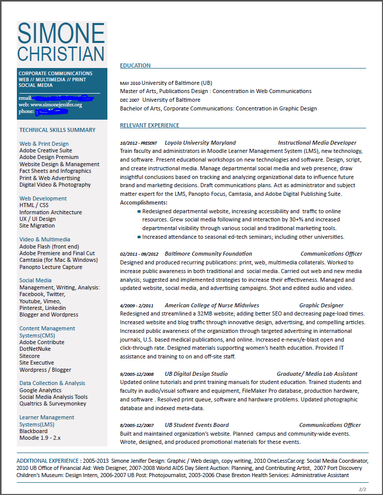
Here's a draft of my
2-column resume. Click
image to see full sized.
The only real issue for me was the length of her resume. The 4-5 years of professional experience that she listed was spread across 10 positions and took up the majority of 2 pages. She showcased internships and volunteer posts in the same category as her professional experience. Were I reviewing her application for a job, I would expect to see a more seasoned designer; just going on the amount of text.

I suggested that she omit some non-relevant content and that she make her body copy fit in a single-page format. Here are a few examples of some two column resumes that allow designers to present themselves succinctly.

On a more personal level, I made the decision to have a one pager for my resume but kept my CV a multi-page document. Besides personal preference, there are other reasons to consider a single-page, 2-column resume format: 1. you only design the first page, 2. reviewers only need to keep track of one page, 3. you get to showcase your ability to prioritize and layout several chunks of content in the single page, 4. you skip the necessity to create a complimentary layout for subsequent pages (this is something I had to do for my CV... as I generally create 3 viable design solutions, this was a time-consuming process for me).


Design by bobgun


Layout by jessiLenz


Dec 4, 2013

This Week: Website Redesign

By On 05:55
This week is actually a bear. I've had meetings and appointments early and for the next two days there will be 8-hour trainings. The icing promises to be a few more meetings on Friday followed by a brainstorming session with a student; who knows how that will turn out.

My free time is occupied with a fun web project, that will encompass social branding as well as the redesign of two sites. This client is a dynamic accountant--you heard me--who needs an online refresh. I've just got some preliminary before and afters. There will be more about the process as this project nears it's end. For now, here are a couple quick pics:

This is the starting point...


This is a bit of the new homepage. The redesign incorporates responsive design, numerous images, less-prominent social media links, and a more clear navigation:


Nov 27, 2013

Top Ten Inspirational Quotes on Art & Design

By On 07:58
Inspirational Quotes are relevant in both work-life and life-life:


1. Simplicity is the ultimate sophistication Leonardo Da Vinci 2. Less is more - Mies van der Rohe 3.   Design is a response to a specific problem. You are given a problem to solve, and then you let the problem itself tell you what your solution is. - Chip Kidd  4. The real issue is not talent as an independent element, but talent in relationship to will, desire and persistence. Milton Glaser 5.    “GOOD DESIGN IS OBVIOUS. GREAT DESIGN IS TRANSPARENT.”JOE SPARANO   6. God is in the details. - Mies van der Rohe  7. If we do our jobs right, and get a little lucky… great art can be great business. Chip Kidd 8. If you have no intuitive sense of design, then call yourself an “information architect” and only use Helvetica. - David Carson9.   Design is not just what it looks like and feels like. Design is how it works. Steve Jobs 10.  I love what I do. Simone Jenifer Christian

Nov 25, 2013

Graphic Design Inspiration: Chip Kidd

By On 06:19
I wanted to share with you a series of graphic design quotes that have stuck with me through my design education and throughout my career. My list got to about ten quotes before it got sidetracked.

I came upon a quote from one of my favorite designers, Chip Kidd. According to the autobiographical Cheese Monkeys—a book that inspired me in school, he sort of fell into the study in school. Since school Kidd has worked as a designer for Knopf, Random house and other publishers. He continues to inspire me.

Oct 25, 2013

Minimalist Design

By On 08:54
My first instinct was to make myself one of these for my cash and cards. My second instinct was to share this beautiful minimalist design with you. Nothing Fancy, minimalist wallets, are created from a single piece of leather by London-based designer Chieh Ting Huang. Check them out:


Oct 21, 2013

CV vs. Resume

By On 07:42
My company recently advertised for a graphic designer and I was tasked with vetting resumes, application, and portfolios.

Several of the applicants applied with the requested documents, but one very talented designer applied using her Curriculum Vitae (CV)—a long, highly stylized document that would have worked best in application for an academic position rather than the non-profit sector. Since her portfolio was excellent, and I really wanted her to have a shot at the job, I ended up contacting the designer and having her resubmit a more succinct resume for the posting.

What’s the Difference Between a CV and a Resume:
 The main difference between a CV and a resume is the intended audience.

A CV speaks primarily to an academic audience. It documents both academic and intellectual accomplishments.

A resume is usually read by hiring managers in non-academic organizations or companies, and ideally should be tailored for this audience. These managers can review hundreds of applications for a single position; each being reviewed for fifteen seconds or less. Therefore resumes must be clear, concise, and make an immediate impression.

That said, both of these personal marketing pieces must provide a persuasive account of your specific skills and experiences as they relate to the specific job. When applying for a specific position, pay close attention to which document they require--and apply with the correct one.

Comparing Both Documents:

Curriculum Vitae
Resume
Audience
Academics in your field
General audience of employers who hire for a wide variety of positions
Goal
Presents a full academic history — that includes teaching, research, awards, and service.
To demonstrate that you have the skills and experience necessary to succeed within the position you are seeking
Length
One or more pages--however long it takes
One to two pages
Focus
Demonstrates academic achievements, scholarly potential, and any research undertaken.
Represents professional experience, extracurricular and volunteer work, and skills gained from these
Essential Information
Education, publications, presentations, teaching experience, honors and awards, and grants
Skill and experience gained as related to the job sought

adapted from CV or Resume? from University of Illinois

Oct 7, 2013

Superfresh! Typography Tattoo

By On 11:03
This takes quite a bit more gumption than I currently have. This dude is no joke.
Ouchie!


Oct 2, 2013

Top 5 Online Portfolio Mistakes...

By On 10:39

... And How to Avoid Them


You’ve picked the pieces to showcase in-person and in your online portfolio. Links to your portfolio now live on all of your identity pieces and you’re all set to get your new awesome job. So, how come employers aren’t champin’ at the bit to contact you after seeing your mad design skills?

It could be that you’ve made one or more of the following mistakes on your portfolio site.

1. POOR TYPOGRAPHY IS A TURN OFF
Typography is one of the main pillars of graphic design. As someone in the market for a design job you’re expected to have a good grasp of typography best practices. Without these, even the least qualified art director will overlook you and your site.


THE FIX: Once you’ve created your site and included all columns of type, step away from it for a few hours. When you come back, review a wordy column of type and see if it needs any tweaks in the leading or tracking; do the headlines command attention or do they blend with your paragraphs? Finally be sure to keep line-length to below 80 characters—to enhance readability.


2. TOO MUCH IS TOO MUCH
You’ve got a flash animation, and lots of jquery motion graphics, maybe a revo slider with individual text links, and accordion panes. Stop! That’s way too much going on. 

THE FIX:  remember that this portfolio site is meant to showcase your design talent. Less is more. Dozens of moving pieces detract from your message.


3. HIGHLIGHTING ONLY STUDENT WORK
If you only have student work, then by all means show it proudly. However, it’s important to come off as a designer who has worked with clients and has experience working with clients. 

THE FIX:  find yourself a few freelance clients and get those projects onto your site, pronto. If that’s not an option, consider referring to your student work as “conceptual” projects. This simply means that these pieces weren’t produced for a specific client. Although this is the same as saying student work, the connotations are more positive.

Use as 3-D Mockup to show a 'conceptual' design in a real-world setting...with no need to stress about properly photographing the finished product.


4. 2-D IS NOT AN OPTION
While we’re on the topic of student work, let’s talk about flat designs that float in space. Offering a flat representation of your work, is not showing it in the best possible light. Don't rely on the imagination of your audience to connect the dots. Instead, show those conceptual projects as complete finished products.

Use 3D PSD mockups to show your work in a real-world setting. Below is an example of an identity project that many students have completed for Prof. Boam in Grad school;


THE FIX:  Okay a drop shadow is a quick way to add depth, but an even better way is to create photo-realistic mock ups. Check out these mock ups for inspiration.


5. TYPOS WILL GET YOU OVERLOOKED
 I’m definitely guilty of this one. The most embarrassing incident I’ve seen when it comes to typos happened when reviewing portfolio for a graphic design position last year. The applicant cited her “attention to derail” right on the home page. I didn’t even click on on the portfolio link after reading that.

THE FIX:  Once your site is done, get someone else to look it over. If you’re working with DreamWeaver or with an online CMS (wordpress, blogger), use the Spell Check tool.


.


.


.

Sep 30, 2013

Living and working in MD

By On 03:56


Women in the US have made tremendous socio-economic strides in recent  decades, but this progress has been unequal. In a Center for American Progress report, Maryland ranks No. 1 in the United States for the state of its women.

In the report, titled "The State of Women in America", all 50 states were assessed on factors contributing to women's economic security, leadership opportunities, and health. Maryland's overall grade of "A" was a product of its No. 1 rank in both economic security and leadership.

Sep 6, 2013

Robots and Resumes II

By On 05:32
Two Junes ago I posted an article outlining ways to get around "robots", the ATS that your online application may pass through before getting into the hands of a human being. These programs strip out the formatting and compare your resume text to that of the original job posting and then give a generic score to applications that best fit the outlined criteria.

Trolling Pinterest today, I found an infographic that best illustrates the process:

Sep 1, 2013

Farewell Summer Assistant

By On 14:50
Let's talk a bit about one of the benefits of completing an internship.

At the end of the spring semester this year, I pushed to have either an intern or a summer assistant who hailed from an outside university. My reasoning was that I wanted to open up the opportunity to a larger pool of talented students. I got my wish and was able to hire a summer assistant from my alma mater; a young woman with more graphic design skill than a freshman or sophomore (which is all we seem to get in my office). I lucked out.

My assistant just worked her last day this week and will hopefully move on to bigger and better things.

In addition to a modest hourly rate, she got a chance to work scripting, recording and editing instructional tutorials using Camtasia; something previously outside of her skills set. The project added expertise in software that is fast-becoming an industry standard tool. She also got to put her personal style on the finished materials. The project was a complete success, and she enjoyed the work, too.

"...thank you so much for mentoring me for what felt like another semester. You taught me so much in such a short time and I wish I could have stayed around for longer..."
Well, she's got a great career ahead of her!


Aug 30, 2013

Do you Sketch Before you Design?

By On 15:54
I just participated in a conversation on the topic with colleagues. It was a bit like preaching with a choir, but I want to share some of the commentary here.

I recently had the chance to work with a newly graduated designer who habitually goes straight to the computer whenever a design project is presented. If needing to change gears or develop more design solutions, there was always the need to go back to the drawing board; I personally, found it an inefficient process.

When faced with a new design challenge I always whip out my pencil and sketchbook. This is owing to my fine arts background; it's how I brainstorm, storyboard, script, plan, and develop my ideas. Plus, my poor memory means that I take a lot of notes, so there's always a hard-bound sketch book in my hand.

Here's how some of my seasoned colleagues replied when asked, "Do you sketch before you design?"

"Absolutely! I almost never design on the computer. The computer is a tool and that's it. My creativity flows faster and easier with a pen/pencil and paper. Plus you have a reason to spend an insane amount of money on cool drawing utensils and books!" - PD

"There has to be some preparation before spending the time in design. UX items need to come into play and UX protype tools such as Axure let the designer plan out the site and give it a testing before going into the visual design work. Or, it can be as simple as a drawing in a notebook to plan out a page. So, a sketch is part of the process and can give you as a designer a clear vision." - MS

"Absolutely, I can usually get half-a-dozen concepts out sketching in the time takes my computer to get warmed up. Purely from an efficiency perspective it makes sense." - JS

"90% of the time I do. The other 10%, I do what I call block sketching. It is where I go into Illustrator and just create shapes and build them together. I do this to create a font or build a wireframe for a website. It's quick fun and doesn't take long to get the idea from your head to screen." - TS

"Design begins with the thought process that follows a thorough investigation of the client's needs and the market they're in. Generally for me that is word based, especially for branding. I distil everything down to what I refer to a key words, a very concise summary of the discovery process. In turn this is the start of creating visual proposals and working with the client as 'ownership' by the client is vital. Other projects may be layout and production only where the client has already compiled the material but lacks the ability, skill and experience to turn the material into a professional piece of literature, or other form of marketing or promotional material, exhibition or packaging. Sometimes it is a combination of both. The vital skill for me is drawing out the essence of what is required before any form of creative work begins. Do I draw or sketch first after this? Yes, the pencil or pen is much more flexible than the computer. Do I present this to the client? Sometimes." - RS

Although he didn't participate in the disucssion, Milton Glaser said this about jumping on the computer to create  design, "Computers are to design as microwaves are to cooking." Hey, the soup is hot, but is it good?


Aug 25, 2013

Inspiration: Milton Glaser Interview

By On 14:59
The great benefit of drawing is not to replicate reality, but to understand what is real."


Aug 23, 2013

This Week: Lecture Series Update

By On 11:49
I just spent the majority of the day shrieking inaudibly at technology. At my disposal is a Macbook, and 2 (allegedly) high-end Windows desktops in my office that I'm to use for multi-media projects. They are all inadequate. Today saw me  spend several hours watching a 2 minute commercial render on various crappy computers in our lab.

Unfortunately, there's been little time left for me to give a s$%^t about updating my blog; with me constantly monitoring my blood pressure and all--yes the technology failure had me stressed out. Now that my vitals have returned to normal, I'll happily share this update with you.

We've nailed down the speakers, images, dates and times, and communications plan--pretty much--for promoting the series. So I'm able to share more fleshed out pieces with you:


I'm actually quite happy with the way that this has all turned out and I'm looking forward to my part in the first session. Not to mention; recoding and sharing the events on our new website, promoting via social media, and tracking the analytics and attendance stats.


Aug 22, 2013

Freebies: Hand-Tooled Type

By On 07:19
My first MOOCs begin soon, I’ll be taking a photography course and a hand-tooled typography course. I’m inspired to share freebies with you. Here are a few hand drawn fonts that got me inspired this week.

I’ve shared some samples to get you guys inspired as well. These lovelies have a relatively high x-height and most have built-in leading. Check them out:

Created by Jusebox


Created by Nice and Ripe


Created by Vanessa Bays


This may be my favorite!


Aug 16, 2013

Professional Pet Peeve: Laziness

By On 07:39
I've got something to say to the lazy folk. You make me sick!

There's nothing  wrong with having a relaxed attitude toward work. Being relaxed is important to being effective. However, some people just take it a bit to far; stretching the boundaries of relaxing into the realm of apathy.

Now that the opinion piece is out of the way let's talk about it. Here are a few tips to help you NOT be perceived as lazy in the workplace:


  1. Be on time - Oh my god, just be on time!
  2. If a project is overwhelming, ask for assistance or guidance early.
  3. Know what you're referencing - If you've got several projects in the hopper, keep their titles and parameters straight. I'm talking about in conversation. You could be perceived as apathetic or worse dumb if constantly referencing the wrong name, team members, or goals of a project.
  4. Are you exhausted or feel overworked? Take a break - Yes I said it. Get up and get away from your desk/office. If you need to, call it a day and head home. Fatigue makes it hard to concentrate and get things done. Instead of trying to power through a project, or doing a half-assed job, step away from it and come back fresh.

Aug 13, 2013

How do you Want to be Remembered?

By On 11:21
Source: http://danielbischoff.blogspot.com/
A recent encounter with a former co-worker brought back vivid memories of an on-campus work-study job. The thing that she remembered about me was that I enjoyed doing one of our mandatory, crappy jobs early in the morning--cleaning the facilities early in the morning. Funnily enough, I hated the task. But instead of avoiding it, I got to it as quickly as possible in order to get it out of the way.

Here’s the back story: In college, I took a work-study position at the campus gym and volunteered for the early morning shift. This meant entering the building by 6:30 each morning, cleaning all of the facilities, equipment, group fitness and racquetball rooms, mopping the gigantic gymnasium floors, and seeing to customers. One staff member had to be at the reception desk at all times, so these jobs couldn't be done in tandem.

Early in my tenure, I worked with a really good friend who helped me figure out two important truths about arriving on time. First, we could both do a couple loads of laundry every day in the industrial machines before the rest of the staff reported to work. Second, if we switched off and tackled the work in shifts, we’d get it done quickly; one day she’d take the floors and I’d take the rest, and the next day we’d swap.

So, while we always got to work by 6:30 and got to our jobs as quickly as possible, we were still working when clients started coming in at 7am. However, we’d only be hampered by them for about a half hour. It was a well-timed process. We both got to finish up the hard work and spend the rest of the time on homework, projects, or just surfing the net between greeting customers.

The friend who mentioned my "cleaning fetish" was someone else that I worked with on the morning shift, briefly. The working relationship was different with this peer she came in at quarter-to-seven in the morning. So, the plan to start cleaning up the filthy, huge gym right by 6:30 didn't work—by the time we got started clients were queuing to come in and use the facilities that we were to clean. On these mornings, as soon as my counterpart entered the building I made a bee-line for the cleaning supplies to get the hated task completed quickly.

Anyway, speaking to my former coworker and hearing that she thought I loved the cleaning aspect of that job—those years ago—makes me feel a bit proud. I was able to complete those tasks efficiently, without voicing too many complaints.

This brings me to the moral of this story: We all have a task we don’t like at work. The best way to handle it is approach it with the same effort and enthusiasm as the best parts your the job, and do it well.

Aug 1, 2013

This Week: Fall Lecture Series

By On 09:55
My job is at times trying, challenging, rewarding, and sometimes just plain fun. In the upcoming semester, I'll be presenting as part of this lunchtime lecture series, and I get to design the print and electronic promo materials. This is a monthly series and we plan to promote primarily via web contact, but there will also be a few print/ digital posters around campus.

The series title and typography speaks to the informal setting and the feeling that we want to convey. The Autumn color palette lends bit more sophistication, while also giving a nod to the season. My goal is to reuse this layout/format and only switch out the colors for each semester series (yes, that is Greek text):


I'll see how this project progresses, and I may slip it into my portfolio when it's all done. :)


Jul 25, 2013

Know When to say Yes

By On 03:28
I recently read a blog post on idealist.org about saying “No” without committing career suicide. It’s a good read. Check it out.

Today I want to talk about the opposite side of that coin:

When faced with the chance to say no, weigh your options and see if you have a better reason to say YES. 

In a previous job I never had the choice to say yes or no to office social events; company picnics, birthdays, baby showers, and the like. Attendance to all such events was mandatory for those in my department. This came from the VP in charge of my division. For someone like me—who gets wrapped up in interesting design projects and relishes the satisfaction of completing a project then jumping feet-first into the next—these events were painful to endure. Each day that I was encouraged to leave the office early and drink beer with my professional peers was a day wasted.

Today my director and team participate in numerous departmental and organization-wide social activities—including  volunteer opportunities that allow the university community to mix with the larger community where we’re located. At times I’m encouraged to participate or I’m invited by the big cheese, but rarely is anything ever mandated. I feel at liberty to pick and choose events, and ultimately feel good about attending. Plus, it’s a rare occasion where I’m staying at my desk for hours after quittin’ time trying to make up those lost hours. It’s liberating.

I recently had an invitation thrust upon me with almost no notice, and had to choose whether to take it or pass. The invite came four days before the event. An industry conference held four states away, days before my birthday. My first instinct was to pass—my media development duties—as well as creating a curriculum for the class I  teach next semester are all still on my plate, along with working on my house after work and battling insomnia all night long (yes, I block out time for that too).

Happily, I took this opportunity to say yes; projects, home, and lack of sleep will still be there when I return. Making an inconvenient jaunt to New York directly after work is little sacrifice for what I gain in trade. This conference helps me develop, grow, and learn about industry trends.  It helps me see where we are in relation to our professional peers in the field. It helps make me a valuable member of the team.  Plus, who knows what higher education budgets will look like a year from now; this could be a one-time-only opportunity.


Jul 18, 2013

Book (cover) Review

By On 17:11
I know I should be ashamed that I'm finally getting around to reading this book. It's been on my reading list for over 15 years--no kidding. When on our honeymoon in June, we stayed at a lovely B&B in Annapolis, MD; Chez Ami. One of the decorative books placed around the room was a hardbound copy of the Oscar Wilde classic. I began reading it on our first night while trying to beat back my chronic insomnia. I got through four chapters before nodding off. Then we left the inn for the second leg of our bike trip.

Click to view full
I'll stop right here and say that this is actually more of a review on the design of this book--the Penguin Classic paperback version of Dorian Gray.

On the third leg of our trip, we spent the night in Washington, DC. And in the morning we headed off to find the Rock Creek Parkway bike trail into Northern Virginia. My new husband surprised me with this book after we crossed the bridge and I was elated!! When we paused for a water break, I examined the book jacket and became disappointed in the Penguin Classics graphic design team.

Wilde's descriptive prose--and my imagination--drew a picture of a dewy youth with light eyes and a warm complexion whose androgynous good looks could charm men, women, and the stars from the skies. Regardless of the text, I pictured this unlined boy with dark hair that contrasted with his pale eyes and added  a bit of rogueishness to the cherubic innocence that Wilde presented.

Folded cover, detail
The Penguin design team didn't agree with me. Instead, they gave their readers a pasty- faced, rosy-cheeked fop, with fair close-cropped hair, and very little attraction or appeal. When I pulled out the book to continue reading, I realized that the cover portrait was ruining my enjoyment of the book. I folded the cover back and continued reading.

Between, biking, strolling, dining, and enjoying the wonderful company or my new hubby, I finished the book. It was a *good read. In it, Wilde alluded to the exploits of Dorian in the chastest of terms (by today's standards). Our young Mr. Gray was a sociopath, who used his appeal to poison the lives and reputations of others. He then killed without remorse and easily placed the blame for his actions on the innocents who loved him.

FYI, the cover portrait is a John Singer Sargent piece painted in 1900.
*Wilde, like many of his contemporaries, is a great lover of the English language. His words paint a canvas in the imagination and he leaves nothing to chance. That said, it's a departure from the utilitarian style of modern fiction writers.

Jul 16, 2013

This Week: Preparing a Seminar on Online / Hybrid Course Design

By On 09:28
Online Course Design is Web Design


I really can't go into all of the details right now, but I will make the presentation available online to the Instructional Design Group for feedback once my first draft is complete. The goal of this training is to help instructors organize their course content to keep students engaged. Too often, academics believe that online instruction is akin to in-person, and it's not. Lectures no longer work. Therefore, presenting wordy blocks of text and exhaustive lists will get your course content ignored. Period.

Broken down to the barest of facts,  effective course pages and homepages both:

  • introduce the subject matter, 
  •  present clear navigation, 
  •  are easy to visually scan, 
  • and lead to more in-depth, robust content.

Jul 13, 2013

HtML5 VIdeo: Use VLC MEdia Player to Convert Video

By On 17:28
A recent project I built a HTML5 video player. For these players to work across all the major browsers redundant video formats must be created. There are several free online services that will convert video formats to ogg theora, mp4, and webm for you. However, once you get to long/large video files, they act up (require payment, or freeze).

VLC media player is free and will convert your vids to the desired format, relatively quickly. One drawback is that you can't run more than one conversion instance at a time. If you need to convert, say 1000 videos, then you'd better get some help.  Here' the quick and dirty of using this player to make your job easier:

Jul 12, 2013

Where have all the Graphic Design Jobs Gone??

By On 13:29
For the first time in recent history--four years or so--the graphic design job market does not lead the pack in creative services job postings. A newly graduated friend sent me his portfolio to review and then wanted to talk about the fact that his job search seemed to be in limbo. He's been applying for a couple months now, with nary a nibble.

I've also noticed that the number of job offerings for "keyword: graphic design" seems light. On a search last week the SimplyHired.com interface yielded exactly two new jobs offered in a 7-day time frame. Graphic designer positions are being replaced by interaction design, web and social media design, UI/UX design, and instructional design. Can we see a theme developing here? 

The jobs of yesteryear that focused on print marketing, direct mail, and analog client contact are now replaced with the dynamic and/or social design positions. We can't get away from it. The medium is changed.

So, what does a designer who is adept at print do to compete? Grow. Evolve.

I had to remind my friend of his strong portfolio and highly developed creative skills. Moving from print to electronic media is a natural progression; while the platform changes the comprehension of good design, audience and research doesn't. The to-do list--we penned together--included taking some professional development and then expanding his freelance base--taking on a couple social media building/management clients to get started.

"Look for free or inexpensive ways to get professional development."

I'm looking forward to hearing about his progress--and he can take me out to lunch after he lands the next awesome job.

Jul 11, 2013

Mock-ups Round Up

By On 16:50
Photoshop Magazine Mockup
When I originally put together my online portfolio and printed leave behind, I took several photographs of my samples so that my work would be well represented in both media. It was a mostly successful project. However, some of my conceptual pieces--ones that never went into production--had to be altered to fit stylistically. There were ways to get around this. I found an awesome Photoshop mockup that allowed me to share more of my work. I also created so ad hoc mock up scenarios that were also successful.

For conceptual posters, I photographed gallery walls and inserted appropriate sized design samples into frames or in a salon style hanging.

Poster Mockup II
Here are some other great mock up options to help get your portfolio a second glance:


Jul 9, 2013

Three Job Search Pet Peeves

By On 08:48
In no particular order...

First: I’ve always made the argument to soon-to-be or recent grads that they should narrow their job searches; applying only for positions in industries where they want to work, instead of casting a wide net. I usually add that folks should have some idea about where they want to work before they graduate. Then I challenge them to consider design firms, nonprofit agencies, corporate arenas, finance, legal practices, medical centers, etc to help them decide.

Some graphic designers completely disagree with me.  They make the reasonable argument that the goal of early jobs in our field is to gain expertise and test-drive different industries. That may be the right thing to do for some, but my approach may work for others.

In undergrad I was offered an agency job with a company whose major clients included a car manufacturer and a soda company. As someone who advocates for non-processed foods, low-carbon footprint lifestyles, pushing polluting private vehicles and promoting obesity was not for me. An advertising agency could never be my creative home. I declined the position and opted to work for a non-profit that promoted women’s health and education instead.

 Today, I still run into a few people who are three or four years post-graduation floundering to find their niche in the professional world.  I’m talking about the "graphic designer" who can’t decide what to apply for when the choice comes down to entry-level designer, program coordinator, or child minder. Our education was an extensive and expensive one. We should be out there using our skills to pay back those student loans, spreading the gospel of good design, and propelling ourselves closer to our life/professional goals.

Next: What’s up with inappropriate resumes hitting hiring managers’ desks? An over-designed, or unsophisticated resume is the main thing that gets applications overlooked. Design firms and creative companies expect applicants to showcase their creativity with a well-thought-out identity and maybe even an infographic resume.  Corporate and non-profit agencies expect applicants to submit traditional-style resumes in application for jobs—even in their design departments. Sophisticated design is expanding the traditional definition of a resume, but origami still won't fly in most arenas.

When we use inappropriate formats and odd-sized paper to apply for design or communications positions, we send the message that we know little—if anything—about the company, industry, or position. That equals apathy, and get’s resumes discarded.


Finally: We should always be on the lookout for robots! Robots pre-screen online job applications and resume submissions. If application materials don’t contain keywords found in the original position posting, then the entire application gets discarded before a human being has set eyes on it.


One more thing: Can we stop submitting Word doc resumes? PDFs retain any special formatting and styles regardless of computer software and versions. This is just common sense.

I recently had a potential employee apply for a job with a Word file and when I opened her submission, two sentences were pushed onto the back page. I knew that this was a mistake, but I still asked her why she made that design decision during our phone interview. Frankly, if she came up with a convincing answer, I may have given her a shot at the job.


It feels good to get all that off of my chest, 
Simone

Jul 8, 2013

Dos and Do-Not-Dos: Student Portfolios

By On 13:07
I got a question from my former intern last week and had to share. She’s ready to graduate and is now looking for her first ‘real job’ (thanks).

Her question: Do I Include Student work in My Portfolio?

Were this anyone else my answer may be different. In the past four years she has built a portfolio of exceptional student work, freelance projects and a few pieces from her internships.

My answer: In the 7-10 projects she includes, select those that best display her talent, creative range and technical skill. In short, go for it.

The caveat is that student work need not have a blazing neon sign over it singling out the projects as “student”. Instead they can be called conceptual design or not be labeled at all. Think about this if your portfolio is predominantly assignments and school projects. 

Jun 24, 2013

That HTML5 Video Player?

By On 11:47
I got a bunch of questions about this HTML5 video player, so I wanted to shed some light.

This product was designed and developed by the awesome and talented Lambert Group. This player is basic but so functional. This is a full list of more Lambert Group products

Jun 10, 2013

This Week: HTML5 Video Player

By On 11:33
Hey I just realized that I haven't made any recent updates on my work projects. It's that that I haven't been busy because I have! Recently completed was a web style guide for online courses, plus a workshop on using video lecture capture. Also a book and presentation of effective graphic design. There's also the freelance website project for a local Lutheran church, and I can't forget the infographic project that's almost complete. There're one or 2 other things, for now take a look a the evolution of the HTML5 video player that I've been developing for my university's streaming media server:

This is the final version. Look below for all it's iterations.

This screenshot looks more sophisticated than the actual page.

More realistic.
This is the out-of-the-box, page that I threw together. T'was step 1.

We started with this Open Source Flash Media Player that only supported FLVs. With the advent of HTML5 and the proliferation of mobile and handheld devices, Flash is now only  a good fallback option, not a first solution.

Popular