Enter your keyword

Communications Design Industry Discussion, Inspiration, & Tutorials

Nov 28, 2012

Public Domain Stock Photography

By On 17:28
I'm in Love. . . with this website!

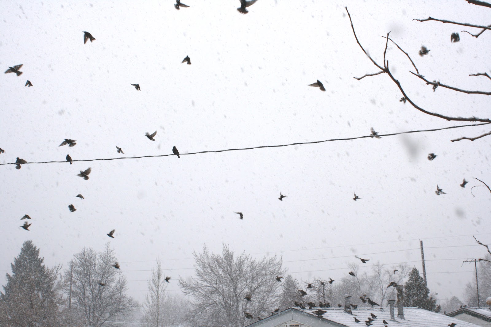
Coming from a non-profit, graphic design background, I am well-versed in the economical online image search. Some time last year I found this site and have visited often when looking for the right hi-res photo for various projects.

Check out and bookmark Photos-Public-Domain!

For winter holiday / christmas/ new years / seasonal images go directly to Holidays and Seasons.

Nov 21, 2012

Internship: Format Your Resume

By On 11:58

As a current student, your professional experience is limited. While you’ve taken several diverse courses, participated in student groups, and completed several freelance pieces, you don’t feel that marketable. But you are!

Which Type is the Right Type?
When updating your resume for an internship consider your audience. Is the industry a creative one? Is it receptive to out-of-the-box design concepts? Is it conservative or built on tested ideals? Will your design, paper size, typography, or color palette cause your application to be discarded? The different format options will help to highlight your talents.

  • Functional Resume Format - Many job search sites and guides claim that functional resumes are the way-to-go when you have limited experience. I disagree. When I see this  resume type show up in a group, I know immediately that the applicant has something to hide; be that limited experience, or gaps in professional history. To be safe, don't use this format.
  • Chronological Resume Format - Use a format that can grow as your experience grows. Use a format that is easily scannable and recognizable by the people who matter. This is the most widely used formats in the USA, and recognizable across different industries.
  • Infographic Resume  Format- When applying for an internship with a graphic design firm or creative company, it’s important to demonstrate what sets you apart from the other applicants. A well-designed infographic resume is a great tool for this.

    This format allows you to showcase your graphic design skills, illustrate the principles of effective design, and convey your experience and interests on a single page. To be clear, this is a suitable format for jobs and internships in creative fields, but will not work in the non-profit sector, or corporate, or educational settings
Here are some INFOGRAPHIC RESUMES to help get your creative juices flowing:


Here are some CHRONOLOGICAL RESUMES to help get your creative juices flowing:


Nov 4, 2012

Instagram DIY or Another Photoshop Tutorial

By On 05:29
I've gotten a few requests for an easy tutorial on increasing blur in portraits. Here's a super easy how-to using a selection and a filter. For this sample, I used a low-res portrait of myself snatched from a social site.


1. Open your image with Photoshop and unlock the layer by double clicking on it and hitting “OK”.
Create a duplicate copy of that layer.


2. With the top layer selected choose the Lasso tool from the toolbar. Change the feather radius to between 75 and 250px—choose a higher feather for higher resolution images. I used 100 px for this portrait.


3. Draw an oval around the area that you want to remain sharp. When you close the shape,
Photoshop will alter your selection. Be sure that the area you choose is large enough to keep your
subject in focus. Redraw your selection if you need to.


4.From the top dropdown menu choose Select > Inverse.
Your marquee is now around the area that will be blurred!

5. Go to Filter > Blur > Gaussian Blur and choose a blur radius between 5 and 15—
use higher numbers for higher resolution images. I used 5.5 for this portrait. Hit “OK”

6. NOW, DO IT AGAIN. Choose Crtl + D OR Command +D on your keyboard to deselect the area.

7. Choose the lasso tool and draw another marquee around the subject. Your feather radius will remain the same. Select the inverse and then choose Filter > Blur > Gaussian Blur.
 Use a smaller radius this time—between 1 and 5 px. I used 1.6 for this portrait.


You now have a sharp focus area and blurred border to your image. You can stop now or apply one more filter to add a little more visual interest. Check out the simple vignette…


(I used a blur radius of 34px and output of 99 for this one)

Popular