Enter your keyword

Communications Design Industry Discussion, Inspiration, & Tutorials

Showing posts with label print. Show all posts

Mar 21, 2017

This Week:Event Planning!!!

By On 12:57
In my new role as instructional yadda yadda, I have had the opportunity to oversee the final touches on the university's recording studio...and in doing that, to build relationships!

 To that end, my team and another on campus will be hosting a multimedia open house later this semester--on the cheap.

We're working together to plan the events, activities, and promotions. For me it's imperative to get all of my work on this project done and dusted before the end of the month, as I will be otherwise indisposed for most of early April.

Detail of my sketches.
It's crunch time right now! However, I want to take a few moments to share my design process for these promotions. It's a bit elementary for seasoned designers--or in-house designers even--to develop a full, comprehensive creative brief. And unnatural for a team of 1, but as I'm partnering with others on campus, I had to spell out the projects, rationales, and various media by using a creative brief. And to be honese, it has helped me to focus more quickly that usual, for this period of hard work. After sharing the brief and getting team ideas on tweaks, I've begun to craft the various promotional messages (copy) and layout the various media (signage, digital and otherwise, a couple website updates that require custom photography and writing, and a small run of elegant printed invitations).

Here's where I went with the invites.

Mind you: we'll be printing and finishing, and delivering these babies by hand, and on the cheap. So I opted for B/W with no bleeds. This almost reminds me of a typography project that I've given students in the past--to make them think hard about their design decisions. Pictured is one of about 8 design solutions that I explored.


Cheers, S

Oct 26, 2015

This Week: Open House Invitations

By On 11:25
My department, the office of Educational Technology, is about to launch our new faculty innovation and production space, and we plan to do it with finesse! Yes, beautifully printed invitations that are hand delivered to some and mass emailed to others. At the event, we'll have try-before-you-buy new technology and continental breakfast, technology give-aways and boxed wine. It promises to be a fantastic networking event for our team and our core constituents.

Here're my roughs for this invitation:

(It occurs to me that yes, print is not dead, or dying. This is evidenced by the fact that whenever a client starts talking about exclusivity or a personal touch they always want printed collaterals-not web or multimedia.)


Mind you, the second side is mostly text and our new logo!

Jun 22, 2015

Adobe Illustrator: Identity Packages

By On 12:05
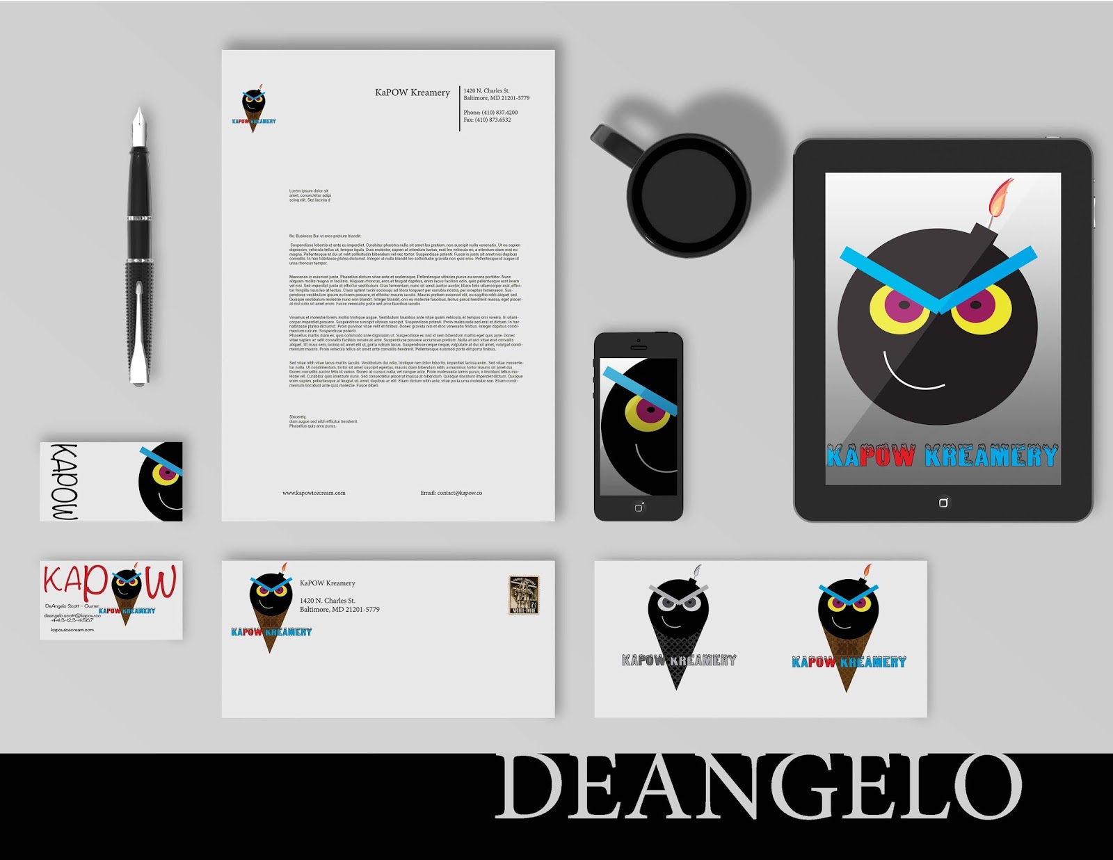
We've worked long and hard to get these pieces put together. They showcase a range of shape, color palettes, typography, balance, contrast, alignment, repeated elements, and proximity. We'll discuss these in depth when class next meets:


Dec 7, 2013

The Two-Column Resume Option

By On 06:36

Earlier this week, a recent graduate asked me to review her resume. It was well-laid-out and used typography quite effectively. I loved her clean, cool color palette. So, I didn't really have much to do by way of crit.

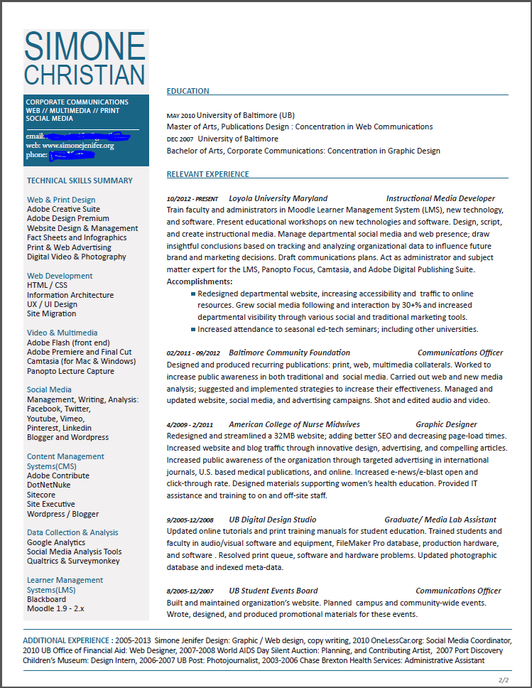
Here's a draft of my
2-column resume. Click
image to see full sized.
The only real issue for me was the length of her resume. The 4-5 years of professional experience that she listed was spread across 10 positions and took up the majority of 2 pages. She showcased internships and volunteer posts in the same category as her professional experience. Were I reviewing her application for a job, I would expect to see a more seasoned designer; just going on the amount of text.

I suggested that she omit some non-relevant content and that she make her body copy fit in a single-page format. Here are a few examples of some two column resumes that allow designers to present themselves succinctly.

On a more personal level, I made the decision to have a one pager for my resume but kept my CV a multi-page document. Besides personal preference, there are other reasons to consider a single-page, 2-column resume format: 1. you only design the first page, 2. reviewers only need to keep track of one page, 3. you get to showcase your ability to prioritize and layout several chunks of content in the single page, 4. you skip the necessity to create a complimentary layout for subsequent pages (this is something I had to do for my CV... as I generally create 3 viable design solutions, this was a time-consuming process for me).


Design by bobgun


Layout by jessiLenz


Aug 23, 2013

This Week: Lecture Series Update

By On 11:49
I just spent the majority of the day shrieking inaudibly at technology. At my disposal is a Macbook, and 2 (allegedly) high-end Windows desktops in my office that I'm to use for multi-media projects. They are all inadequate. Today saw me  spend several hours watching a 2 minute commercial render on various crappy computers in our lab.

Unfortunately, there's been little time left for me to give a s$%^t about updating my blog; with me constantly monitoring my blood pressure and all--yes the technology failure had me stressed out. Now that my vitals have returned to normal, I'll happily share this update with you.

We've nailed down the speakers, images, dates and times, and communications plan--pretty much--for promoting the series. So I'm able to share more fleshed out pieces with you:


I'm actually quite happy with the way that this has all turned out and I'm looking forward to my part in the first session. Not to mention; recoding and sharing the events on our new website, promoting via social media, and tracking the analytics and attendance stats.


Aug 1, 2013

This Week: Fall Lecture Series

By On 09:55
My job is at times trying, challenging, rewarding, and sometimes just plain fun. In the upcoming semester, I'll be presenting as part of this lunchtime lecture series, and I get to design the print and electronic promo materials. This is a monthly series and we plan to promote primarily via web contact, but there will also be a few print/ digital posters around campus.

The series title and typography speaks to the informal setting and the feeling that we want to convey. The Autumn color palette lends bit more sophistication, while also giving a nod to the season. My goal is to reuse this layout/format and only switch out the colors for each semester series (yes, that is Greek text):


I'll see how this project progresses, and I may slip it into my portfolio when it's all done. :)


Apr 4, 2013

This Week : Strategic Plan Update

By On 07:25
I'm back from vacation and feeling rejuvenated! Before I hit the Costa Rican coast, I put the finishing touches on the Office of Technology Services Strategic Plan Update.  In addition to layout on this project, I also did a bit of copy editing. This is an activity that's a bit out of my comfort zone, but necessary to keep the page numbers down! T'was fun. Here's what we got back from the printer:

Layout - Strategic Plan Design

Layout - Strategic Plan Design

Layout - Strategic Plan Design


Popular