Enter your keyword

Communications Design Industry Discussion, Inspiration, & Tutorials

Dec 28, 2014

Teaching Update: Spring 2015

By On 08:05
I’m back in the classroom in January, teaching Digital Imaging at my alma mater. I look forward to a new group of students with different skills and ability levels. Most of all I look forward to applying the flipped class model to working with Photoshop and Adobe Illustrator (my A-number-one-most-favoritest-golly-gee-I-do-love-it, design software)!

Last spring I got a chance to try it out when teaching InDesign and web design, and students were really receptive to that teaching style, even if they were a bit surprised by it. This season, I’ve already compiled a series of video resources—thanks to Youtube and Camtasia—and have put together our class blog with pre-scheduled articles. One thing that I’m adding to the mix is the class discussion forum—instead of using a Wordpress blog for peer feedback. It struck me that the pressure of writing in a public forum might be a little intimidating to some students. Hence the forum that’s in our LMS. I’m so jazzed.

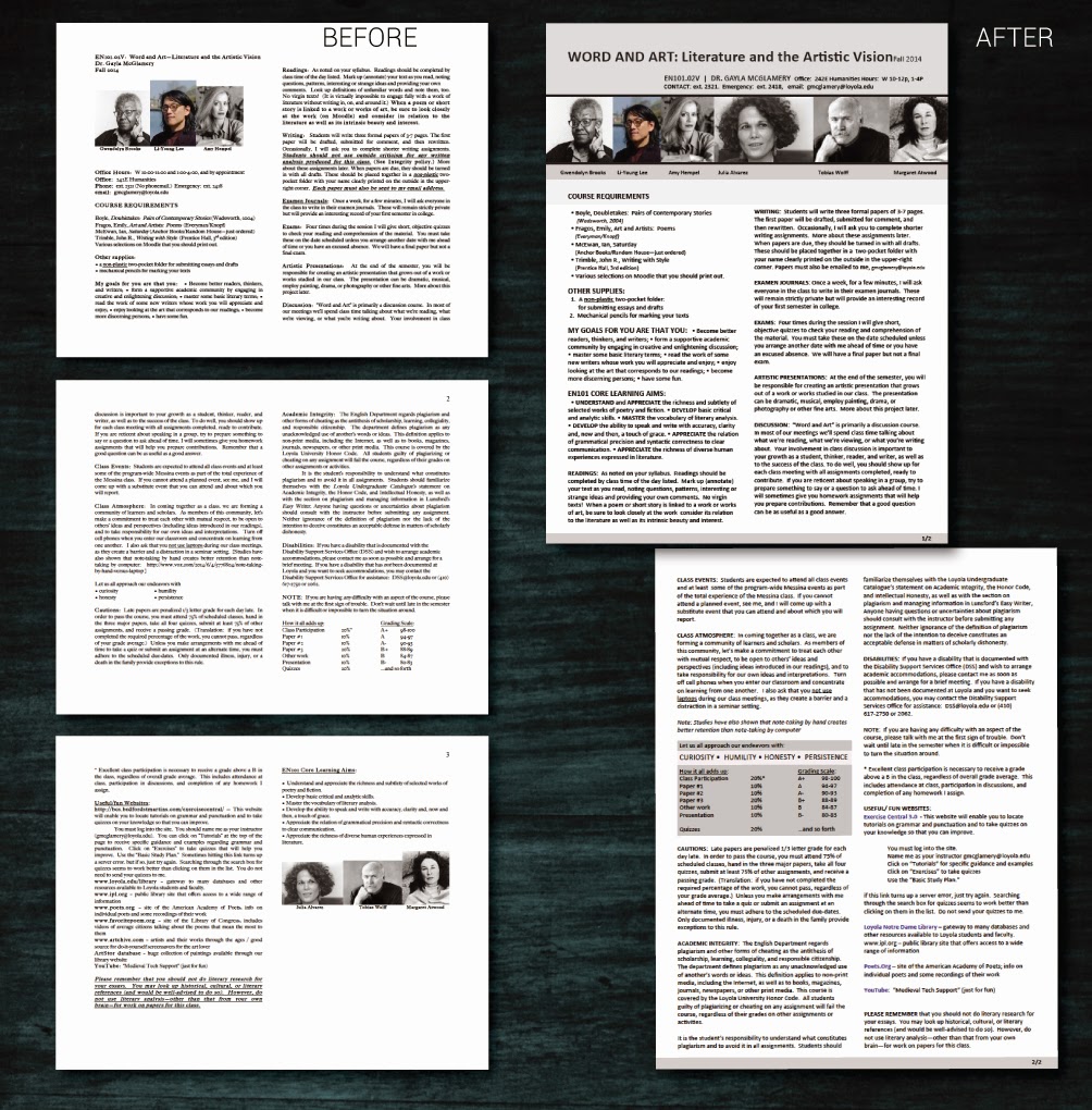
Oh, right, what’s a flipped classroom, you ask? This:

Dec 12, 2014

Creative Commons Photo Round Up.....

By On 07:21
Note: Not all images shared from these sites are necessarily free-to-use. Be sure to review the license details before using any image that isn’t yours in your collage:
  • Flickr: Must check search options boxes for “Find Content to Modify, Adapt, and Build Upon”
  • Wikimedia Commons: Thousands of worldwide images licensed under Creative Commons.
  • stock.xchng: More than 350,000 free photo images, searchable.
  • dreamstime: Free section of a very large photo images archive. Excellent quality images.
  • morgueFile: More than 200,000 free photo images, searchable in several ways, including by color and topic.
  • WorldImages: About 75,000 international images, well-organized by content areas and searchable.
  • U.S. Government Images: Photos produced by U.S. Government employees are copyright-free. This site has a selection of links to different government agencies’ collections.
Stock Images can be expensive, those of us in the non-profit sector, education, and rapidly-shrinking in house design departments are well aware.  Here are some sites that can give you the free images that you need to really make your designs pop!
Public Domain images and materials are ‘publicly available’ and not covered by intellectual property or copyrights. Today, graphic a design and digital media is abundant, so there is a high demand for images for use in print, web, and multimedia.
Here are are four public domain sites to pin and save. Enjoy:
http://publicdomainpictures.net
http://commons.wikimedia.org/wiki/Main_Page
http://photos-public-domain.com
http://www.sxc.hu

This week: Branding Instructional Innovation

By On 06:32
It’s been busy around here! We had our final TechTalk PD session of the semester and I’m working on our 2-year strategic communications plan. That sentence is my inelegant segue…


Part of our strategic communications is a push to rebrand. I've been working on concise and informative mission and vision statements that define and support the branding. These statements are headed to the team for feedback and tweaking—if any.

Accompanying the text is a series of logo designs that I propose will represent our team of instructional technology experts. Click on the image to take a closer look:


Dec 1, 2014

This Week: Syllabus Solutions

By On 08:37
Course Design is graphic design, and graphic design is not strictly art. There are rules and guidelines that allow the novice or seasoned designer to create an effective page; course web page or commercial web page.

These principles of design include balance, proportion, rhythm, emphasis, and unity.

It means that the layout of the finished page has a harmonious mix of words and images that provides an easily deciphered page. If you want a primer on the principles of design take intro to graphic design or show up to day one of any class that I teach.

One of our English faculty emailed me with this problem ‘help, my students are having trouble understanding my syllabus.’ After reviewing the syllabus and course I saw the problem. Since this client wants a hand in the revamp of the course materials, I opted to roughly layout a few options (web and print)now and then meet with her after finals to refine.

Below are before an after. Think about how balance, proportion, rhythm, emphasis, and unity work together to make one option more effective than the other:

Notice in the update that the 2-column layout is maintained. However, weighty elements are at the top of the
opening page, and all images are now uniform. Although hard to distinguish, subheads have a regular format
and are rendered in all-caps, bold. Lastly, the grading criteria is placed in a callout box to draw the reader...
 

Popular