Enter your keyword

Communications Design Industry Discussion, Inspiration, & Tutorials

Dec 15, 2012

Portfolios That Inspire: Moxie Press & Co.

By On 07:55
If typography is high art, then letterpress is the best of paint, brushes, and canvas. Moxie Press & Co., the brainchild of Maryland designer Chris Undi, does it so well. This one-man shop offers design services, illustration, and printing. Not only is Chris a fantastic designer/pressman, he's also a good friend. Check out more of his work and see Moxie Press on Facebook:


Dec 11, 2012

The Online Portfolio

By On 18:11
Today is the perfect day to get started on yours. OR to update your existing online presence with recent work!

Having an online portfolio does a lot to boost your street cred among potential clients and employers. It’s also:

More Convenient than a Resume
and saves time in a job search.
This tool gives potential employers and clients a preview of your skills and abilities. In addition to the pieces that you present, folks are impressed by the design of the portfolio site and the user experience.

Showcases Your Talents
Online portfolios instantly show off your work. To establish yourself in this industry, let your designs do the talking!

Makes you Readily Accessible
Having your portfolio online makes you accessible to clients worldwide, instantly. This can open up opportunities to work internationally. Potential clients from other regions are now able to access your portfolio and maybe even hire you! Plus your contact information / link helps get contacts in touch immediately.

Saves Time
Virtually all e
mployers have embraced the concept of online portfolios. They expect to see you’re your samples when you apply for a position in their company.Look at it from their perspective. Employers have to search dozens of resumes, choose the right candidates, schedule and conduct interviews. This is very time consuming and virtually impossible without design samples. Having an online portfolio saves employers time and they can see your design work instantly, enabling them to find the right fit for their company.

If you don't have the time to code a site yourself, here's a list of great website and portfolio resources for you to check out. Compare all five: 

  • CarbonMade: Cutesie. 
  • Coroflot: A simple way to connect with creative opportunities worldwide. Upload your portfolio, connect with other designers, or post jobs.
  • BeHance:  a favorite of design professionals nation-wide. The javascript that powers this site is elegant and lovely.
  • Jobrary  and Krop:  Both sites have similar look and services. The site is UI is clean and minimalist.
A great alternative is to use a blog site and create something a bit more interactive. I always suggest Blogger, Wordpress or Tumblr to those who ask, but using social media site is also a great way to do this. TwitPics, FB pages, or even LinkedIn updates are becoming fantastic designers' tools for highlighting work.


Dec 10, 2012

The Portfolio: Not Just for Creatives Anymore

By On 06:00

My buddy, Barbara*, works in marketing and does a lot of media writing. This year she gave a riveting AIGA talk about interviewing with a portfolio when not in the creative arts field. Today, a great article on Idealist.org loudly seconded her sentiment. It's good enough to share.

According to Barb and Idealist every professional should arrive at an interview with a portfolio in-hand; "we do more than just our job description" and a portfolio book is an excellent way to show it. A professional portfolio--or leave behind--gives the potential employer a great idea of our skills, abilities and range. It's also pretty impressive!

How Does it Look? This simplest presentation of your leave-behind is a spiral-bound book separated by tabs. These can be printed and bound, in quantity, at retail copy shops or by yourself if you have a spiral binder at hand). Be sure to select  a heavy weight paper and substantial cover stock. Spiral-bound books are not the only option. This publication can also be a highly polished design piece that profiles your creative skill as well. If you choose to go in this direction consider hiring a graphic design student, freelancer, or recent grad to help layout / design a polished look.


Here are a few examples of print portfolio books:

What Does it Contain? Your portfolio is a great supplement to the interview conversation. As you speak about your projects, accomplishments, or accolades, refer to the samples that you have in-hand. Here are Barbara's suggestions for basic content for this book:
  • Your resume or Curriculum Vitae
  • Listed technical skills, software, and hardware
  • Printed samples of your work or projects on which you've worked--with descriptions of the project, your role on the project, and other pertinent information
  • Writing Samples - if you have relevant, well-written pieces; include 2-3 samples of technical writing, public relations, media or editorial writing
  • Kudos and accolades on your work or performance from colleagues or employers

Why Not Go Digital? If making a print portfolio is outside of your means and expertise, create an online portfolio. There are several free sites that offer open formats for you to showcase a variety of projects. An online portfolio gives potential employers a look at your scope of skill, and also makes you look very web-savvy; this is more important across all industries. In addition to portfolio sites like: Behance, CarbonMade, Jobrary.com there are several blog format sites that allow for maximum flexibility; like Blogger, Wordpress, or Tumblr.


*her name isn't really Barbara.

Nov 28, 2012

Public Domain Stock Photography

By On 17:28
I'm in Love. . . with this website!

Coming from a non-profit, graphic design background, I am well-versed in the economical online image search. Some time last year I found this site and have visited often when looking for the right hi-res photo for various projects.

Check out and bookmark Photos-Public-Domain!

For winter holiday / christmas/ new years / seasonal images go directly to Holidays and Seasons.

Nov 21, 2012

Internship: Format Your Resume

By On 11:58

As a current student, your professional experience is limited. While you’ve taken several diverse courses, participated in student groups, and completed several freelance pieces, you don’t feel that marketable. But you are!

Which Type is the Right Type?
When updating your resume for an internship consider your audience. Is the industry a creative one? Is it receptive to out-of-the-box design concepts? Is it conservative or built on tested ideals? Will your design, paper size, typography, or color palette cause your application to be discarded? The different format options will help to highlight your talents.

  • Functional Resume Format - Many job search sites and guides claim that functional resumes are the way-to-go when you have limited experience. I disagree. When I see this  resume type show up in a group, I know immediately that the applicant has something to hide; be that limited experience, or gaps in professional history. To be safe, don't use this format.
  • Chronological Resume Format - Use a format that can grow as your experience grows. Use a format that is easily scannable and recognizable by the people who matter. This is the most widely used formats in the USA, and recognizable across different industries.
  • Infographic Resume  Format- When applying for an internship with a graphic design firm or creative company, it’s important to demonstrate what sets you apart from the other applicants. A well-designed infographic resume is a great tool for this.

    This format allows you to showcase your graphic design skills, illustrate the principles of effective design, and convey your experience and interests on a single page. To be clear, this is a suitable format for jobs and internships in creative fields, but will not work in the non-profit sector, or corporate, or educational settings
Here are some INFOGRAPHIC RESUMES to help get your creative juices flowing:


Here are some CHRONOLOGICAL RESUMES to help get your creative juices flowing:


Nov 4, 2012

Instagram DIY or Another Photoshop Tutorial

By On 05:29
I've gotten a few requests for an easy tutorial on increasing blur in portraits. Here's a super easy how-to using a selection and a filter. For this sample, I used a low-res portrait of myself snatched from a social site.


1. Open your image with Photoshop and unlock the layer by double clicking on it and hitting “OK”.
Create a duplicate copy of that layer.


2. With the top layer selected choose the Lasso tool from the toolbar. Change the feather radius to between 75 and 250px—choose a higher feather for higher resolution images. I used 100 px for this portrait.


3. Draw an oval around the area that you want to remain sharp. When you close the shape,
Photoshop will alter your selection. Be sure that the area you choose is large enough to keep your
subject in focus. Redraw your selection if you need to.


4.From the top dropdown menu choose Select > Inverse.
Your marquee is now around the area that will be blurred!

5. Go to Filter > Blur > Gaussian Blur and choose a blur radius between 5 and 15—
use higher numbers for higher resolution images. I used 5.5 for this portrait. Hit “OK”

6. NOW, DO IT AGAIN. Choose Crtl + D OR Command +D on your keyboard to deselect the area.

7. Choose the lasso tool and draw another marquee around the subject. Your feather radius will remain the same. Select the inverse and then choose Filter > Blur > Gaussian Blur.
 Use a smaller radius this time—between 1 and 5 px. I used 1.6 for this portrait.


You now have a sharp focus area and blurred border to your image. You can stop now or apply one more filter to add a little more visual interest. Check out the simple vignette…


(I used a blur radius of 34px and output of 99 for this one)

Oct 26, 2012

Everyone has an E-book Inside

By On 20:27
The old saying was that everyone has at least one book inside 'em. Undoubtedly, I've got one in me that may make the world a slightly better place. While my globe-trotting, brushes with mortality, and trying tales of punk bands and band aids would curl even the straightest hairs, I'm certain that book one should be a guide for us creative types--a short guide.

ID CS6 inspires me to compress my design market writings into a fantastically fabulous folio for querying creatives. Details to come soon!

Oct 16, 2012

What is a Leave Behind?

By On 06:43
Postcard serise by: http://iwonak.com/tag/postcards/
Simply put, a leave behind a physical object that you leave behind after an interview. This media helps the interviewer or potential client to remember you. The object can range from the mundane (business card)—to the functional (printed portfolio)—to the elaborate (folding portfolio poster with DVD insert).

To Create a Good Leave Behind:
  1. Keep your brand consistent. Any logos, typography, graphic elements in use on your resume or website should be represented here.
  2. Stay true to you. It should reflect they type and style of work that you produce.
  3. Make it easy to handle. Origami Folding cranes are relaxing to make and beautiful to behold, but impractical for job-seekers. So , keep it simple

Oct 9, 2012

Stuff I’ll Miss About My Job (II)

By On 07:12
 In recent years, I’ve done plenty of market research about changing currents in graphic design industry and written articles on my findings. The prevailing wind has definitely shifted to growth and development of portable media and specific types of electronic design. The trends I witnessed led me to conclude that I belong back on a university campus, working in instructional design. The fates heard my thoughts and bestowed upon me an incredible opportunity. So, I’m headed back to university life, schedules, and quirks.

The job I now leave has made a fantastic impression on me. After working for nearly 2 years as the graphic designer in a 3 person communications team—part of a 9-person development team, which is part of a 32-person community foundation, I’ve learned a lot about what drives the financial services and philanthropic communities. I won’t keep you in the dark, it’s money. But, not only that. It’s also people with: commitment, knowledge, great ideas, and stamina. I’m really going to miss this job.

Here’s the short list of what I’ll miss specifically:

  •  First and foremost, my awesome, collaborative communications team 
  • Gigi’s Outlook Tasks. I’ve actually begun to use this tool to stay organized, her 20 months of gentle prodding has not been for naught 
  • There are always lots of fantastic print projects to keep my design hamster running
  • Ralph lamenting that he can never get me to laugh. I should’ve told him to ply me with Pinot 
  • Ashley’s multi-syllabic phone answering script.
  • Great ideas that come from a meeting of a roomful of people—that’s a rare thing indeed 
  • Hillary’s righteous indignation--about politics, sports, the weather, whatever
  • Mandatory meetings on a boat or in a pizza place
  • Biking downhill to work in the morning
  •  Being part of a group of people that's so diverse that in one staff meeting we have tattoos, sitting next to republicans, next to an accomplished musicians, next to theater buffs, next to parents, next to long distance runners, next to immigrants, next to grandparents, next to croquet champions, next to students, next to creative folks, next to animal lovers, next to the chronically loquacious, next to entrepreneurs, next to me.
  • AND, of course “Food on the 8th floor” emails. Followed, in close second, by "Food on the 9th floor" emails. 

 Here’s some stuff I won’t miss at all:

  • Stale coffee
  •  Biking home from work, uphill 
  •  Updating fact sheets every 2.5 days 
  • AND, of course “Food on the 8th floor” emails. Followed, in close second, by "Food on the 9th floor" emails. 

Oct 6, 2012

simonejenifer.org - 2012 revision

By On 12:29
Without too much chit chat, here's my new home page at www.simonejenifer.org
Reform Design by simonejenifer.org! The page showcases my pro bono and barter design services, recent graphic design projects, plus some fun and exciting recycling art projects. Take a look.

Sep 21, 2012

Need a Web Development Refresher?

By On 10:30
In a recent conversation with fellow Pub Design grads, a friend posed the following question:

"I'm about to cross the line from full-on print designer to (teaching myself) web design. I know basic code but not much else. I plan on getting practice by creating a blog - can anyone fill me in on the most important things I should know? I've heard jQuery a ton of times--and any free tutorial sites that will be helpful in this ridiculously scary endeavor..."
This request prompted me to dig around for resources for the self-tutoring designers of the world. Here are links and mini descriptions. I hope this helps.

First, let's be clear, you should have at least basic knowledge of HTML and CSS, and Java Script before delving into the more complex resources below.

Codeacademy boasts that it's the easiest way to learn code. A group of my peers are currently using this resource to bone up on current skills. Check it out...

NetTuts+ This Envato offering has a comprehensive PSD to HTML tutorial. It gives you the tools needed to build a set of site designs. Check it out...

Tuts+Premium 30 Days to Learn jQuery. I'm taking this course now and the bite-sized lessons are great for someone with a short attention span. Check it out...

If you're ready to pay for it, grab a 1 month membership to Lynda.com and use every resource that's available.

Sep 19, 2012

It's Time--again--for a Good Purge

By On 06:43
Binge & Purge (clothing swap) is back and I want to talk about it.

The original idea behind B&P was that I had a ton of super-fly gear from the now defunct shop "Funk in the Trunk"--a vintage clothing store in Baltimore, owned by Travis, Chris and me. The gorgeous garments, stunning shoes, bitchin' belts, and bodacious baubles cluttered up my life and apartment for years after we closed. My original plan was that I'd sell the goods online or on consignment. Seriously, I'm way too lazy for that.

The idea of clothing swap allowed me to get rid of these items and lots of others from my own wardrobe. AND I decided to donate left-over gear to a local women's services organization. Anyway, swap day came and went off without a hitch, by the end of the event I was approached by a local friend and neighbor who offered to take all of the donatable items and ship them to Nigeria--for the benefit of needy families there. I jumped at the chance. In my view, helping others is helping others, period.

In subsequent swaps I have kept the donations to local social service organizations. This September I'm looking forward to driving a truckload of goods to drop off at House of Ruth, My Sister's Place, and Dress for Success.

Regarding the logo and typography, I've made similar design decisions in creating this web banner as in previous years. Check them out...
See B&P1
See B&P2
See B&P3

Binge& Purge Clothing Swap: Sunday, September 23, 2pm-6pm at the Metro Gallery in Baltimore
1700 N. Charles Street, Baltimore, MD 21201

Sep 4, 2012

Tutorial: Simple Photoshop Vignette

By On 10:41
Here is an easy-peasy way to vignette a photo by darkening it's corners using a simple mask. For this tutorial, I'm using a photo of two of my friends--both MICA grads--who attended the 2012 MICA graduation carrying inspirational signs to encourage the new grads.

Open your image in photoshop. In the layers panel double-click the image to unlock it

Select the Elliptical Marquee Tool and drag a marquee from the upper-left to the lower-right of your image. This will select most of the image except for the 4 corners


From top menu choose Select > Inverse to choose the outer corners of your image
Press “Q” or click on the Select the Edit in Standard Mode mask from your tools panel


Go to Filters for your top menu and select Blur > Gaussian Blur. Set your radius to between  50 and 60px (57px used here). Hit OK

Press “Q” again
Select Image  > Adjustments  > Levels and with your RGB channel selected, use the light Output to create the darkened edges on your photo.

Here’s what I finished with:


thanks Zach and Street

Aug 29, 2012

Standing Out In a Crowd…

By On 05:11
…is More Important Than Ever.

My company is in the process of hiring a Copywriter / Editor to join our communications team. We posted the position a few weeks ago and we’ve gotten nearly 200 responses. Here’s a quick breakdown of what that means to a jobseeker in this market.

Of the 200 respondents:
  • a large percentage of the applicants are based outside of this state, and a smaller, but significant number of these are based outside of the United states, 
  • approximately 40 individuals meet the criteria outlined in the job posting, 
  • about half of this qualified group can be classified as highly qualified, 
  • fewer than 10 people will be contacted to interview. 
This is the trend that I outlined in my article Job Search Advice for New Grads. It’s now the norm.

My Communications Director was floored at the number of applications that this posting has yielded compared to years past. Not only are the applicants more diverse, so are their skill levels—there’s been an abnormally high number of recent college graduates who’ve applied. Recently, when discussing her selection process she commented that, “You can see the effects of the economy, now more than ever.”

When we posted a similar position a few years ago, the maximum number of resumes was around 40 and the highly qualified pool held 5 individuals. How do you ensure your application will yield an interview? Be prepared to compete with highly skilled individuals.


Keep Your Resume in the Call-Back Pile
In order to stand out from the crowd of applicants you MUST ADDRESS ALL of the job requirements in the posting. Don’t leave it to the department head to infer what you mean. If they ask for app development then you’d better say app development in your resume and/or cover letter.

Present an Appropriate Identity 
When updating your resume for a job, consider your audience. Is the industry a creative one? Is it receptive to out-of-the-box design concepts? Is it conservative or built on tested ideals? Will your design, paper size, typography, or color palette cause your application to be discarded?

I recently spied an applicant’s highly stylized resume that was bold, bright, boisterous, and inappropriate for this job posting. An effective resume not only addresses all of the listed requirements, it is also designed for the audience. This graphic designer resume would be well-received at a creative firm but it doesn’t fit the bill at a human services nonprofit organization. It’s also inappropriate for a Copywriter / Editor position; a job in which the main goal is clarity of message.

Aug 24, 2012

This Week: Lotsa Stuff

By On 11:30
What is Simone working on this week, you ask. I have several projects that are winding down. In  no particular order: an event invitation, a direct mail solicitation, a poster of a great guy, a PhotoShop tutorial for you, and a jQuery online course. Here's part of the direct mail piece, I'm making the most of some fantastic stock images!


Jul 27, 2012

This week: Circus Peanuts and the Unicorn

By On 04:55

I have an inexplicable soft spot in my soul for circus peanuts; you know the orange, semi-soft, semi-hard candy that’s shaped like peanuts and tastes like a combination of red dye #5, yellow dye # 3, and sugar?


Whenever I see them in stores I’m instantly drawn. But I limit myself to gorging on a 2.99 bag of Circus Peanuts just once a year.

I think my love of this heinous confection is connected to childhood memories of the annual school trip to the Ringling Brothers circus.

In the years before 4th grade, my childishly innocent eye allowed me to believe in the unicorn. In these years,  the daring of the aerialists and acrobats kept me speechless until their performance concluded with a drop into the net and a graceful forward roll onto the safety of the arena floor. In these years a cheap, light-up spinny thing and a poster was all I needed as a souvenir; I’d look at the poster in my room later and be transported back to that 3-ring spectacle.

Eating Circus Peanuts now is like prying open a crack in the window of that little girl’s life to let a sliver of that  innocence shine through. It’s fleeting and it’s nostalgia. Too often—while I revel in that taste of the past-- my window works itself shut and I’m left with half a bag of some pretty terrible candy.

Jul 23, 2012

Sappi Samples: Freebies

By On 07:41
Sappi offers booklet/book samples for free to designers and students--they're samples!


Highly recommended:Folding and scoring book is a huge favorite!http://sappi.litorders.com/SelectInventoryList.aspx

Jul 16, 2012

Branding You

By On 10:00

How to design the right identity to market yourself

In recent discussion with a group of students I learned that a major stumbling block in completing a portfolio is creating a personal identity package in which the finished portfolio will reside. 
When in my 3rd year of undergrad, I was approached by a friend, in her final year of grad school and taking a portfolio class. One slow afternoon in the college design studio she asked me to help her brainstorm her personal identity package.

1. The design process starts on paper
The obvious isn't always the best solution
My first idea was to make a list of things, objects, images that her last name, Dana Marsh, evokes. At the end of this first exercise we scratched out 25 terms pertaining swamps, marshes, and water fowl.

This was a good start, but this list did not say anything about Dana’s personality or design style. We then made a better list: one with her design influences, her personality traits, personal style, and her favorite activities. We ended up with several words and phrases that would help narrow in on the target. We cleaned up the lists and crossed out all mention of beer, bourbon, and rum.

At the final tally, we knew that Dana’s design style was irreverent, and quirky. She was drawn to bright, bold typographic solutions. While not breakthrough revelations, the list in front of us would help create her final identity.

2. What’s your type?
Dana knew that she wanted a bold hand-drawn typeface with little embellishment but lots of personality. She poured through the Fontbook database and scoured dafont.com. When these resources were tapped out Dana grabbed a sharpie from my desk and scrawled out her full name several times on sheets of copy paper. After the 7th attempt, she had found her typeface. The next step was to create horizontal rules and hatch marks in the same style--in case she needed them for the design later. She then scanned and cleaned up her work digitally, ending up with several PSD files with transparency.

3. A color palette is worth a thousand words.To choose her colors Dana went back to her list. Bold and irreverent type isn’t harmed by a high-contrast palette. Since the logotype was black she chose to use pink to speak for her. To envision this vibrant hue, think bright neon high lighter marker. In the end the colors and type became a direct reflection of the woman I knew.

4. Putting it together
With the hard work done, Dana’s final task was to put it all together; create her collaterals and portfolio site. She already had the skill to create an effective presentation. So, she sketched out two different versions of her resume, cards, CD package in InDesign. Then she found a hosting site with the right look and enough user controls so that she could work with and got started. In the end Dana created a fabulous identity package that landed her a job within weeks of graduation.

Jul 12, 2012

Salary: What to Expect When Starting Out

By On 02:42
I just took part in another heated discussion with a mixed group of recent grads and mid-career graphic designers.  A young woman in the group raised the question of salary range for an entry level graphic designer with a master's degree.


This question was asked the recent graduate:
"What kind of pay should I be expecting for a full-time entry level graphic design position with my master's and no prior career experience? I've gotten a couple offers that seem just way too low, but for the amount of experience I don't have I'm wondering if that's just what I should expect.... argh."


Here's my response and a few others... I applied for and was offered a job at a DC non-profit during my last semester of grad school. I had already had a few years of professional design experience, and this was not an entry-level job.

The highest salary they could stretch to was around  44K--I believed that was on the low end. So, I negotiated an extremely flexible schedule that allowed me to work from home three days, and I was able to take 1 full month off each winter (in addition to the regular vacation and sick days).

NEGOTIATE! If they're not willing to pay more, see if you can negotiate on the perks: more flex time, working offsite, more vacation days, or unpaid leave. I personally believe that 28K is a slap in the face. Two years of college cost more than that!!! Read a bit more about negotiating your salary after the offer, http://www.howdesign.com/design-career/salary/salarynegotiationtips/


Here's what other design professionals had to say:

B.G.: If it is a print only job the pay will be low and that will never change. Chances are you will never advance because the folks above you are content and not going anywhere. If you are in a hybrid role or designing for web and/or new media your pay will be better and your career path will be brighter. The degree doesn't matter, its your work and what you bring to the table that matters most. I think low 40s is a decent starting point. If you jump around for the first 2-3 years of your career you'll not only learn a lot more but you will make significantly more after those first few years. Worry about getting good experience first, the money will come if you work hard for it. I know all of this from experience.

J. G.: Good luck trying to figure this one out! I'm still unable to answer that. I've asked teachers, internship supervisors, employers, friends with design jobs, people on linked in and google. I always get a range and it goes from about $28K-$50K. The lower end being Baltimore jobs and jobs that focus more on print design and the higher end being jobs in DC or surrounding areas and jobs that focus more on digital design. I know that's not very helpful. The helpful part might be to stop trying to find just one answer and go with what works for you. Also, keep in mind, some jobs have great benefits with a lower salary but it could even out?
* I got my this particular job while in my last year of grad school. This was not an entry level position and I'd had a few years of professional experience when I applied for the job.


J.G.M.: 50-100 if you know Wordpress (basic php) and web development

Hope this helps,
Simone


Jul 10, 2012

Interview Question: Do you have any Questions for Me?

By On 14:21
I just participated in a heated discussion on the dreaded final interview question. This one is asked when you're sure that you and the interviewer have beaten the molecules back and forth for the last time. The art director takes a shallow breath, exhales, and then asks, "Do you have any questions for me?"

There are a few different ways you can respond to this one.

My answer:
I always ask the interviewer "So, how'd you end up working here?".... followed up with what are your most /least favorite aspects of your job. It's rare that this person is asked about her/his own personal experience, and this disarming question might elicit some useful insights about what you're in for when offered the job.

Here's how other design professionals answered this:

A. Scott
It's been a while since I interviewed and I always dreaded that question as well; I also ask questions throughout the interview. I tend to ask about the position. "Are you replacing someone or is it new?" "Are you looking to continue the pace of the position or go in another direction?" I always ask how long before a decision and what are the next steps.

B. Gillespie
The question doesn't have to come up. Think of the interview as a discussion where you ask question, they ask questions, and you just talk. But if you need some try these: Ask about culture and for specifics. I've found that the culture makes the job and that many companies can be delusional or misrepresent the culture. Avoid anything that is negotiable at that time, like vaca, benies and salary (once you get an offer, negotiate). Ask about typical work flow, the typical day, room for growth, ask about clients and how they handle them. Ask if you will work directly with clients or who you would work with on a daily basis. Ask to see work space. Ask about equipment and software. And always ask what plan they have for the person that filles the role you are interviewing for. Where do they see growth for that person and future opportunities. This is a great one to start a discussion.

M. Lewis
I tend to ask questions about the company culture, the team dynamics, etc. ("What is the atmosphere here like?" "Is there a lot of collaboration between the designers and the other departments?" "What is the best part about working here?"). That way, you don't just end with "I can't think of anything," you can't be construed as trying to get out of work (asking about leave and hours), and it shows that you are interested in being a part of their team and organization. Whatever they respond, you can say, "That sounds really great. I've been looking for a place that's like that."

D. Peterson
You can ask about work/life balance; ask about the company's culture; or if and how they support professional development.

A. Russell
I usually say something like "I'm very excited about the opportunity and it sounds like a great fit for me, however, I am looking for a company in which I can grow for the long run. When the time comes, do you generally promote from within? And are there opportunities for advancement among employees who have been here for a long time?"

Jul 2, 2012

Tutorial: Salvage a Signature in Photoshop

By On 08:15
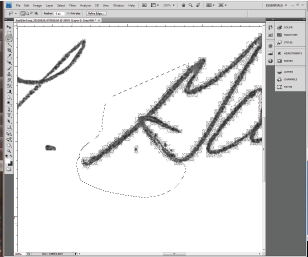
I got a printed scan of our signature on my desk this morning. This sheet of paper looked terrible, but it was all I had so I needed to make it work. Here’s the quick and dirty on how to make salvage a low quality printed signature for digital use.

  1. Rescan the image and set the output to TIFF or other image file type. Be sure to select the highest resolution setting. This will yield a lot of artifacts on the image but you can remove them pretty easily. 
  2. Open the file in Photoshop, and crop it; removing all excess white space around your work area.
  3. Go to the layers panel and create a new layer filled with white. Move this layer below your working layer and reselect the top layer. 

 Now, let’s get to work! 

First: Increase contrast. Go to Image > Adjustments > Brightness/Contrast. With Preview on, move the brightness slider down to around -150 and increase contrast to 100. You may need to repeat this once more before you continue. Eyeball it, then hit OK.


Next: Zoom in on a section of the signature—I chose 200% for this one—and select the Lasso tool. Then: Start with a small area, and select stray pixel artifacts surrounding the main letterforms.


Hold down Command + X (Mac) or Ctrl + X(Windows) to remove the pixels.


Repeat. Make sure that you zoom out to 100% every-so-often to be sure the right pixels have been removed.


 Final Clean up

  1. Merge down layers. In the Layers panel select your top layer and select merge down from the dropdown.
  2. Increase contrast. Go to Image > Adjustments > Brightness/Contrast. With Preview on, move the brightness slider down to -150 and increase contrast to 100. Do this only once! . Then hit OK.
  3. Save it. Select File > Save As>

Jun 26, 2012

In the Media: Macbook Markup

By On 06:14
Visitors to online travel site Orbitz.com are fed higher hotel rates based on the operating system (OS) they use. Mac/Apple users are reported to spend around $30 more on travel and accommodations than Windows users, so Orbitz chooses to capitalize. Their practice is to show more expensive options--boutique hotels, as opposed to more economic options--when users search from the Apple OS.

Read the full article at www.online.wjs.com


Jun 23, 2012

Robots and Resumes

By On 04:51
Maybe you’ve heard that a tailored resume is one of the best ways to grab a hiring manager’s attention.

It’s a fact that the one-size-fits-all, generic, general resume doesn’t cut it. Not anymore. Remember, you’re facing a pool of hundreds (and potentially thousands) of competing applicants whenever you apply for a job.
Because of the increasingly high numbers of applicants, more employers rely on resume screening software; robots. It pays to know how an Applicant Tracking System (ATS) works so that you can tailor your resume and cover letter to the job you're applying for. 

HOW THE ATS ANALYZES YOUR RESUME:
  • Your uploaded resume is run through a parser, which removes the styling from the resume and breaks the text down into recognized words or phrases.
  • The parser then sorts that content into different categories: 
    • education, 
    • contact info, 
    • skills, and 
    • work experience, etc.
  • The employer's desired skills or keywords are matched against the results from above.
  • Your resume is then scored on relevancy—using semantic matching against the employer's search terms and your years of experience.
It's important that you include relevant text in the body of your resume. Instead of simply cutting-and-pasting keywords from the job description; employ a strategy. Remember, other savvy applicants are likely using the same keywords in their applications.

WHAT TO DO ABOUT IT
Don’t just narrow your focus to keywords. A sophisticated ATS goes beyond the keywords to look for related terms (not just graphic design, but also “creative cloud”, print, web, motion, logo, etc.). *sites like Monster.com and others use technology to help employers find the best candidates (see Monster's concept-matching resume search).

Your areas of expertise. Ensure that your resume matches the special categories for the job you're applying for, use a bulleted list to organize your areas of expertise. If you opt for generic categories, make sure that you add some descriptive text. Here's a simplified example: 

 Prioritize your keywords. Begin by auditing the job description for primary and secondary keywords to include. Priority words are used in the title, job description, and in bulleted criteria lists. Secondary keywords include mentions of the industry (women’s health, international football, micro brewing, etc.), direct competitors, and industry qualifications (memberships, key training or software). 

Consult an insider. It can’t hurt to get input from a friend within the company or in the industry—go straight to the source and ask them if they could either look over your resume or suggest what skills they look for in a candidate.
  • Another option is to contact someone in a position similar to the one you'd like to have—tap your social network and ask questions.
Sprinkle liberally. ATSs factor in the length of experience. So, it's also important to place those important words, throughout your resume, in all jobs where appropriate. Order your bullets in descending order of relevancy to the job description.
Use social networks to enhance your resume. More advanced ATSs add other features to check on you. Reppify, for example, checks your social network posts, and use of sites like LinkedIn, Facebook, and Twitter. Be sure that what you post in public fits with what you say on your application.

Your resume should cover all of the listed job requirements. The ultimate goal is get your resume in the hands of a real human being. These tips should also increase your chance of getting past live screeners and hopefully land you an interview.


Popular