Enter your keyword

Communications Design Industry Discussion, Inspiration, & Tutorials

Jan 31, 2011

Stuff I'll Miss About My Job

By On 18:41
There are many things that I'll genuinely miss about ACNM; most notably, the commitment to the mission of promoting midwifery and women's health. I love being surrounded by folks who genuinely believe in the work they do (that's one thing that is true of ALL of the staff at ACNM). This is my main reason for choosing to work for non-profit organizations. 

Other Positives of the Job:
  1. My awesome, collaborative communications team
  2. Telecommuting
  3. Designing lotsa Websites
  4. "treats in the lounge" emails
  5. Having coffee every Monday
  6. "We really love your work" emails
  7. Working with printers and learning their special jargon - I can fold a piece of paper in at least 12 different ways AND name them!
  8. Numerous opportunities to create logos
  9. Always being busy
  10. Redesigning or updating popular publications
  11. I designed the cool new Website. Booyeah!!
  12. Their 1-man IT team is incredible and deservers all props that staff and consultants give him!!
And, then there are the not-so positives:
  1. Kathy's love of using bold/red to create a feeling of urgency, and her die-hard commitment to Comic Sans as  "a great informal font," remind me why I studied so hard to become a designer
  2. In nearly two years, I've had 5 lunch breaks (my bad)
  3. The feeling of too-many-cooks.
  4. 2-hour meetings
  5. Updating powerpoint presentations (I actually learned a ton about how to create visually interesting decks by searching the Help menu, so I suppose this isn't really that negative)

Jan 24, 2011

Packaging Redesign - Now Essential Oils

By On 14:53
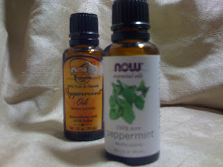
This, I love! The apothecary look is gone; replaced with fresh greens, clean type, and modern lines.

I'll let you examine all the changes for yourself, but I do want to address the product description typography. "Peppermint" on the original label is rendered in a  hand-tooled script (it also says 'peppermint oil'). The new white label renders the word in a large, lower-case sans serif. This word now vertically balances with the newly redesigned logo ("now"). I think the typeface is Euphemia UCAS with lost of comfy, spacious kerning.

Overall, the new label design brings now into the 21st century. I will also mention that the label is now made of that slick plastic material where the original was coated paper.

Jan 23, 2011

BSO Print Design Hits all the Right Notes!

By On 15:35
This afternoon, we decided to catch the BSO performance entitled Robustly Russian. Maestro Marin A. led the orchestra in 3 hours of decidedly beautiful and at times haunting soviet classical music. We got to hear several pieces from Rachmaninoff and Shostakovich.

While the selections were intriguing on their own I was really interested in running an eye over the winter program. My chance came at intermission, and I was not disappointed.

The BSO graphic designer put together an elegant edition of Overture. They presented a sophisticated mix of  three primary typefaces: Baskerville, Helvetica, and Edwardian Script used in accent.

So often we try to stick to a two-font solution when there are more options at our disposal. We can use one (like Arial, which has at least 10 weights or Century, etc.) or three--maybe even *four with plenty of  practice.

The imagery presented was also a healthy mix of squared-off photographs balanced with anthropomorphic vectors used to punctuate ideas; take a quick gander at the cover. The swirls that appear to be coming toward the orchestra over the terrace level seating is a great example. They could be a visual representation of the sound waves working their way through the room.

Excellent job BSO, this Overture goes in my inspiration file.

*it's been done very successfully, check out the book Visible Signs by David Crow.

Jan 22, 2011

Why Pro Bono?

By On 21:28
Okay! I've been telling more folks about my non-paid graphic design work. The more I mention it, the more quizzical looks I get.

So, this post is a short explanation - by no means will it answer all the questions.

I began designing, in undergrad, after I had successfully changed my major for the 5th time; I found that I had an aptitude for the business side of creativity. Conversely, I also found that I had little aptitude for pursuing the American dream (as defined: acquisition of bigger and better status symbols, up to 2.5 kids, a shiny car, an ulcer, a nine-to-five, and an addiction to talking constantly about all of the above--I really should've started with a disclaimer about my opinion before I got into this, too late).

To feed my growing love for graphic arts, I offered my services for cheap or free to anyone in need. This practice earned me a few bucks, but also a lot of practice. I began to appreciate different styles/types of design work. I also learned more about myself. The easier projects to complete always involved my creating identities/collateral for individuals or small groups who had passion, drive, ingenuity, and an undefeatable entrepreneurial spirit; you know, the little guy.

So, why pro bono? Because my passion lies with the little guy; the one with more ambition than cash, the one with a dream of a brighter future for us all, the one who takes that great blindfolded leap into uncertainty, the one led by her/his heart.

Web Designers Rejoice - More Seamless Backgrounds!

By On 20:55
I've got the busiest weekend I've seen in months (and the busiest to come in 2011, I reckon). There are four Web projects to complete and only one more day off from the regular job. So in my hurry to create bg images for one blog project I stumbled upon the coolest tiling background image site ever...
...ava7 patterns!

I'm in love! Users choose the primary color, pattern direction, or orientation, then scroll around the page to see how the swatches fit together on the Web page. Hit 'preview' and a cool bit of PHP tiles the image across the entire page so that you can see if it's not enough, too much, or just right!

Stick it in your bag of resources, I swear--for patterned backgrounds--it's a keeper!

Jan 19, 2011

First I was amused, Then I was livid

By On 15:49
I just had my first look at the "Male Privilege Checklist" and it made me sick. Literally sick to my stomach. Item 45 in particular...


45. Sexual harassment on the street virtually never happens to me. I do not need to plot my movements through public space in order to avoid being sexually harassed, or to mitigate sexual harassment.(view the full checklist...)


I guess it's the bit about plotting alternate routes to avoid douchebaggery that got to me. I ride a f*cking bike. You know how inconvenient it is to bike 2 blocks out my my way to get home from the grocery store that's 2 blocks away???


 I firmly believe that we should be able to discharge pepper spray in the eyes of those cretinous bastards. Who do I talk to about making that a ballot initiative?

Jan 10, 2011

By On 06:22
A fellow designer called me for advice on a logo project that he’s in the midst of tackling. The event is a film series on women’s health or some such. One solution that he’s fond of involves using a film strip--either as part of the logo or on the fact sheets.
Okay buddy, here’s a bunch of free vector film strips that can be manipulated to suit the project.

The site All-Silhouettes offers thousands of free vectors for private and commercial use, Bookmark it!

Jan 9, 2011

Entrepreneurial Spirit: Shannon Reilly

By On 13:10
Shannon Reilly is the owner and  esthetician-on-duty at Charm City Skin in Hampden. We’ve been friends for several years and fB friends for  about one. Shannon’s recent status update caught my eye and I knew I had to feature her on my blog. That eye-catching quote, “ I love what I do!”

How’d you get started on this path? 
Six years ago Shannon decided to go to school to be an esthetician. “I had a college degree from Towson to which I was putting to good use by bartending. :) I was feeling like I needed a usable trade-one which didn't involve me getting drunk."
She took a 7-month course, at the end of which she began teaching what she'd learned to other would-be estheticians. Teaching allowed her to grow increasingly comfortable with the concepts learned in the classroom.


How’d you decide to make the move?
Fast forward five years, Shannon was working as a professional in a spa in Baltimore. "I was gaining a pretty big book where I worked, but I was disheartened by the way the spa was run. My clients would make comments like 'the only reason I come to this place is to see you.' My efforts to make suggestions fell on deaf ears; I knew that something had to give.  Finally I had the confidence to branch out on my own. It wasn't easy, and making the move did lose me clients at first."
However, she  continued to work hard to build a new client base and provide excellent service to the people who stuck with her.

And today…"my business has grown exponentially." Shannon is so busy, in fact, that she is on the verge of hiring a new employee. She loves what she does and puts that passion into every service that she provides. Something to keep in mind when you're getting your full Brazilian, fellas!!

Thanks Shannon! You’re an inspiration!

Jan 4, 2011

Rant - Open Letter to Users

By On 10:35
Dear Users,
It’s come to my attention that some of you may have trouble understanding our graphic styles guide. It seems that the terms and conditions of the guide are impossible to comprehend. Let me take a few moments to clear things up for you.
  1. First, you all know my favorite color is Olive; the world would be all Olive if I had my way. However, I don’t neglect the tried and tested conventions of this company by making all of the text on our affiliate’s Websites Olive—that is wrong. So, too, is turning text Purple, Green, Salmon or any other color not found in our style guide. The guide and the Website’s CSS define body text as a tint of black, namely #2B2A2A. Please refrain from adding additional styles to individual pages of the site.
  2. On the subject of body text, I know that there are always priority items that need to be highlighted on our informational Web pages. The agreed-upon convention is the use of hierarchical formatting (these are also outlined in the existing CSS). This means using headers and subheads and even bulleted lists for emphasis. This does not mean that three (3) full paragraphs are bolded.
  3. Finally, page five of the guide lists our color palette and suggests different combinations of the swatches for emphasis. Nothing is ever Red.


Thank you for your time and patience. There is no need to respond to this message.

Popular