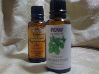
This, I love! The apothecary look is gone; replaced with fresh greens, clean type, and modern lines.
I'll let you examine all the changes for yourself, but I do want to address the product description typography. "Peppermint" on the original label is rendered in a hand-tooled script (it also says 'peppermint oil'). The new white label renders the word in a large, lower-case sans serif. This word now vertically balances with the newly redesigned logo ("now"). I think the typeface is Euphemia UCAS with lost of comfy, spacious kerning.
Overall, the new label design brings now into the 21st century. I will also mention that the label is now made of that slick plastic material where the original was coated paper.
Jan 24, 2011
Packaging Redesign - Now Essential Oils
Tags:
packaging,
Typography
![Author Image]()
About Simone Subversive
Soratemplates is a blogger resources site is a provider of high quality blogger template with premium looking layout and robust design
Labels:
packaging,
Typography
Subscribe to:
Post Comments (Atom)


No comments:
Post a Comment