
These principles of design include balance, proportion, rhythm, emphasis, and unity.
It means that the layout of the finished page has a harmonious mix of words and images that provides an easily deciphered page. If you want a primer on the principles of design take intro to graphic design or show up to day one of any class that I teach.
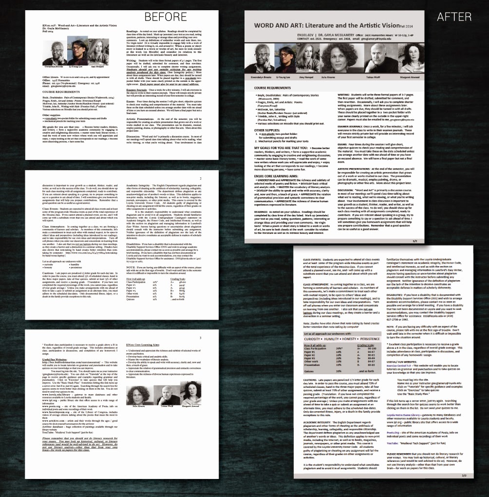
One of our English faculty emailed me with this problem ‘help, my students are having trouble understanding my syllabus.’ After reviewing the syllabus and course I saw the problem. Since this client wants a hand in the revamp of the course materials, I opted to roughly layout a few options (web and print)now and then meet with her after finals to refine.
Below are before an after. Think about how balance, proportion, rhythm, emphasis, and unity work together to make one option more effective than the other:
1.jpg) |
| Notice in the update that the 2-column layout is maintained. However, weighty elements are at the top of the opening page, and all images are now uniform. Although hard to distinguish, subheads have a regular format and are rendered in all-caps, bold. Lastly, the grading criteria is placed in a callout box to draw the reader... |


No comments:
Post a Comment