Enter your keyword

Communications Design Industry Discussion, Inspiration, & Tutorials

Jul 27, 2012

This week: Circus Peanuts and the Unicorn

By On 04:55

I have an inexplicable soft spot in my soul for circus peanuts; you know the orange, semi-soft, semi-hard candy that’s shaped like peanuts and tastes like a combination of red dye #5, yellow dye # 3, and sugar?


Whenever I see them in stores I’m instantly drawn. But I limit myself to gorging on a 2.99 bag of Circus Peanuts just once a year.

I think my love of this heinous confection is connected to childhood memories of the annual school trip to the Ringling Brothers circus.

In the years before 4th grade, my childishly innocent eye allowed me to believe in the unicorn. In these years,  the daring of the aerialists and acrobats kept me speechless until their performance concluded with a drop into the net and a graceful forward roll onto the safety of the arena floor. In these years a cheap, light-up spinny thing and a poster was all I needed as a souvenir; I’d look at the poster in my room later and be transported back to that 3-ring spectacle.

Eating Circus Peanuts now is like prying open a crack in the window of that little girl’s life to let a sliver of that  innocence shine through. It’s fleeting and it’s nostalgia. Too often—while I revel in that taste of the past-- my window works itself shut and I’m left with half a bag of some pretty terrible candy.

Jul 23, 2012

Sappi Samples: Freebies

By On 07:41
Sappi offers booklet/book samples for free to designers and students--they're samples!


Highly recommended:Folding and scoring book is a huge favorite!http://sappi.litorders.com/SelectInventoryList.aspx

Jul 16, 2012

Branding You

By On 10:00

How to design the right identity to market yourself

In recent discussion with a group of students I learned that a major stumbling block in completing a portfolio is creating a personal identity package in which the finished portfolio will reside. 
When in my 3rd year of undergrad, I was approached by a friend, in her final year of grad school and taking a portfolio class. One slow afternoon in the college design studio she asked me to help her brainstorm her personal identity package.

1. The design process starts on paper
The obvious isn't always the best solution
My first idea was to make a list of things, objects, images that her last name, Dana Marsh, evokes. At the end of this first exercise we scratched out 25 terms pertaining swamps, marshes, and water fowl.

This was a good start, but this list did not say anything about Dana’s personality or design style. We then made a better list: one with her design influences, her personality traits, personal style, and her favorite activities. We ended up with several words and phrases that would help narrow in on the target. We cleaned up the lists and crossed out all mention of beer, bourbon, and rum.

At the final tally, we knew that Dana’s design style was irreverent, and quirky. She was drawn to bright, bold typographic solutions. While not breakthrough revelations, the list in front of us would help create her final identity.

2. What’s your type?
Dana knew that she wanted a bold hand-drawn typeface with little embellishment but lots of personality. She poured through the Fontbook database and scoured dafont.com. When these resources were tapped out Dana grabbed a sharpie from my desk and scrawled out her full name several times on sheets of copy paper. After the 7th attempt, she had found her typeface. The next step was to create horizontal rules and hatch marks in the same style--in case she needed them for the design later. She then scanned and cleaned up her work digitally, ending up with several PSD files with transparency.

3. A color palette is worth a thousand words.To choose her colors Dana went back to her list. Bold and irreverent type isn’t harmed by a high-contrast palette. Since the logotype was black she chose to use pink to speak for her. To envision this vibrant hue, think bright neon high lighter marker. In the end the colors and type became a direct reflection of the woman I knew.

4. Putting it together
With the hard work done, Dana’s final task was to put it all together; create her collaterals and portfolio site. She already had the skill to create an effective presentation. So, she sketched out two different versions of her resume, cards, CD package in InDesign. Then she found a hosting site with the right look and enough user controls so that she could work with and got started. In the end Dana created a fabulous identity package that landed her a job within weeks of graduation.

Jul 12, 2012

Salary: What to Expect When Starting Out

By On 02:42
I just took part in another heated discussion with a mixed group of recent grads and mid-career graphic designers.  A young woman in the group raised the question of salary range for an entry level graphic designer with a master's degree.


This question was asked the recent graduate:
"What kind of pay should I be expecting for a full-time entry level graphic design position with my master's and no prior career experience? I've gotten a couple offers that seem just way too low, but for the amount of experience I don't have I'm wondering if that's just what I should expect.... argh."


Here's my response and a few others... I applied for and was offered a job at a DC non-profit during my last semester of grad school. I had already had a few years of professional design experience, and this was not an entry-level job.

The highest salary they could stretch to was around  44K--I believed that was on the low end. So, I negotiated an extremely flexible schedule that allowed me to work from home three days, and I was able to take 1 full month off each winter (in addition to the regular vacation and sick days).

NEGOTIATE! If they're not willing to pay more, see if you can negotiate on the perks: more flex time, working offsite, more vacation days, or unpaid leave. I personally believe that 28K is a slap in the face. Two years of college cost more than that!!! Read a bit more about negotiating your salary after the offer, http://www.howdesign.com/design-career/salary/salarynegotiationtips/


Here's what other design professionals had to say:

B.G.: If it is a print only job the pay will be low and that will never change. Chances are you will never advance because the folks above you are content and not going anywhere. If you are in a hybrid role or designing for web and/or new media your pay will be better and your career path will be brighter. The degree doesn't matter, its your work and what you bring to the table that matters most. I think low 40s is a decent starting point. If you jump around for the first 2-3 years of your career you'll not only learn a lot more but you will make significantly more after those first few years. Worry about getting good experience first, the money will come if you work hard for it. I know all of this from experience.

J. G.: Good luck trying to figure this one out! I'm still unable to answer that. I've asked teachers, internship supervisors, employers, friends with design jobs, people on linked in and google. I always get a range and it goes from about $28K-$50K. The lower end being Baltimore jobs and jobs that focus more on print design and the higher end being jobs in DC or surrounding areas and jobs that focus more on digital design. I know that's not very helpful. The helpful part might be to stop trying to find just one answer and go with what works for you. Also, keep in mind, some jobs have great benefits with a lower salary but it could even out?
* I got my this particular job while in my last year of grad school. This was not an entry level position and I'd had a few years of professional experience when I applied for the job.


J.G.M.: 50-100 if you know Wordpress (basic php) and web development

Hope this helps,
Simone


Jul 10, 2012

Interview Question: Do you have any Questions for Me?

By On 14:21
I just participated in a heated discussion on the dreaded final interview question. This one is asked when you're sure that you and the interviewer have beaten the molecules back and forth for the last time. The art director takes a shallow breath, exhales, and then asks, "Do you have any questions for me?"

There are a few different ways you can respond to this one.

My answer:
I always ask the interviewer "So, how'd you end up working here?".... followed up with what are your most /least favorite aspects of your job. It's rare that this person is asked about her/his own personal experience, and this disarming question might elicit some useful insights about what you're in for when offered the job.

Here's how other design professionals answered this:

A. Scott
It's been a while since I interviewed and I always dreaded that question as well; I also ask questions throughout the interview. I tend to ask about the position. "Are you replacing someone or is it new?" "Are you looking to continue the pace of the position or go in another direction?" I always ask how long before a decision and what are the next steps.

B. Gillespie
The question doesn't have to come up. Think of the interview as a discussion where you ask question, they ask questions, and you just talk. But if you need some try these: Ask about culture and for specifics. I've found that the culture makes the job and that many companies can be delusional or misrepresent the culture. Avoid anything that is negotiable at that time, like vaca, benies and salary (once you get an offer, negotiate). Ask about typical work flow, the typical day, room for growth, ask about clients and how they handle them. Ask if you will work directly with clients or who you would work with on a daily basis. Ask to see work space. Ask about equipment and software. And always ask what plan they have for the person that filles the role you are interviewing for. Where do they see growth for that person and future opportunities. This is a great one to start a discussion.

M. Lewis
I tend to ask questions about the company culture, the team dynamics, etc. ("What is the atmosphere here like?" "Is there a lot of collaboration between the designers and the other departments?" "What is the best part about working here?"). That way, you don't just end with "I can't think of anything," you can't be construed as trying to get out of work (asking about leave and hours), and it shows that you are interested in being a part of their team and organization. Whatever they respond, you can say, "That sounds really great. I've been looking for a place that's like that."

D. Peterson
You can ask about work/life balance; ask about the company's culture; or if and how they support professional development.

A. Russell
I usually say something like "I'm very excited about the opportunity and it sounds like a great fit for me, however, I am looking for a company in which I can grow for the long run. When the time comes, do you generally promote from within? And are there opportunities for advancement among employees who have been here for a long time?"

Jul 2, 2012

Tutorial: Salvage a Signature in Photoshop

By On 08:15
I got a printed scan of our signature on my desk this morning. This sheet of paper looked terrible, but it was all I had so I needed to make it work. Here’s the quick and dirty on how to make salvage a low quality printed signature for digital use.

  1. Rescan the image and set the output to TIFF or other image file type. Be sure to select the highest resolution setting. This will yield a lot of artifacts on the image but you can remove them pretty easily. 
  2. Open the file in Photoshop, and crop it; removing all excess white space around your work area.
  3. Go to the layers panel and create a new layer filled with white. Move this layer below your working layer and reselect the top layer. 

 Now, let’s get to work! 

First: Increase contrast. Go to Image > Adjustments > Brightness/Contrast. With Preview on, move the brightness slider down to around -150 and increase contrast to 100. You may need to repeat this once more before you continue. Eyeball it, then hit OK.


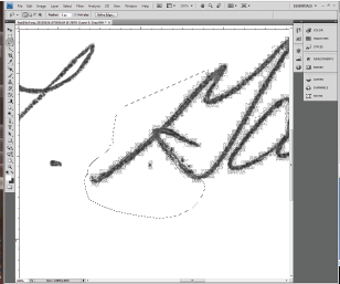
Next: Zoom in on a section of the signature—I chose 200% for this one—and select the Lasso tool. Then: Start with a small area, and select stray pixel artifacts surrounding the main letterforms.


Hold down Command + X (Mac) or Ctrl + X(Windows) to remove the pixels.


Repeat. Make sure that you zoom out to 100% every-so-often to be sure the right pixels have been removed.


 Final Clean up

  1. Merge down layers. In the Layers panel select your top layer and select merge down from the dropdown.
  2. Increase contrast. Go to Image > Adjustments > Brightness/Contrast. With Preview on, move the brightness slider down to -150 and increase contrast to 100. Do this only once! . Then hit OK.
  3. Save it. Select File > Save As>

Popular