Enter your keyword

Communications Design Industry Discussion, Inspiration, & Tutorials

Nov 27, 2013

Top Ten Inspirational Quotes on Art & Design

By On 07:58
Inspirational Quotes are relevant in both work-life and life-life:


1. Simplicity is the ultimate sophistication Leonardo Da Vinci 2. Less is more - Mies van der Rohe 3.   Design is a response to a specific problem. You are given a problem to solve, and then you let the problem itself tell you what your solution is. - Chip Kidd  4. The real issue is not talent as an independent element, but talent in relationship to will, desire and persistence. Milton Glaser 5.    “GOOD DESIGN IS OBVIOUS. GREAT DESIGN IS TRANSPARENT.”JOE SPARANO   6. God is in the details. - Mies van der Rohe  7. If we do our jobs right, and get a little lucky… great art can be great business. Chip Kidd 8. If you have no intuitive sense of design, then call yourself an “information architect” and only use Helvetica. - David Carson9.   Design is not just what it looks like and feels like. Design is how it works. Steve Jobs 10.  I love what I do. Simone Jenifer Christian

Nov 25, 2013

Graphic Design Inspiration: Chip Kidd

By On 06:19
I wanted to share with you a series of graphic design quotes that have stuck with me through my design education and throughout my career. My list got to about ten quotes before it got sidetracked.

I came upon a quote from one of my favorite designers, Chip Kidd. According to the autobiographical Cheese Monkeys—a book that inspired me in school, he sort of fell into the study in school. Since school Kidd has worked as a designer for Knopf, Random house and other publishers. He continues to inspire me.

Oct 25, 2013

Minimalist Design

By On 08:54
My first instinct was to make myself one of these for my cash and cards. My second instinct was to share this beautiful minimalist design with you. Nothing Fancy, minimalist wallets, are created from a single piece of leather by London-based designer Chieh Ting Huang. Check them out:


Oct 21, 2013

CV vs. Resume

By On 07:42
My company recently advertised for a graphic designer and I was tasked with vetting resumes, application, and portfolios.

Several of the applicants applied with the requested documents, but one very talented designer applied using her Curriculum Vitae (CV)—a long, highly stylized document that would have worked best in application for an academic position rather than the non-profit sector. Since her portfolio was excellent, and I really wanted her to have a shot at the job, I ended up contacting the designer and having her resubmit a more succinct resume for the posting.

What’s the Difference Between a CV and a Resume:
 The main difference between a CV and a resume is the intended audience.

A CV speaks primarily to an academic audience. It documents both academic and intellectual accomplishments.

A resume is usually read by hiring managers in non-academic organizations or companies, and ideally should be tailored for this audience. These managers can review hundreds of applications for a single position; each being reviewed for fifteen seconds or less. Therefore resumes must be clear, concise, and make an immediate impression.

That said, both of these personal marketing pieces must provide a persuasive account of your specific skills and experiences as they relate to the specific job. When applying for a specific position, pay close attention to which document they require--and apply with the correct one.

Comparing Both Documents:

Curriculum Vitae
Resume
Audience
Academics in your field
General audience of employers who hire for a wide variety of positions
Goal
Presents a full academic history — that includes teaching, research, awards, and service.
To demonstrate that you have the skills and experience necessary to succeed within the position you are seeking
Length
One or more pages--however long it takes
One to two pages
Focus
Demonstrates academic achievements, scholarly potential, and any research undertaken.
Represents professional experience, extracurricular and volunteer work, and skills gained from these
Essential Information
Education, publications, presentations, teaching experience, honors and awards, and grants
Skill and experience gained as related to the job sought

adapted from CV or Resume? from University of Illinois

Oct 7, 2013

Superfresh! Typography Tattoo

By On 11:03
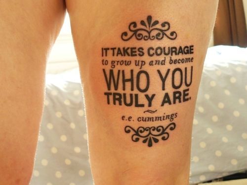
This takes quite a bit more gumption than I currently have. This dude is no joke.
Ouchie!


Oct 2, 2013

Top 5 Online Portfolio Mistakes...

By On 10:39

... And How to Avoid Them


You’ve picked the pieces to showcase in-person and in your online portfolio. Links to your portfolio now live on all of your identity pieces and you’re all set to get your new awesome job. So, how come employers aren’t champin’ at the bit to contact you after seeing your mad design skills?

It could be that you’ve made one or more of the following mistakes on your portfolio site.

1. POOR TYPOGRAPHY IS A TURN OFF
Typography is one of the main pillars of graphic design. As someone in the market for a design job you’re expected to have a good grasp of typography best practices. Without these, even the least qualified art director will overlook you and your site.


THE FIX: Once you’ve created your site and included all columns of type, step away from it for a few hours. When you come back, review a wordy column of type and see if it needs any tweaks in the leading or tracking; do the headlines command attention or do they blend with your paragraphs? Finally be sure to keep line-length to below 80 characters—to enhance readability.


2. TOO MUCH IS TOO MUCH
You’ve got a flash animation, and lots of jquery motion graphics, maybe a revo slider with individual text links, and accordion panes. Stop! That’s way too much going on. 

THE FIX:  remember that this portfolio site is meant to showcase your design talent. Less is more. Dozens of moving pieces detract from your message.


3. HIGHLIGHTING ONLY STUDENT WORK
If you only have student work, then by all means show it proudly. However, it’s important to come off as a designer who has worked with clients and has experience working with clients. 

THE FIX:  find yourself a few freelance clients and get those projects onto your site, pronto. If that’s not an option, consider referring to your student work as “conceptual” projects. This simply means that these pieces weren’t produced for a specific client. Although this is the same as saying student work, the connotations are more positive.

Use as 3-D Mockup to show a 'conceptual' design in a real-world setting...with no need to stress about properly photographing the finished product.


4. 2-D IS NOT AN OPTION
While we’re on the topic of student work, let’s talk about flat designs that float in space. Offering a flat representation of your work, is not showing it in the best possible light. Don't rely on the imagination of your audience to connect the dots. Instead, show those conceptual projects as complete finished products.

Use 3D PSD mockups to show your work in a real-world setting. Below is an example of an identity project that many students have completed for Prof. Boam in Grad school;


THE FIX:  Okay a drop shadow is a quick way to add depth, but an even better way is to create photo-realistic mock ups. Check out these mock ups for inspiration.


5. TYPOS WILL GET YOU OVERLOOKED
 I’m definitely guilty of this one. The most embarrassing incident I’ve seen when it comes to typos happened when reviewing portfolio for a graphic design position last year. The applicant cited her “attention to derail” right on the home page. I didn’t even click on on the portfolio link after reading that.

THE FIX:  Once your site is done, get someone else to look it over. If you’re working with DreamWeaver or with an online CMS (wordpress, blogger), use the Spell Check tool.


.


.


.

Sep 30, 2013

Living and working in MD

By On 03:56


Women in the US have made tremendous socio-economic strides in recent  decades, but this progress has been unequal. In a Center for American Progress report, Maryland ranks No. 1 in the United States for the state of its women.

In the report, titled "The State of Women in America", all 50 states were assessed on factors contributing to women's economic security, leadership opportunities, and health. Maryland's overall grade of "A" was a product of its No. 1 rank in both economic security and leadership.

Sep 6, 2013

Robots and Resumes II

By On 05:32
Two Junes ago I posted an article outlining ways to get around "robots", the ATS that your online application may pass through before getting into the hands of a human being. These programs strip out the formatting and compare your resume text to that of the original job posting and then give a generic score to applications that best fit the outlined criteria.

Trolling Pinterest today, I found an infographic that best illustrates the process:

Sep 1, 2013

Farewell Summer Assistant

By On 14:50
Let's talk a bit about one of the benefits of completing an internship.

At the end of the spring semester this year, I pushed to have either an intern or a summer assistant who hailed from an outside university. My reasoning was that I wanted to open up the opportunity to a larger pool of talented students. I got my wish and was able to hire a summer assistant from my alma mater; a young woman with more graphic design skill than a freshman or sophomore (which is all we seem to get in my office). I lucked out.

My assistant just worked her last day this week and will hopefully move on to bigger and better things.

In addition to a modest hourly rate, she got a chance to work scripting, recording and editing instructional tutorials using Camtasia; something previously outside of her skills set. The project added expertise in software that is fast-becoming an industry standard tool. She also got to put her personal style on the finished materials. The project was a complete success, and she enjoyed the work, too.

"...thank you so much for mentoring me for what felt like another semester. You taught me so much in such a short time and I wish I could have stayed around for longer..."
Well, she's got a great career ahead of her!


Aug 30, 2013

Do you Sketch Before you Design?

By On 15:54
I just participated in a conversation on the topic with colleagues. It was a bit like preaching with a choir, but I want to share some of the commentary here.

I recently had the chance to work with a newly graduated designer who habitually goes straight to the computer whenever a design project is presented. If needing to change gears or develop more design solutions, there was always the need to go back to the drawing board; I personally, found it an inefficient process.

When faced with a new design challenge I always whip out my pencil and sketchbook. This is owing to my fine arts background; it's how I brainstorm, storyboard, script, plan, and develop my ideas. Plus, my poor memory means that I take a lot of notes, so there's always a hard-bound sketch book in my hand.

Here's how some of my seasoned colleagues replied when asked, "Do you sketch before you design?"

"Absolutely! I almost never design on the computer. The computer is a tool and that's it. My creativity flows faster and easier with a pen/pencil and paper. Plus you have a reason to spend an insane amount of money on cool drawing utensils and books!" - PD

"There has to be some preparation before spending the time in design. UX items need to come into play and UX protype tools such as Axure let the designer plan out the site and give it a testing before going into the visual design work. Or, it can be as simple as a drawing in a notebook to plan out a page. So, a sketch is part of the process and can give you as a designer a clear vision." - MS

"Absolutely, I can usually get half-a-dozen concepts out sketching in the time takes my computer to get warmed up. Purely from an efficiency perspective it makes sense." - JS

"90% of the time I do. The other 10%, I do what I call block sketching. It is where I go into Illustrator and just create shapes and build them together. I do this to create a font or build a wireframe for a website. It's quick fun and doesn't take long to get the idea from your head to screen." - TS

"Design begins with the thought process that follows a thorough investigation of the client's needs and the market they're in. Generally for me that is word based, especially for branding. I distil everything down to what I refer to a key words, a very concise summary of the discovery process. In turn this is the start of creating visual proposals and working with the client as 'ownership' by the client is vital. Other projects may be layout and production only where the client has already compiled the material but lacks the ability, skill and experience to turn the material into a professional piece of literature, or other form of marketing or promotional material, exhibition or packaging. Sometimes it is a combination of both. The vital skill for me is drawing out the essence of what is required before any form of creative work begins. Do I draw or sketch first after this? Yes, the pencil or pen is much more flexible than the computer. Do I present this to the client? Sometimes." - RS

Although he didn't participate in the disucssion, Milton Glaser said this about jumping on the computer to create  design, "Computers are to design as microwaves are to cooking." Hey, the soup is hot, but is it good?


Aug 25, 2013

Inspiration: Milton Glaser Interview

By On 14:59
The great benefit of drawing is not to replicate reality, but to understand what is real."


Aug 23, 2013

This Week: Lecture Series Update

By On 11:49
I just spent the majority of the day shrieking inaudibly at technology. At my disposal is a Macbook, and 2 (allegedly) high-end Windows desktops in my office that I'm to use for multi-media projects. They are all inadequate. Today saw me  spend several hours watching a 2 minute commercial render on various crappy computers in our lab.

Unfortunately, there's been little time left for me to give a s$%^t about updating my blog; with me constantly monitoring my blood pressure and all--yes the technology failure had me stressed out. Now that my vitals have returned to normal, I'll happily share this update with you.

We've nailed down the speakers, images, dates and times, and communications plan--pretty much--for promoting the series. So I'm able to share more fleshed out pieces with you:


I'm actually quite happy with the way that this has all turned out and I'm looking forward to my part in the first session. Not to mention; recoding and sharing the events on our new website, promoting via social media, and tracking the analytics and attendance stats.


Popular