Enter your keyword

Communications Design Industry Discussion, Inspiration, & Tutorials

Oct 25, 2013

Minimalist Design

By On 08:54
My first instinct was to make myself one of these for my cash and cards. My second instinct was to share this beautiful minimalist design with you. Nothing Fancy, minimalist wallets, are created from a single piece of leather by London-based designer Chieh Ting Huang. Check them out:


Oct 21, 2013

CV vs. Resume

By On 07:42
My company recently advertised for a graphic designer and I was tasked with vetting resumes, application, and portfolios.

Several of the applicants applied with the requested documents, but one very talented designer applied using her Curriculum Vitae (CV)—a long, highly stylized document that would have worked best in application for an academic position rather than the non-profit sector. Since her portfolio was excellent, and I really wanted her to have a shot at the job, I ended up contacting the designer and having her resubmit a more succinct resume for the posting.

What’s the Difference Between a CV and a Resume:
 The main difference between a CV and a resume is the intended audience.

A CV speaks primarily to an academic audience. It documents both academic and intellectual accomplishments.

A resume is usually read by hiring managers in non-academic organizations or companies, and ideally should be tailored for this audience. These managers can review hundreds of applications for a single position; each being reviewed for fifteen seconds or less. Therefore resumes must be clear, concise, and make an immediate impression.

That said, both of these personal marketing pieces must provide a persuasive account of your specific skills and experiences as they relate to the specific job. When applying for a specific position, pay close attention to which document they require--and apply with the correct one.

Comparing Both Documents:

Curriculum Vitae
Resume
Audience
Academics in your field
General audience of employers who hire for a wide variety of positions
Goal
Presents a full academic history — that includes teaching, research, awards, and service.
To demonstrate that you have the skills and experience necessary to succeed within the position you are seeking
Length
One or more pages--however long it takes
One to two pages
Focus
Demonstrates academic achievements, scholarly potential, and any research undertaken.
Represents professional experience, extracurricular and volunteer work, and skills gained from these
Essential Information
Education, publications, presentations, teaching experience, honors and awards, and grants
Skill and experience gained as related to the job sought

adapted from CV or Resume? from University of Illinois

Oct 7, 2013

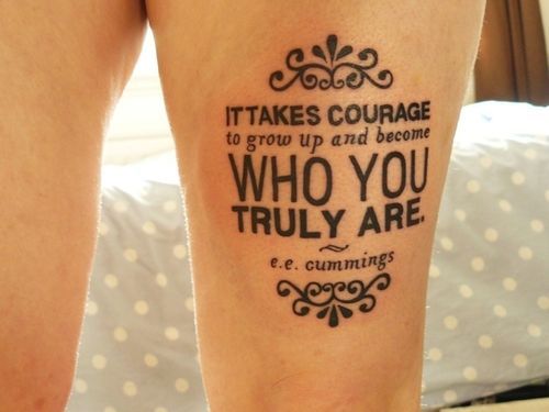
Superfresh! Typography Tattoo

By On 11:03
This takes quite a bit more gumption than I currently have. This dude is no joke.
Ouchie!


Oct 2, 2013

Top 5 Online Portfolio Mistakes...

By On 10:39

... And How to Avoid Them


You’ve picked the pieces to showcase in-person and in your online portfolio. Links to your portfolio now live on all of your identity pieces and you’re all set to get your new awesome job. So, how come employers aren’t champin’ at the bit to contact you after seeing your mad design skills?

It could be that you’ve made one or more of the following mistakes on your portfolio site.

1. POOR TYPOGRAPHY IS A TURN OFF
Typography is one of the main pillars of graphic design. As someone in the market for a design job you’re expected to have a good grasp of typography best practices. Without these, even the least qualified art director will overlook you and your site.


THE FIX: Once you’ve created your site and included all columns of type, step away from it for a few hours. When you come back, review a wordy column of type and see if it needs any tweaks in the leading or tracking; do the headlines command attention or do they blend with your paragraphs? Finally be sure to keep line-length to below 80 characters—to enhance readability.


2. TOO MUCH IS TOO MUCH
You’ve got a flash animation, and lots of jquery motion graphics, maybe a revo slider with individual text links, and accordion panes. Stop! That’s way too much going on. 

THE FIX:  remember that this portfolio site is meant to showcase your design talent. Less is more. Dozens of moving pieces detract from your message.


3. HIGHLIGHTING ONLY STUDENT WORK
If you only have student work, then by all means show it proudly. However, it’s important to come off as a designer who has worked with clients and has experience working with clients. 

THE FIX:  find yourself a few freelance clients and get those projects onto your site, pronto. If that’s not an option, consider referring to your student work as “conceptual” projects. This simply means that these pieces weren’t produced for a specific client. Although this is the same as saying student work, the connotations are more positive.

Use as 3-D Mockup to show a 'conceptual' design in a real-world setting...with no need to stress about properly photographing the finished product.


4. 2-D IS NOT AN OPTION
While we’re on the topic of student work, let’s talk about flat designs that float in space. Offering a flat representation of your work, is not showing it in the best possible light. Don't rely on the imagination of your audience to connect the dots. Instead, show those conceptual projects as complete finished products.

Use 3D PSD mockups to show your work in a real-world setting. Below is an example of an identity project that many students have completed for Prof. Boam in Grad school;


THE FIX:  Okay a drop shadow is a quick way to add depth, but an even better way is to create photo-realistic mock ups. Check out these mock ups for inspiration.


5. TYPOS WILL GET YOU OVERLOOKED
 I’m definitely guilty of this one. The most embarrassing incident I’ve seen when it comes to typos happened when reviewing portfolio for a graphic design position last year. The applicant cited her “attention to derail” right on the home page. I didn’t even click on on the portfolio link after reading that.

THE FIX:  Once your site is done, get someone else to look it over. If you’re working with DreamWeaver or with an online CMS (wordpress, blogger), use the Spell Check tool.


.


.


.

Popular