Enter your keyword

Communications Design Industry Discussion, Inspiration, & Tutorials

Apr 29, 2011

Website Redesign: SEA the Truth

By On 16:24
Writer and poet, Simone Eva Alexis has more talent in her left eye than I do in my whole being when it comes to the spoken and written word. She amazes me every time I see her.
Her site did not, however. We discussed a redesign over a year ago and played phone tag or just drank wine when we should've been talking business.

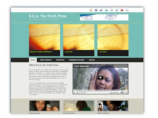
Today we've begun a project that will make her site more accessible and easier to navigate.  The first problem with the original site is that it does not work in most browsers.  Early version of IE, yes. But Chrome, Firefox, Safari, Opera, or even IE 8, not at all.
Before

New Color Palette

Design In Progress

As I've mentioned before, I love to incorporate more of the artist's personality into sites I create. As earlier implied, Simone also performs spoken word. She's take the time to create edited shorts of a few of her pieces and spliced in photography and film. I took the liberty of adding just one link to the home page. I also moved a sparsely populated page's content to the home page. 


Apr 26, 2011

How Many Samples do You Really Need?

By On 10:46

Just back from some R’nR in Costa Rica to a new post on ENVATO Notes .  Lasts week's discussion topic was about the state of our work space-- is your desk messy?

The short answer is YES, my desk is more messy than not.  A great stopgap measure that  I devised was my sample wall. I post designs that I'm presently in love with on the wall and refer to that as needed.

The wall is 6'x4' and full of push-pins, magazines, postcards, and one special memento (place cards from my lunch with the president of the Ravens). Almost every square inch is covered. This is not my only repository of samples, but it is the place where I keep the most useful, relevant and interesting pieces. I also rotate the pieces on a monthly basis as I get more beautiful design work to look at.
Here's to getting organized!
-Bueno SuertE!

Apr 15, 2011

Creative Commons Week - You Need These Fonts!

By On 10:28
If you're on the lookout for a serious grunge look--before it completely falls out of fashion--take a look at Action of The Time - New

The latest update of this ultra-bold, distressed, grunge font shows more cross hatching than the last. It looks like what happens to glass or mirrors after some seriously rough treatment.

Note: use sparingly

Creative Commons Week - You Need These Fonts!

By On 05:57
I remember when I first found Bleeding Cowboys back in '07-I'd sought out the font on the urging of designer, Jay Higgert of Bittbox. Needless to say, it was love at first sight.

Today, I pay it forward. If you're in the market for an uncomplicated sans serif with a slender stroke, clean lines, that's exceedingly readable at the smallest point size, then Chapenettoer 8 THIN is the typeface for you.


Apr 14, 2011

Creative Commons Week- Best Vector Halftones

By On 06:21
You can achieve halftones many different ways. The effect--properly executed-can really make an illustration or design come to life.

Here are a few of the free halftones that I've found and used from around the web. There's also a handy-dandy how-to that I've found invaluable for creating patterns.


Apr 13, 2011

Creative Commons Week - African Batik

By On 12:49
In a recent blog redesign, I came upon a problem of finding the right image to place. I needed an afro-centric, woman-centric graphic and could find nothing suitable. Eventually, I took some existing photography and created an illustration that was suitable.

I snapped some pics of different Batik fabrics and have themavailable for download on Flickr.  The set has medium to hi-res images for ya!

Download the full set at Flickr


Apr 11, 2011

Creative Commons Week – Baltimore City Skyline

By On 12:23
On a recent project, I was hard-pressed to find –in my photographic archive, istock, and wiki searches—images of Baltimore.
I  ran outside with a camera, but still couldn't find the perfect shot. Eventually I ended up hitting the mother load of creative commons on Flickr and All-silhouettes. Here are a few of the pics I found and the artist link.
spike55151 has taken nearly 20,000 photographs in his travels in Baltimore and parts beyond.Here are bits of the Baltimroe skyline, as seen by spike 55151:
-Here's Baltimore's famous Skyline
-Mt. Royal Station and Meyerhoff
-Bromo Seltzer tower
-Aquarium and Power Plant

Apr 6, 2011

Here's the Skinny on Soap Packaging

By On 15:07
DIY, natural, crafty, and cute. That's the look of SkinnySkinny.

Elegant Honey

By On 14:59

click on the image to view a larger version


Honey packaging is some of the most consistently lovely. I found this doing an online search and I had to share with you.

Creative Commons Week- April 11-15

By On 09:41

I declare the week of April 11, Creative Commons Week!
As a designer working in the non-profit sector, cost is a major consideration in the majority of my work.
Through the years I’ve found some awesome photographic and Web resources that helped me achieve my graphic design goals. So, it’s time to pay homage to Creative Commons creators and to put some of my own out there as well.

This means there'll be new posts highlighting a different CC resource every day next week. 


Apr 1, 2011

Blog Redesign - 2nd Rising

By On 15:01
It's so easy to look at something and say, this or that should be different. However, it's not always easy to bring your ideas to life.

A lot of folks have a try -try -until you get it right approach--and frankly I do at times too-- but more often I try a methodical and creative approach.

What's that mean exactly? As a designer, I love the chance to get my hands on a variety of projects, even ones I know little about. The joy, for me,  in a redesign is in:

  •  the research of an industry, 
  • selecting colors that compliment my subject
  • creating typographic styles that speak without images
  • and bringing this all together in an elegant finished product.
That being said, I seriously jumped in blind in working on this site. Fortunately Chekejai trusts me to deliver the goods in the end.  Here are some pics to illustrate this process.

Note the starting point. Step two saw me use all the Blogger tools at my disposal in an attempt to create something that they don't offer. The bokeh pattern is lovely, but not for this project.

Then I took a day off and worked on my mounting to-do list on my desktop before revisiting 2nd Rising. After I got some work done I went back through the older blog posts. I read the mission and vision and let them sink in. Who is the audience, who contributes to this blog, who will follow this author--even if 2nd Rising switches platforms--I found the answers hidden in plain site. 
Here, I'm getting closer, but not at the finish line yet.
2nd Rising offers a  forum for African American artists to collaborate and share; to learn and experience their various forms of art.

Eureka! A bit of illustrator magic, and some more careful thought brought me to the final stage. I'm happy with the way the page looks, and I think my final tweak will be to sit down with a Hex Color guide and get the Post Background the perfect shade and Bob's your uncle  (as they say).

Popular