Enter your keyword

Communications Design Industry Discussion, Inspiration, & Tutorials

Dec 6, 2016

Decrease Cognitive Load in Online Courses (simply)

By On 09:01

On what do you want students to focus?


Whether in Graphic Design, Corporate Marketing, or Instructional Design…my focus is always design for ease of understanding, readability, and visual cleanness. It’s my design background, it permeates everything I do. Basic graphic design principles are the cornerstone of effective communications. TMy first rule of instructional design is “Less is More.”

This is also the basis of the Cognitive Load Theory of learning. Plainly, the theory states that the more disparate, combatting elements on a page, the less likely a learner is to grasp the full meaning of the content. Whereas, the more simplified design, the more uniform the presentation, the easier content is to grasp.

Here’s an example that I use in many of the faculty training courses I’ve recently developed (this is peppered into courses that cover online accessibility, educational video, and of course building e-learning). I’m deadly serious about reducing the cognitive load for students.


In this example, the instructor wanted to call out various parts of the text content to ensure students did not ignore them. However, the multiple colors, text sizes and weights work to confuse learners. Is it immediately obvious what the important content is on the left-side example?

On the right, I used built-in formatting to organize the type cleanly and succinctly...headings, body text, and lists dictate hierarchy.

Guidelines to simplify course content and increase readability of online courses


Text Contrast

The most readable text is simple black text on a white background. It offers the greatest accessibility for learners using assistive technologies. It is the MOST readable color combination, and it works.
Resist the urge to add more colors to your course, if you must select another dark color that offers a high contrast to the white background. Sticking to these guidelines you’ll find there is no need ever to use the color Red, extra-bold, 20pt fonts, and exclamation points to catch your students’ attention.

Font Sizes and Decoration

Hierarchy dictates importance in the written word. Use it to your advantage!

Stick to one size/style for body text, headings, subheadings, and lists. Don’t rely on ever=increasing sizes of text to add emphasis.

Fortunately, the Learner Management System (we use Blackboard) already includes distinctive preset styles for these various hierarchical text elements. There is little or no need to then introduce extraneous colors sizes and weights to the text.Using the existing styles, and then breaking up your text content will increase readability across the entire course.

Paragraphs

Large blocks of text are difficult to read. So are long lines of text that span from the far left to far right of the screen.

Simply stated, text is easiest to read when you deliver it in short paragraphs – ideally, no more than a few sentences each. Relevant images add interest and break up visually dense columns of text. Use images sparingly, and be sure that they are properly placed---not distracting. We've all seen sites where text and images are butted up against one another (that decreases readability and your credibility as an educator, sorry too say).

White Space

If your eLearning design consists of wall-to-wall text, I guarantee no one is going to read through it. Use margins around your text blocks, and try two line breaks between paragraphs, instead of one—to distinguish paragraphs more clearly

Ideal Alignment

  • Left-Aligned type is the easiest for us to read (in American culture)
  • Centered and Right-Aligned text is more difficult to read.
  • Justified text is also more difficult to read on screens–because the algorithms that allow for that spacing can move letters extremely close together or uncomfortably far apart, to keep the line widths consistent; resulting in uneven gutters of white space.

Nov 30, 2016

Hot Chocolate Happy Hour

By On 08:17

In my new post, I'm tasked with growing the marketing and brand awareness of my division within the educational community. in addition to designing  more robust professional development, and fostering greater partnerships with other divisions, I'm also trying to have a party or two!

Last month, my team hosted a candy-themed open house, and we're planning a lunch series, starting next season, that is heavy on the sandwiches. However, now that it's somewhat cold with shorter days and less reason to interact, I'm thinking Hot Chocolate Happy Hour.

The idea came to me earlier today, as I was simultaneously showing off the graphics capabilities of the Surface pro and craving a hot steaming of hot chocolate. Brilliant, right. The conflation of technology and treats has always been a winning combination for my teams in the past, giving participants the option of snacking, learning, and getting to know the faces and tools that are available to them.

For this specific day (s), I want to focus on the teams in my building. This is where Academic Technology Services will soon launch our Record & Go Studio, and who best to reach first than the people in closest proximity?!

Coming soon to a campus near you.

This Week: Stock Photography

By On 08:04
This week--at my new and already beloved job--I'm shooting a series of student, faculty, and technology-related images for use in any upcoming marketing media I might produce (in the future). It's one of the more nebulous undertakings, as I have no idea what my graphics needs will be a year from today...or even whether I'll be using the pics. Needless to say, I'm shooting faces, hands, ears, full bodies, devices, and locations indiscriminately.


MSU Academic Quad, during fall rain

Working in predominately white environs for my entire career, I already knew of the scarcity of people of color in stock--frankly it was never much of an issue...eventually a image with one or two black /brown folks eventually turned up in my searches (and I always opted to show those marginally diverse images in lieu of more homogeneous). Well, today at an HBCU (historically black college/university), where ratio is flipped to that of the nation (80% African american to 20% other races, ethnicities, and nationalities), it's important. My designs and communications have to reflect this diversity... so one or two tan faces is a crowd just won't cut it.


Female student, visiting MSU website on Surface tablet

Hence my exciting photo project. I'm using student employees, colleagues, and faculty to fill out my arsenal of useful images; plus www.unsplash.com for some beautifully-shot, yet not too specific images.


Oct 10, 2016

Resume for an Internship or Campus Job

By On 06:45
Don’t feel intimidated that you have little or no real-world experience.

Internships, work-study, student jobs, and even relevant coursework can make your resume stand out. Your goal is to present this information in the best possible way: present relevant details, be thoughtful in layout, and tailor each resume to the specific position.

To be clear, internships and campus jobs are just that, but they can be stepping-stones to your dream posting after graduation.


Begin with the Basics

SELECT THE RIGHT FORMAT 


TAILOR YOUR RESUME TO THE POSTING
This is an excellent practice to get into for the future. ALWAYS suit your resume and cover letter to the post to which you are applying. Generic and irrelevant content are just as likely to get you ignored on campus as in the real world. This is important!


CONTENT
Campus job and internship resumes are different than those for jobs out in industry. It’s encouraged to include relevant coursework, non-work experience, as well as grades or GPA in the body of the document. The hiring managers in these jobs are looking for a great student AND someone who can benefit from the duties of the part-time job. These elements mean that the incumbent will perform well and work to learn /master new skills at their limited time in the position.


  • Consider Including: Skills (soft skills or technical), Memberships, Awards, Internships, Software and Technology, Volunteering and Community Engagement, Research Projects, Interests, and Work Experience. 
  • Want to add the job at the Minute Mart….is it relevant…you decide.
*. If you don’t have particularly good grades as a student, don't included you GPA, better still- be sure to include your “Relevant Coursework”

LAYOUT & DESIGN
Many years ago, the general rule was that you wanted to keep your resume under one page—unless you had good reasons for going over. Today, that is less of a rule, but know this you should AT LEAST fill a single page.

Don’t Half-Ass This: A half-page resume is ridiculous... it's like you're saying that you have not been thoughtful about your own worth and suitability. Never apply for a job with a half-page of half-thoughts and half-complete sentences! You are attempting to get a job that will make you a marketable, viable candidate once out in the real job market. Be thorough and intentional. This practice run--landing an internship or campus job--is important. 

  1. Using a template? Use a simple one with wide margins to give ample white space. 
  2. Do not over-use colors or graphic elements. Stick with 1-2 colors and rely on the typography to present hierarchy (use Title, Headings and paragraph text, and bulleted lists).
  3. Get a Reviewer: a friend, professor, or career services agent at your university..
  4. PDF is better than a Word file..if you have used a template or special formatting, PDFs display exactly the same on every computer everywhere. Word files can change formatting and make your resume and cover letters look like garbage. While this is not your intention, it could be perceived that way ....

    (I know this because of a recent experience with a potential intern. Her resume formatting, created in an early version of MS Office, displayed horribly on my Mac--which had newer software, and she could not explain her "design decisions' in layout of her application materials. It was unfortunate. This undergraduate student eventually re-submitted to me her PDF resume and I was able to see the layout that she originally intended.

    In most cases, you may not get a second chance to make that first impression. Instead, the recruiter might think you unsuitable for the post, because of  a demonstrated lack of knowledge of basic page layout and formatting...got me?) 


SPELLING/GRAMMAR
For god’s sake spell-check your application documents before you hit send! It’s best to get someone to read through them. Spelling and grammatical errors are another reason why resumes get thrown into the circular file.

*. did you work a Pubic Service Announcement or a Public Service Announcement for class?

INTEREST/ COVER LETTER
This element of your application can help to set you apart from other candidates. Stating your interest in a note/letter that shows you have done basic research about the company or department is important. Include a cover letter--addressed to an individual (not "Dear Hiring manager" or "To Whom it May Concern")--that gives a better idea of you and your interest in the post. No need to overthink this, but be sure it it not generic.

To help you tailor the message:

  • visit the organization or department's website to learn something about them, making the slightest effort can help make you the only candidate for the post.
  • Don't just talk about you, demonstrate some knowledge about the org or department.
  • Learn 7 Tips to an Excellent Cover Letter...


When applying for an on-campus job or an internship, remember that you are being evaluated first by the resume and cover letter--it is normally the first contact that the department will have with you. Take the time and care to do a good job and you’ll be guaranteed an interview for any post to which you apply. Seriously!

Apr 1, 2016

Finding Balance on a Bike…

By On 18:41
Parked in DC, in spring.
Since grad school ended, I’ve had the opportunities to work and also volunteer with many dynamic organizations, companies, and individual clients. This is just one perk of my work.
It fits with my commitment to community engagement and my green(er) lifestyle. In addition to being dedicated to exceptional communications, effective design, and positive growth in my community (and planet). I’m committed to simplicity in all things. To this end I have chosen to live healthfully and employ this bike in a carbon-lite commuting existence.

Yeah, that’s great for those of us with the option to bike everywhere, but being accessible to clients and work means sometimes having to travel great distances. A bike is less than practical.

As I got rid of my private car in 2005—way back in my undergraduate years—motorized transport has always been a factor of my professional life; from MARC train, to metro, to driving on occasion. It became evident years ago that a balance must be struck.

Just last week, as a matter of fact, I undertook a week-long series of site visits and facilitated training workshops at various locations across the state; each necessitated at least an hour drive each way. I shudder to think how long I’d have to be on a bike, lugging my: led projector, laptop, course handouts, lunch, and water each way. What’s my long-distance transport? Zipcar, of course.

An annual membership means that I get to hop into a car, parked a block from my house, whenever I need to travel for work (right now, that usually means once a week, every month). Then I get to bike to my office or to campus to teach every other day. It’s the perfect

Feb 15, 2016

(surprise) Interview Question: What kind of Animal are you?

By On 11:01
I helped out a new job seeker with a mock interview last month, over salads and wine. This young woman is in search of a junior designer position within an educational institution--a regional behemoth. But I digress…

She did a bit of practicing before we met up and I asked her a few basic questions over bread and olive oil. In addition to the  usual suspects I decided to throw in one of those curveball questions, just to break her out of the practiced answers that she was giving. I asked:


"If you were an Animal, What Would you be?"

That actually stopped my young friend in her tracks, she looked up to the right, thinking. After a long while, she said "I don't know." The curveball completely knocked all reasonable thought out of her head. This is a tactic employed by some interviewers. It's not actually meant to leave you stuttering, but rather it's meant to see how you think critically and might see yourself in the hierarchy of the organization.

I had to tell my friend not to freak out. Instead of pursuing the question OR giving her time to pick one of the millions of species of animals that she has to choose, I asked her the following questions…speaking not as a mock interviewer, but her friend who just bought her dinner:

  • Seriously, what do you know about the company and this job that you've applied for?
  • From what you know, can you seriously see yourself working there and making a difference to their mission? 
  • What are your traits that make it possible?

From her answers to those above, I used her words to formulate this follow up...
  • Okay, so in a setting like Organization X, that calls for hard work, and dedication to strong communities, positive growth, and increased academic achievement for youth, are your traits an appropriate fit?

How do you Answer that Question

I answered for her, "so, you would be a pit bull, or a Thai Fighting Fish, or a Rooster, or a Rabbit, or a Gecko". Pick one, or pick a completely different animal if you want. I had to explain that the actual answer is about the traits and habits that she brings to the table. She needs to pick the traits and morph these into an animal. Whatever animal.

We spent the next few minutes playing a game where I'd throw out random positive traits and she'd pick an animal and explain them in  a few words (like dolphins have great communication and organizational skills…). This was a bit of fun, but you get the idea.

In a nutshell, my friend had already thought about and outlined her strengths and what positive attributes she brought to the job. She simply needed to revisit those in order not to be blindsided by this surprise question. 

One last thing, this question may never be asked in a job interview, so don't stress yourself about coming up with the ideal animal that will play well with others in a professional setting.

More Interview Questions:

    Feb 1, 2016

    New Year, New You

    By On 11:43


    Well, Me Actually...


    I believe in starting each new year with a refreshed professional perspective:

    1. For those of us working, this is easily accomplished by refreshing updating the resume.
    2. For others, in the midst of a job search, it looks more like updating the resume, cover letter, website, and online presence. 

    I’m currently heavily engrossed in option one.

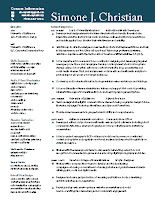
    Many of you have seen my 2-column resume layout. This design made it possible for me to stick to a single-page resume in the past. And it’s been the basis of several of the resume redesigns that I’ve undertaken on behalf of other job seekers this year.

    This year, I’m going back to basics. One-Column! This means I run the risk of spanning two (or more) pages. With this in mind I fearlessly embark on a new look for 2016! A quick note on my design process:

    •  Rewrite: update text phrases, and accomplishments 
    • Brainstorm: choose font combinations, sketch potential layouts, research what other folks are doing (you bet!) 
    • Mock-up / Comps: these are practically done, and are sent to a few discerning editor/designers for notes before I finalize anything. 

    So far, two layouts—of the original seven have made it to the Comprehensive phase.


    Note: Peers and students always ask about my more corporate/less creative field layouts of my resumes, and the answer is simple (and a two-parter). I rarely pursue positions directly in agencies or art departments, but instead in nonprofit arenas. There’s a gravitas of design that’s expected to get in there. Second, starting with a more universal, sedate layout can be pushed toward a more creative style easier than the other way-round.

    Here are a couple other examples of 2-pagers that are relevant and well-designed
    (Click on the image to view full-size):


    Holding Steady: Graphic Design Salaries

    By On 09:55
    In past years I've found this information on Monster, CareerBuilder, US Government jobs survey and a few other sources. This time around I decided to check out a  website, service that caters specifically to creative designers in our industry, Coroflot. This site is another of the free portfolio sites that I've referenced and still promote to students. Needless to say Coroflot is making a comeback in a big way…their participant surveys are one strong indication.

     As always, this is an independent source which has solicited responses from a few thousand creative professionals that specifically use their service. They capture nationwide data unevenly, so the results may be different in specific geographic locations.

     Findings for Graphic Designers:

    The precipitous drop in creative professionals' salaries--from the global recession--seems to be stabilizing. There's no great decrease or increase over last year. According to Coroflot, median salary is in upper-mid 40s. Get the details...


    We'll remember just two short years ago, 2014, the national average salary for designers rose a full 8%—from 2012. This was reported in HOW Magazine and sticks roughly to the Indeed Salary Data I shared last year.


    What's Different?

     In checking with the Indeed Salary Data for this year--keep in mind that this company does not survey anyone--instead it compiles and analyzes salaries from all vacancy postings listed on it's job search engine. According to this job search site, median creative professional salaries are indeed up a bit over last year, to the tune of approximately $2,000


    Be sure to note their further analysis, average salaries are lower most.

    Jan 13, 2016

    Collaborative Learning Space Design

    By On 16:30
    I recently posted about the Pre-Christmas Open House that showcased the new Technology Incubator Lab. This was a project on which I embarked with my team in Ed Tech. The aim was to create a space where testing, learning, trying, meeting, teaching, thinking, and collaboration can take place on the campus of a small, Jesuit,  liberal arts school on the eastern seaboard.

    To design the space, we had to consider the audience, the pre-set layout, and our purposes, in equal measure.

    Color Theory and Learning

    We chose deep aqua blue for the  prominent colors. Blue is the color of the sky and sea. It is often associated with depth and stability. It symbolizes trust, loyalty, wisdom, confidence, intelligence, faith, truth, and heaven. Blue is considered beneficial to the mind and body. It slows human metabolism and produces a calming effect. Blue is strongly associated with tranquility and calmness. In heraldry, blue is used to symbolize piety and sincerity.
    • Deep blues represent knowledge, power, integrity, and seriousness.

    For this location, I chose to include the recording/editing studio in which the Instructional Media Developer (and faculty, and students) can work in a pro-style setting to create the best quality audio and video for their projects. This was simple, as the tiny studio room already existed--after sound proofing, the reverb dampening was simple, and the layout followed the function.


    For this location, I chose to setup two small group spaces that could combine  to accommodate up to seven. It can easily break apart so that each individual can work, uninterrupted with headphones, or just quietly undisturbed. My director selected these swivel-desktop, comfy chairs on casters for the optimal maneuverability (excellent choices).


    For this space, we wanted also a place where conference calls, meetings, and focus groups could be held. My director and team made this happen by creating an easily accessible conference table space. This is a work station that breaks down into four individual tables.


    Collaborative Space Design for Teaching & Learning

    What does the "classroom of the future" look like? Instead of the traditional lecture-oriented room, this new classroom emphasizes group learning and collaboration. The instructor serves as a facilitator, handing out projects, answering questions, providing resources, and moving around the room as necessary. Students work in groups to learn, and activities are structured to emphasize collaborative, active, student-based learning. - Learn more... 

    Popular