Well, Me Actually...
I believe in starting each new year with a refreshed professional perspective:
- For those of us working, this is easily accomplished by refreshing updating the resume.
- For others, in the midst of a job search, it looks more like updating the resume, cover letter, website, and online presence.
I’m currently heavily engrossed in option one.
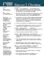
 Many of you have seen my 2-column resume layout. This design made it possible for me to stick to a single-page resume in the past. And it’s been the basis of several of the resume redesigns that I’ve undertaken on behalf of other job seekers this year.
This year, I’m going back to basics. One-Column! This means I run the risk of spanning two (or more) pages. With this in mind I fearlessly embark on a new look for 2016! A quick note on my design process:
- Rewrite: update text phrases, and accomplishments
- Brainstorm: choose font combinations, sketch potential layouts, research what other folks are doing (you bet!)
- Mock-up / Comps: these are practically done, and are sent to a few discerning editor/designers for notes before I finalize anything.
So far, two layouts—of the original seven have made it to the Comprehensive phase.
Note: Peers and students always ask about my more corporate/less creative field layouts of my resumes, and the answer is simple (and a two-parter). I rarely pursue positions directly in agencies or art departments, but instead in nonprofit arenas. There’s a gravitas of design that’s expected to get in there. Second, starting with a more universal, sedate layout can be pushed toward a more creative style easier than the other way-round.
Here are a couple other examples of 2-pagers that are relevant and well-designed
(Click on the image to view full-size):


