Enter your keyword

Communications Design Industry Discussion, Inspiration, & Tutorials

Showing posts with label portfolio. Show all posts

Sep 12, 2017

Instructional Designer Portfolio

By On 09:36


In assisting a colleague in preparing her portfolio I have searched the web high and low for excellent examples to assist in pages, headings, and possibly even layout. Finding diverse, responsive examples is not that easy. I believe this is because many ID professionals have an extensive education in Bloom's’ taxonomy, rubrics, effective course development, summative and formative assessments, etc. However, their graphic design education may be limited. This is odd to me—coming from a graphic design and communications background to instructional design. The foundations of graphic design and ID are closely related and in some cases duplicative. It’s all in the execution.

Rather than outline the differences and similarities here, I’ll skip the commentary and share a few well-executed Instructional Designer portfolios that give a comprehensive view of the professional and their skills, while also presenting an elegant layout and design aesthetic.

  • Simone Jenifer: this portfolio is a subset of a graphic design portfolio and presents all media and samples on a single, responsive page.
  • Kristin Anthony: Another blog-style site with fully responsive designed pages, and lightbox project pages. Beautifully executed
  • Rachel Barnum: Blog-style Instructional Design Portfolio page
  • Shalini Mathias: Prezi, interactive, motion graphics-based portfolio. THis is an interesting use of this medium. Featured projects are interesting and well-designed.
  • Ginger Nichols: Responsive pinboard style portfolio, which features a separate page of individual projects
Once you've been inspired by these take a quick view at best practices for developing your online Instructional Design Portfolio, from eLearning Industry blog.

Mar 17, 2017

5 Tips to a Great Design Portfolio

By On 09:07
Without any piffle, here we go:


  1. Ditch the Box: technology advances mean that we can leave the large portfolio case at home. Especially since a printed book that outlines your best works just as well. Some designers have ditched print altogether and showcase digital media samples; bringing a tablet/laptop on which to show their work. This can still allow for interactivity, if you design the digital portfolio with this built in
  2. Simplicity. Simplify. Simple: use an uncluttered simple layout.
  3. Brand Consistency is key. Keep the look of all consistent: the book, the leave behind, the resume, cover letter and business card.
  4. Get Feedback: once you’ve settled on your designs find out from peers, industry professions and art directors what they think.
  5. Leave a Leave Behind: after a stellar interview and portfolio review, you must put something in the interviewer's hand that will remind them of your fabulous self once you've gone. You want them to reach for their phone (or whatever) and have their hand linger over your leave behind...instead of making tha call they pick up your designed piece and handle it. At they review they can't help but ponder how awesome it would be to have someone with your skill, talent and creativity working on heir team... they could finally get "X" done right, etc.


Get some design inspiration from Pinterest

Jun 22, 2015

Adobe Illustrator: Identity Packages

By On 12:05
We've worked long and hard to get these pieces put together. They showcase a range of shape, color palettes, typography, balance, contrast, alignment, repeated elements, and proximity. We'll discuss these in depth when class next meets:


Oct 2, 2013

Top 5 Online Portfolio Mistakes...

By On 10:39

... And How to Avoid Them


You’ve picked the pieces to showcase in-person and in your online portfolio. Links to your portfolio now live on all of your identity pieces and you’re all set to get your new awesome job. So, how come employers aren’t champin’ at the bit to contact you after seeing your mad design skills?

It could be that you’ve made one or more of the following mistakes on your portfolio site.

1. POOR TYPOGRAPHY IS A TURN OFF
Typography is one of the main pillars of graphic design. As someone in the market for a design job you’re expected to have a good grasp of typography best practices. Without these, even the least qualified art director will overlook you and your site.


THE FIX: Once you’ve created your site and included all columns of type, step away from it for a few hours. When you come back, review a wordy column of type and see if it needs any tweaks in the leading or tracking; do the headlines command attention or do they blend with your paragraphs? Finally be sure to keep line-length to below 80 characters—to enhance readability.


2. TOO MUCH IS TOO MUCH
You’ve got a flash animation, and lots of jquery motion graphics, maybe a revo slider with individual text links, and accordion panes. Stop! That’s way too much going on. 

THE FIX:  remember that this portfolio site is meant to showcase your design talent. Less is more. Dozens of moving pieces detract from your message.


3. HIGHLIGHTING ONLY STUDENT WORK
If you only have student work, then by all means show it proudly. However, it’s important to come off as a designer who has worked with clients and has experience working with clients. 

THE FIX:  find yourself a few freelance clients and get those projects onto your site, pronto. If that’s not an option, consider referring to your student work as “conceptual” projects. This simply means that these pieces weren’t produced for a specific client. Although this is the same as saying student work, the connotations are more positive.

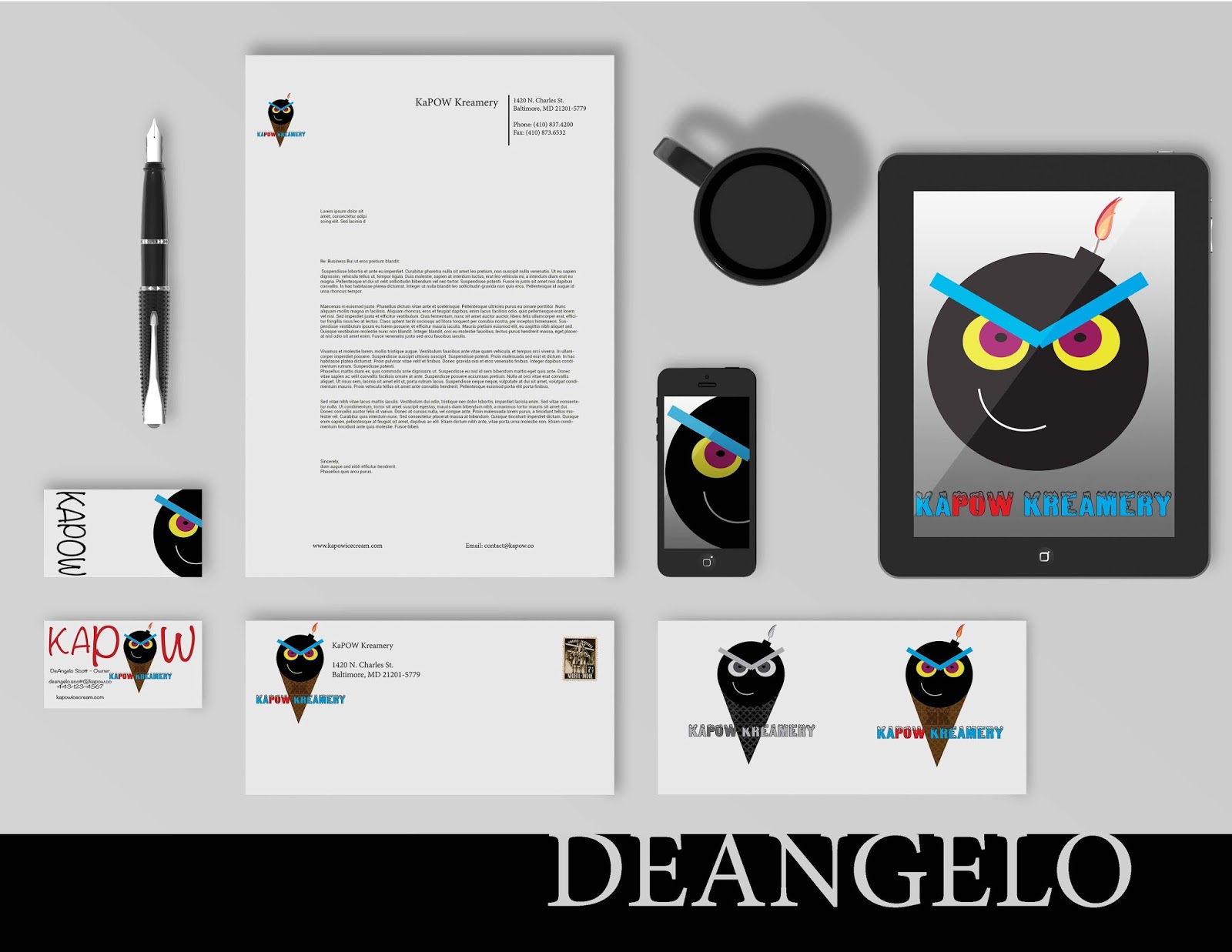
Use as 3-D Mockup to show a 'conceptual' design in a real-world setting...with no need to stress about properly photographing the finished product.


4. 2-D IS NOT AN OPTION
While we’re on the topic of student work, let’s talk about flat designs that float in space. Offering a flat representation of your work, is not showing it in the best possible light. Don't rely on the imagination of your audience to connect the dots. Instead, show those conceptual projects as complete finished products.

Use 3D PSD mockups to show your work in a real-world setting. Below is an example of an identity project that many students have completed for Prof. Boam in Grad school;


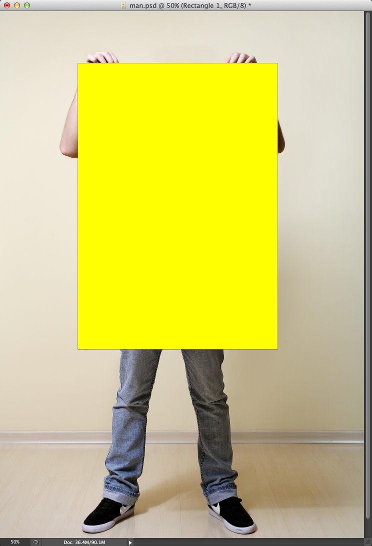
THE FIX:  Okay a drop shadow is a quick way to add depth, but an even better way is to create photo-realistic mock ups. Check out these mock ups for inspiration.


5. TYPOS WILL GET YOU OVERLOOKED
 I’m definitely guilty of this one. The most embarrassing incident I’ve seen when it comes to typos happened when reviewing portfolio for a graphic design position last year. The applicant cited her “attention to derail” right on the home page. I didn’t even click on on the portfolio link after reading that.

THE FIX:  Once your site is done, get someone else to look it over. If you’re working with DreamWeaver or with an online CMS (wordpress, blogger), use the Spell Check tool.


.


.


.

Aug 23, 2013

This Week: Lecture Series Update

By On 11:49
I just spent the majority of the day shrieking inaudibly at technology. At my disposal is a Macbook, and 2 (allegedly) high-end Windows desktops in my office that I'm to use for multi-media projects. They are all inadequate. Today saw me  spend several hours watching a 2 minute commercial render on various crappy computers in our lab.

Unfortunately, there's been little time left for me to give a s$%^t about updating my blog; with me constantly monitoring my blood pressure and all--yes the technology failure had me stressed out. Now that my vitals have returned to normal, I'll happily share this update with you.

We've nailed down the speakers, images, dates and times, and communications plan--pretty much--for promoting the series. So I'm able to share more fleshed out pieces with you:


I'm actually quite happy with the way that this has all turned out and I'm looking forward to my part in the first session. Not to mention; recoding and sharing the events on our new website, promoting via social media, and tracking the analytics and attendance stats.


Aug 1, 2013

This Week: Fall Lecture Series

By On 09:55
My job is at times trying, challenging, rewarding, and sometimes just plain fun. In the upcoming semester, I'll be presenting as part of this lunchtime lecture series, and I get to design the print and electronic promo materials. This is a monthly series and we plan to promote primarily via web contact, but there will also be a few print/ digital posters around campus.

The series title and typography speaks to the informal setting and the feeling that we want to convey. The Autumn color palette lends bit more sophistication, while also giving a nod to the season. My goal is to reuse this layout/format and only switch out the colors for each semester series (yes, that is Greek text):


I'll see how this project progresses, and I may slip it into my portfolio when it's all done. :)


Jul 11, 2013

Mock-ups Round Up

By On 16:50
Photoshop Magazine Mockup
When I originally put together my online portfolio and printed leave behind, I took several photographs of my samples so that my work would be well represented in both media. It was a mostly successful project. However, some of my conceptual pieces--ones that never went into production--had to be altered to fit stylistically. There were ways to get around this. I found an awesome Photoshop mockup that allowed me to share more of my work. I also created so ad hoc mock up scenarios that were also successful.

For conceptual posters, I photographed gallery walls and inserted appropriate sized design samples into frames or in a salon style hanging.

Poster Mockup II
Here are some other great mock up options to help get your portfolio a second glance:


Jul 8, 2013

Dos and Do-Not-Dos: Student Portfolios

By On 13:07
I got a question from my former intern last week and had to share. She’s ready to graduate and is now looking for her first ‘real job’ (thanks).

Her question: Do I Include Student work in My Portfolio?

Were this anyone else my answer may be different. In the past four years she has built a portfolio of exceptional student work, freelance projects and a few pieces from her internships.

My answer: In the 7-10 projects she includes, select those that best display her talent, creative range and technical skill. In short, go for it.

The caveat is that student work need not have a blazing neon sign over it singling out the projects as “student”. Instead they can be called conceptual design or not be labeled at all. Think about this if your portfolio is predominantly assignments and school projects. 

Jun 4, 2013

Portfolios That Inspire: Marco Goran Romano

By On 17:45
Eclectic and inspired; this designer and illustrator makes me glad to be a part of the community. Pieces from his Behance portfolio has been shared and re-shared all around the design community. Check him out:

Editorial: European Patent

Infographic for Casa
GQ Germany
Check out his awesome illustration on his website, www.goranfactory.com
His Behance portfolio also includes some other graphic pieces, www.behance.net/goranportfolio


Dec 15, 2012

Portfolios That Inspire: Moxie Press & Co.

By On 07:55
If typography is high art, then letterpress is the best of paint, brushes, and canvas. Moxie Press & Co., the brainchild of Maryland designer Chris Undi, does it so well. This one-man shop offers design services, illustration, and printing. Not only is Chris a fantastic designer/pressman, he's also a good friend. Check out more of his work and see Moxie Press on Facebook:


Popular