Enter your keyword

Communications Design Industry Discussion, Inspiration, & Tutorials

Showing posts with label This Week. Show all posts

Sep 28, 2017

Learning Reflections

By On 10:14
Professional Foundations: Collaborating, Researching, and Networking

The Best Laid Plans of Mice and Busy Women...

This week I planned to explore interactive OERs (curricula, simulations, video lectures, etc) to add to my knowledge and understanding of these resources. This is a lofty goal for someone simply working full-time...and a bit too ambitions for someone currently interviewing, completing a freelance design project, and working full-time.

Image source, graphic river
Rather than research and develop a comprehensive learning guide, I studied one genre of these tools and began the outline of said guide.

This limited bit of research has greatly added to my understanding of these tool s, and I feel like I'm already becoming a more knowledgeable resource for my teaching & learning communities!

Engaging in a Community of Practice (CoP)

I joined a few LinkedIn communities when I began working in Instructional Design. Back then I was much  more curious and spent more time learning from and asking questions of my experienced peers. Today, I'm a bit more strategic about my community engagement (this is a euphemism for being rather quiet of late). So, I'm back in the game and enjoying the interactions with my peers. We really are a smart group!
I rekindled my acquaintance with the LinkedIn CoP/Networking group, 'Transformational Teaching with Technology' Reading recent forum posts and checking in on my past contributions. I had forgotten how engaged I when first meeting this community. However, this forum of over 2600 members has taken a turn toward self promotion. No longer are the recent posts conversation starters. In fact, all posts for the last 3 years, showcase someones external website, article, newly created video or interactive quiz... and none appear to have been viewed by any of the cohort; there is no commentary, there are no 'likes', and certainly no' shares'.
Feeling undaunted, I recently engaged with the 'eLearning Guild, then had an accidentally fruitful conversation with a representative with Gartner Research Suite... about their available resources and tools for online teaching and learning. Okay, that's grasping at straws, but I was pleasantly surprised by the information that I gained.
I do need to actively engage with these groups, so my plan is to make a connections at the close of the week to learn what my peers are doing with Open Educational Resources, whether they're successful...and how I can  duplicate their successes.

Sep 12, 2017

Instructional Designer Portfolio

By On 09:36


In assisting a colleague in preparing her portfolio I have searched the web high and low for excellent examples to assist in pages, headings, and possibly even layout. Finding diverse, responsive examples is not that easy. I believe this is because many ID professionals have an extensive education in Bloom's’ taxonomy, rubrics, effective course development, summative and formative assessments, etc. However, their graphic design education may be limited. This is odd to me—coming from a graphic design and communications background to instructional design. The foundations of graphic design and ID are closely related and in some cases duplicative. It’s all in the execution.

Rather than outline the differences and similarities here, I’ll skip the commentary and share a few well-executed Instructional Designer portfolios that give a comprehensive view of the professional and their skills, while also presenting an elegant layout and design aesthetic.

  • Simone Jenifer: this portfolio is a subset of a graphic design portfolio and presents all media and samples on a single, responsive page.
  • Kristin Anthony: Another blog-style site with fully responsive designed pages, and lightbox project pages. Beautifully executed
  • Rachel Barnum: Blog-style Instructional Design Portfolio page
  • Shalini Mathias: Prezi, interactive, motion graphics-based portfolio. THis is an interesting use of this medium. Featured projects are interesting and well-designed.
  • Ginger Nichols: Responsive pinboard style portfolio, which features a separate page of individual projects
Once you've been inspired by these take a quick view at best practices for developing your online Instructional Design Portfolio, from eLearning Industry blog.

May 11, 2017

The Evolution of ENews

By On 10:01

I designed and sent out my first corporate e-newsletter back in 2010. The technology and the MagnetMail CMS were both fairly new to me. I was professionally familiar with the concept, but had never before had my designs virtually blasted into the inbox of over 10,000 professionals in one stroke of a keyboard! Years earlier, I was charged with layout of the quarterly (print) newsletter of the American Institute of Architects, a wholly different animal.

Today, I’ve just completed the layout of a new experiment in e-newsletters. My organization tasked me with turning a Google Site into the host and archive for our monthly news. I’m marrying website and newsletter here., now having the opportunity to hide expanded content in the eNews domain.  This is a far cry from the beginning of our marketing efforts…take a peek at the timeline:
From a multi-page PDF, to an online document, to today's site...
First, a print PDF that at times spanned 7 pages, Next 2-page Printable PDF, Now the Google Site


Enewsletters, while distinct in their layout and content are still built on the foundations of effective writing and basic HTML—things many design professions should be grounded in. What’s the difference between the e-newsletter, print newsletter, and a regular website?

Compare: Newsletter, E-News, & Websites

These three are all content marketing tools, simultaneously informational and promotional. However, they employ slightly different delivery methods.

NEWSLETTERS
The newsletter is largely a print publication, with multiple pages, multiple articles, and (usually) multiple advertisements, to financially sustain such a expensive routine undertaking. Printing costs money folks.

  • Benefits of a newsletter include, very importantly, the user experience. Newsletters are delivered to members, there’s a exclusivity in membership (… this is not something that just anybody receives)! Recipients of this newsletter can read and reread articles, dog-ear the pages, make notes in margins, use them to augment scholarly work, and save them for later…or even just place them strategically around an office or living room to look smart.
  • Cons of a newsletter: a major con is that while everything above it possible, you will rarely know if people do one or more of those activities. Paper and ink do not yield analytics.

WEBSITES
Websites are fantastic for sharing your company, organization, and ideas with your target audiences and anyone else interested in your topic—who stumbles across your site. It’s a fact that many of us who should be updating our website content on a regular basis, rarely do. Instead websites are repositories for much important, if static, information. We more often rely on social media for up-to-the-minute updates for our clients, audience, and followers.

  • Benefits of websites: your voice, your design, your rules! This is a huge benefit over having an online presence comprised only of social media. As for others, your website is a unique URL that can the address for seekers of knowledge, truth, or your expertise. The more it gets known, the more it is shared, and saved, and distributed by search engines. It can grow in popularity without any additional monetary output on the part of your audiences ...hopefully that makes sense.
  • Cons of a website: remember to update your website! Larger sites can become unwieldy and difficulty to keep up-to-date on a regular basis. Sad but true.

ENEWS
This medium relies upon two things we’ve already discussed, effective writing and websites. The enews letter is not a fully developed website with sub-pages, main and secondary navigation. Instead, it’s snippets of useful, interesting content that leads the reader AWAY from the newsletter TO your websites, or contact forms, or articles, or informational pages…things that invariably live on your website, related websites, or your social media platforms. They also rely upon pithy, interesting writing.

www.kb.mailchimp.com/campaigns/ab/about-ab-testing-campaigns
Effective writing is a science: Enews designers go through rigorous testing—of seemingly simplistic aspects of the content—to find a formula that works. In my career, I’ve worked with different communications teams to test various aspects of organizations’ newsletters for the winning combinations that yield a  greater rates of  opens, click-throughs, reads, subscribes (as opposed to unsubscribe), and shares… much of the important testing starts at the subject line. Poorly written subjects mean your email might never get opened. Effective e-News testing goes beyond that, of course, from the placement of images in relation to text, to different ways to present seemingly indistinct information.

  • Benefits of ENews: If you want to know how many of your audience is reading your newsletter, it’s all right there in your analytics. Enews publications also dive traffic to other places here you can track your audience, your website, and social media streams.
  • Cons of ENews: Brevity is the key here. Your enews article MUST be a textual sound bite—the appetizer that entices your reader to click to read more, learn more, or sign up! It’s possible to host a feature article in your enewsletter, but it’s a terrible risk that your readers will stop there and not interact with the rest of the analytics driven document. Needless to say, you want good writers working on the e-news, people who can turn a phrase….not the most verbose member of your team.


Learn more about testing Enews and mailing lists from Media Shift
Learn more about testing campaigns from MailChimp

Apr 24, 2017

Multimedia Open House at Earl S. Richardson Library

By On 10:20

In moving to promote the multimedia resources, I planned a brief, 2-hour, open house event to showcase the newest resources available to the community. This was accomplished with assistance from the team in the IT department.

First, as always, I started with the concept of technology and multimedia. The ideas were flying fast and loose until I reigned them in…simplicity is key to getting across any message. I settled on the icon cloud theme.

There is a level of exclusivity to being invited in card, with a hand scribbled note.

I’m probably a throwback, a relic, but I believe that people like to receive invitations to RSVP in a tangible format, rather than electronic. The next idea that followed was the invitation card. This was to be hand signed and delivered before the electronic messages began spamming the entire community.

The incidentals were then taken care of by our event sponsors: the freebies and other give-aways were furnished by Panopto and Smart Thinking. For my part, I created a series of informational fact sheets and branded signage—along with the updated website and e-blast messages, to pull this all together.

The most important part, however, was the hands on demonstrations and explanations that were given during this brief event. On the day we saw over 100 people in the 2 hours and I repeated my elevator pitch for the Record & Go Studio two-dozen times…whew.


All in all, it was a success.

Mar 21, 2017

This Week:Event Planning!!!

By On 12:57
In my new role as instructional yadda yadda, I have had the opportunity to oversee the final touches on the university's recording studio...and in doing that, to build relationships!

 To that end, my team and another on campus will be hosting a multimedia open house later this semester--on the cheap.

We're working together to plan the events, activities, and promotions. For me it's imperative to get all of my work on this project done and dusted before the end of the month, as I will be otherwise indisposed for most of early April.

Detail of my sketches.
It's crunch time right now! However, I want to take a few moments to share my design process for these promotions. It's a bit elementary for seasoned designers--or in-house designers even--to develop a full, comprehensive creative brief. And unnatural for a team of 1, but as I'm partnering with others on campus, I had to spell out the projects, rationales, and various media by using a creative brief. And to be honese, it has helped me to focus more quickly that usual, for this period of hard work. After sharing the brief and getting team ideas on tweaks, I've begun to craft the various promotional messages (copy) and layout the various media (signage, digital and otherwise, a couple website updates that require custom photography and writing, and a small run of elegant printed invitations).

Here's where I went with the invites.

Mind you: we'll be printing and finishing, and delivering these babies by hand, and on the cheap. So I opted for B/W with no bleeds. This almost reminds me of a typography project that I've given students in the past--to make them think hard about their design decisions. Pictured is one of about 8 design solutions that I explored.


Cheers, S

Mar 17, 2017

This Week: Learn. Create. Grow.

By On 11:39

It’s been 6 months, and time to revisit the communications plan in the Office of Academic Technology Services (ATS). The team has been fighting an uphill battle (one with forward progress, at least) to grow their client base, and educate constituents about our proficiencies, resources, and services.

My brain has been racked for the past couple weeks, in anticipation of today’s team meeting: I’d be unveiling a new tagline and marketing materials that grow on the ones developed about half a year ago. Well, the reception was good. And the ATS team is ready for the continued roll-out. Picture it:

Academic Technology Services: Learn. Create. Grow

It builds back from our university mission and tagline; Growing the Future. Leading the World.

Click on a thumbnail to view full-sized "LEARN." poster:


.

Mar 13, 2017

A Website is still Relevant

By On 07:04
Your Website Vs. Social Media Presence


Social media platforms are great for building community and knowledge of your goods, services, brand...but you don't own or control the platform. We'r all aware of the ever-changing landscape of social media: look at how 'groups', 'pages', 'individual' Facebook account (sharing and privacy) rules have changed in the past few years. Users get very little input on how these evolve.

A website allows you to market yourself on your own terms. On your own site you get to:
  • set rules and guidelines for how you share content
  • have and build direct relationships with your audience
  • organize your branding content how you want  it organized
Roberto Blake gives a lot of food for thought on the topic:

Nov 30, 2016

Hot Chocolate Happy Hour

By On 08:17

In my new post, I'm tasked with growing the marketing and brand awareness of my division within the educational community. in addition to designing  more robust professional development, and fostering greater partnerships with other divisions, I'm also trying to have a party or two!

Last month, my team hosted a candy-themed open house, and we're planning a lunch series, starting next season, that is heavy on the sandwiches. However, now that it's somewhat cold with shorter days and less reason to interact, I'm thinking Hot Chocolate Happy Hour.

The idea came to me earlier today, as I was simultaneously showing off the graphics capabilities of the Surface pro and craving a hot steaming of hot chocolate. Brilliant, right. The conflation of technology and treats has always been a winning combination for my teams in the past, giving participants the option of snacking, learning, and getting to know the faces and tools that are available to them.

For this specific day (s), I want to focus on the teams in my building. This is where Academic Technology Services will soon launch our Record & Go Studio, and who best to reach first than the people in closest proximity?!

Coming soon to a campus near you.

This Week: Stock Photography

By On 08:04
This week--at my new and already beloved job--I'm shooting a series of student, faculty, and technology-related images for use in any upcoming marketing media I might produce (in the future). It's one of the more nebulous undertakings, as I have no idea what my graphics needs will be a year from today...or even whether I'll be using the pics. Needless to say, I'm shooting faces, hands, ears, full bodies, devices, and locations indiscriminately.


MSU Academic Quad, during fall rain

Working in predominately white environs for my entire career, I already knew of the scarcity of people of color in stock--frankly it was never much of an issue...eventually a image with one or two black /brown folks eventually turned up in my searches (and I always opted to show those marginally diverse images in lieu of more homogeneous). Well, today at an HBCU (historically black college/university), where ratio is flipped to that of the nation (80% African american to 20% other races, ethnicities, and nationalities), it's important. My designs and communications have to reflect this diversity... so one or two tan faces is a crowd just won't cut it.


Female student, visiting MSU website on Surface tablet

Hence my exciting photo project. I'm using student employees, colleagues, and faculty to fill out my arsenal of useful images; plus www.unsplash.com for some beautifully-shot, yet not too specific images.


Dec 8, 2015

This Week: Plan , Promote, (Pour)

By On 10:29
This winter I got to plan the Office of Educational Technology Open House for the Technology Incubator Lab. Planning began in early fall and ended with this event. This was the start of our winter season and a great kickoff for the Ed Tech Team. Especially after having outrnew branding in place (and fabulous)!

And there was wine… thanks Bota Box.

For my part, I worked to:
  • design the digital and print invitations and hand-delivered several (very old school)
  • setup the lab furniture using the latest in collaborative learning space design models—allowing for individual work and group work—as in focus groups or meeting participants, 
  • setup Recording studio for optimal efficiency—if not lighting, I prefer a more subtly lit room than most of my peers), 
  • laid out refreshments and try-before-you-by technology tables (my favorite was the robot phone, but there were also Mac Book air, iPad pro, Surface Pro, Logitech headset microphones, and Apple Watch), and
  • helped demo all of the fun technology to the steady stream of visitors who visited the lab.

This meant that I was busy from before the start until the end of the day…almost too busy to snap pictures. Here are few of the images I got during the most successful technology open house in recent history:
Demo technology included this Surface Pro, iPad pro, Mac Book Air, and much more...


You may not see the "Robot Phone' but it can see you...


Nov 13, 2015

This Week: Finally Finished - Relax App

By On 13:07
Well, I've done it… the app is DONE. I'm happy and awaiting feedback from my 'client'. The testers a will also get a crack at this over the weekend and then I wash my hands.

 This is a guided visualization and relaxation apple for the campus community..mainly students a, but also staff--to a lesser degree. It offers resources for recognizing and dealing with stress, and also some soothing and relaxing audio exercises that really work to calm the mind and body
I should know, I narrated several of them.
Two things that I'm fairly proud of in this app, appropriate use of creative commons, and the aforementioned narration. I always try to stress to my students that they can find and use images on the web and use them freely--while giving due credit to the original creators.


Oct 26, 2015

This Week: Open House Invitations

By On 11:25
My department, the office of Educational Technology, is about to launch our new faculty innovation and production space, and we plan to do it with finesse! Yes, beautifully printed invitations that are hand delivered to some and mass emailed to others. At the event, we'll have try-before-you-buy new technology and continental breakfast, technology give-aways and boxed wine. It promises to be a fantastic networking event for our team and our core constituents.

Here're my roughs for this invitation:

(It occurs to me that yes, print is not dead, or dying. This is evidenced by the fact that whenever a client starts talking about exclusivity or a personal touch they always want printed collaterals-not web or multimedia.)


Mind you, the second side is mostly text and our new logo!

Aug 23, 2015

This Week: Website Redesign

By On 06:13
This week, I'm taking my own best advice; creative professionals need to have an accessible online presence and a place to showcase their best, recent work.

It's time again for me to update my website. In the last 3 years I've completed several campaigns, design projects, and PR writing gigs. It's been a busy thousand(+) days! My current website doesn't completely reflect these fresh new projects; they really should be collected in that location. Plus, there are 4 blogs that I maintain--this blog, a personal blog, and two educational blogs that I use for undergraduate courses. That's a lot of web assets! Hence the update.

While I still rely on a responsive design model for this site, my approach is more personal (updates should be completed byAugust 28).

Here are a few shots of what's to come:

The brand is creative, informal, and personal. A change from the last, a quirky take on academia.


In my current site I reference student work--posted on the educational blogs--but now I showcase them.

 If you haven't seen my last site update. Check out my last redesign--way back when.

Jun 8, 2015

Enews Options (for a small budget)...

By On 11:16

Not Just Nonprofits

I'm in the midst of researching an upcoming presentation and thought it best to share what I've learned.

In the half(+) decade since I began working with the various email marketing service providers and cloud hosted tools, little has changed in the realm of e-news. However, access to tools and resources is better. In 2009, we used MagnetMail, in 2011 we used Constant Contact, and today I swear by MailChimp.

I'm all for a free alternative, versus reinventing the wheel.

This week I'll meet with an on-campus client who is hell-bent on making an HTML e-newsletter that is distributed monthly. Their original design tool was MS Publishser. The finished HTML content was embedded into the body of an Outlook message. This, however presented a new problem with each email blast;  usually the content was transformed into a single image that went to the first URL on the page, without exception. 

This client has become convinced that they need to learnAdobe InDesign in order to create less worrisome e-newsletters and they want me to conduct these in-depth trainings in under 8 hours. Maybe there was an article on Wikipedia that explained how this is possible. 

In researching the conversion using InDesign (ID), I learned a few interesting facts:
  1. InDesign does not do this easily.
  2. The individual using ID should have some prior (and advanced) knowledge of HTML/CSS in order to make it work. 
  3. The thing about ID that makes it the ideal tool for graphic designers, total control over placement of content, makes it a terrible resource for the novice. Success relies on the skill and knowledge of the user. So, someone with no coding ability will not learn how to effectively create an enewsletter in ID...not in 8 hours anyway.
  4. Lastly, even after all of the boxes are ticked, and the syntax is correct, the user must then alter the CSS further to create a workable finished product.
This is my challenge. I love teaching ID and HTML. It takes my undergrad students half a semester to get a handle on either. Today and tomorrow I'm streamlining my course presentations and turning some of my hands on activities into 'homework'. 

Enter MailChimp

I've worked with this free tool off and on for 5+ years. Users don't need to worry about HTML/CSS or responsive design if they don't want to. WHEW!

However, the free option means limitations. Campaigns can only go to a mailing list of 2K, and the users of this service can only send 12,000 emails per year. That's a tough sell for my clients who are convinced that they will go over  the freebie amounts. In addition to the crash course I'm planning there will also be  20 minutes dedicated to an in-depth MailChimp hard sell!


Dec 12, 2014

This week: Branding Instructional Innovation

By On 06:32
It’s been busy around here! We had our final TechTalk PD session of the semester and I’m working on our 2-year strategic communications plan. That sentence is my inelegant segue…


Part of our strategic communications is a push to rebrand. I've been working on concise and informative mission and vision statements that define and support the branding. These statements are headed to the team for feedback and tweaking—if any.

Accompanying the text is a series of logo designs that I propose will represent our team of instructional technology experts. Click on the image to take a closer look:


Dec 1, 2014

This Week: Syllabus Solutions

By On 08:37
Course Design is graphic design, and graphic design is not strictly art. There are rules and guidelines that allow the novice or seasoned designer to create an effective page; course web page or commercial web page.

These principles of design include balance, proportion, rhythm, emphasis, and unity.

It means that the layout of the finished page has a harmonious mix of words and images that provides an easily deciphered page. If you want a primer on the principles of design take intro to graphic design or show up to day one of any class that I teach.

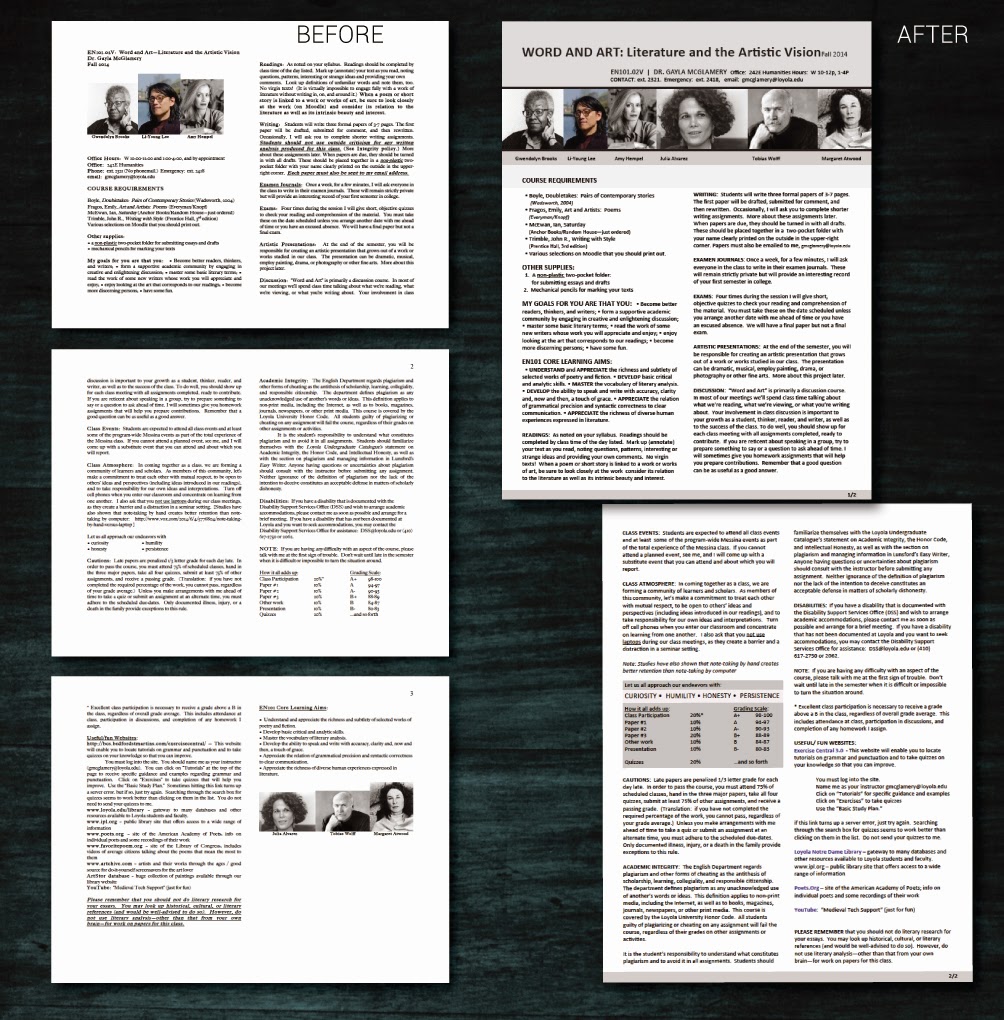
One of our English faculty emailed me with this problem ‘help, my students are having trouble understanding my syllabus.’ After reviewing the syllabus and course I saw the problem. Since this client wants a hand in the revamp of the course materials, I opted to roughly layout a few options (web and print)now and then meet with her after finals to refine.

Below are before an after. Think about how balance, proportion, rhythm, emphasis, and unity work together to make one option more effective than the other:

Notice in the update that the 2-column layout is maintained. However, weighty elements are at the top of the
opening page, and all images are now uniform. Although hard to distinguish, subheads have a regular format
and are rendered in all-caps, bold. Lastly, the grading criteria is placed in a callout box to draw the reader...
 

Nov 25, 2014

This Week: Editing Video(s)

By On 08:12
In the past half-year or so I’ve lamented the fact that I have little time to do in-depth video production. That drought is over.

With growth on the horizon for my department and an organizational push toward getting the most from the technology tools that we now employ, I’ve been called upon to interview some folks. I got the assignment and the deadline last week—these need to be done really soon. Luckily I grabbed my favorite campus personality about a year ago and recorded a 30-minute interview and B roll of him strolling across campus and teaching his online course.


This week is dedicated to editing down 2+ hours of interviews, and an hour of atmosphere/B-roll into three, under-five-minute snapshots of how our faculty use technology in the and out of the class. The upshot of this double-quick assignment is that I get to hear the individual stories of how these folk approach the tools. What I’ve learned—and this is important for us in IT departments to hear—is that they are open to using these tools and pushing the limits of the technology to best fit their needs. They’re experimental and they’re open.

My goal is to have my final cuts done by Friday.

Then sometime on Monday, next week, my committee reviews them for content and offers any edits or input. And I spend that afternoon editing--if necessary. Then the final cuts will be hosted on our website by next Tuesday…

*Whew*


Nov 1, 2014

The Next Best App...

By On 04:39
After the  launch of the campus mobile apps, I was approached by a potential client asking for a new mobile app that shares mindfulness and relaxation exercises. WHAT!!

It's definitely a project that I want to build. My goal in this design is to get it done quickly. I hate to say it, but I  really want to see the finished product  and have it downloaded on my device and in my hot little hands.

There are a few snags or challenges that I must overcome with this project, however:

  • the existing color palette is not wholly harmonious,
  • the client's limited time and expertise in creating media for this project 
  • the general lack of supplemental media (photos, logos, audio, video)
  • did I mention the color palette?
So far in the timeline, I  have made the general outline and creative brief--it's been approved but the client, and there are about 2 dozen preliminary sketches in my notebook (on my desk, in my laptop bag, holding my page in a graphic novel I'm currently reading…everywhere).


Scans and screen captures are coming shortly--because I'll need help and lots of critical eyes on this one.

Oct 20, 2014

This Week: TechTalk Returns

By On 04:38
Although I  had a GOOD time working on the mobile app this summer, I was sad to see the end of TechTalk last April.  Well, my spirits are now lifted. Last week, I created the new fall version of the series logo (it looks familiar) and then wrote the website spiel, and got to work on the collaterals. This season it's all about ideas (and a pumpkin pie palette):


Plus, we've moved from a lunch session to webinar format--that's completely online. Wednesday is the first session. We'll see how that works out.

Aug 25, 2014

This Week: DPS App, Finished (mostly)

By On 12:01
Hey guys,

We've recently completed the design/layout of our new Tech Field Guide. The ID files are huge, but when it's packaged as an appo nthe iTunes store it will be much smaller. Last week I spent hours manually resizing images--because batch processing ended up causing a serious pixillation problem. Without much ado, here's a sneak peek of some the layouts that make me proud.


One little thing, DPS doesn't make apps, it makes magazines--digital mags that have tons of interactive functionality, but magazines nonetheless

Popular