Enter your keyword

Communications Design Industry Discussion, Inspiration, & Tutorials

Showing posts with label Identity. Show all posts

Jan 13, 2016

Collaborative Learning Space Design

By On 16:30
I recently posted about the Pre-Christmas Open House that showcased the new Technology Incubator Lab. This was a project on which I embarked with my team in Ed Tech. The aim was to create a space where testing, learning, trying, meeting, teaching, thinking, and collaboration can take place on the campus of a small, Jesuit,  liberal arts school on the eastern seaboard.

To design the space, we had to consider the audience, the pre-set layout, and our purposes, in equal measure.

Color Theory and Learning

We chose deep aqua blue for the  prominent colors. Blue is the color of the sky and sea. It is often associated with depth and stability. It symbolizes trust, loyalty, wisdom, confidence, intelligence, faith, truth, and heaven. Blue is considered beneficial to the mind and body. It slows human metabolism and produces a calming effect. Blue is strongly associated with tranquility and calmness. In heraldry, blue is used to symbolize piety and sincerity.
  • Deep blues represent knowledge, power, integrity, and seriousness.

For this location, I chose to include the recording/editing studio in which the Instructional Media Developer (and faculty, and students) can work in a pro-style setting to create the best quality audio and video for their projects. This was simple, as the tiny studio room already existed--after sound proofing, the reverb dampening was simple, and the layout followed the function.


For this location, I chose to setup two small group spaces that could combine  to accommodate up to seven. It can easily break apart so that each individual can work, uninterrupted with headphones, or just quietly undisturbed. My director selected these swivel-desktop, comfy chairs on casters for the optimal maneuverability (excellent choices).


For this space, we wanted also a place where conference calls, meetings, and focus groups could be held. My director and team made this happen by creating an easily accessible conference table space. This is a work station that breaks down into four individual tables.


Collaborative Space Design for Teaching & Learning

What does the "classroom of the future" look like? Instead of the traditional lecture-oriented room, this new classroom emphasizes group learning and collaboration. The instructor serves as a facilitator, handing out projects, answering questions, providing resources, and moving around the room as necessary. Students work in groups to learn, and activities are structured to emphasize collaborative, active, student-based learning. - Learn more... 

Jun 22, 2015

Adobe Illustrator: Identity Packages

By On 12:05
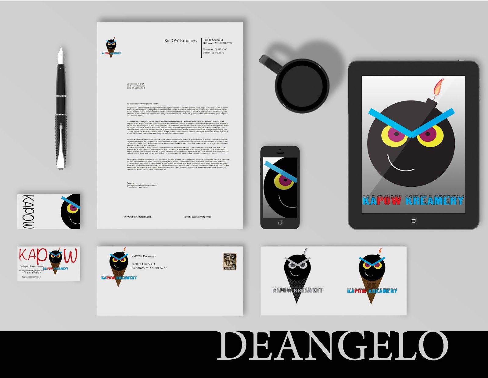
We've worked long and hard to get these pieces put together. They showcase a range of shape, color palettes, typography, balance, contrast, alignment, repeated elements, and proximity. We'll discuss these in depth when class next meets:


May 13, 2014

This Week: Logo Design

By On 10:44
I just completed 2 back-to-back logo designs from folks that I love working with.

The first is a university initiative focused on reducing paper consumption. The second is a clothing designer/website. The time I spent on both projects combined is about 8 hours; from industry research, to preliminary sketches, to comp submission to finals (roughly). I effin’ LOVE when clients/projects are easy and fun!!

I know that several freelance designers have run through the spectrum of difficult clients. I've been lucky in in my near-decade to not have had too many of these folk (barring one freelance photography client and a website for a notoriously difficult and dishonest pothead in Fells Point). Great clients make this job the best job ever.

Take a look at what the abridged process for one of these clients:


Dec 7, 2013

The Two-Column Resume Option

By On 06:36

Earlier this week, a recent graduate asked me to review her resume. It was well-laid-out and used typography quite effectively. I loved her clean, cool color palette. So, I didn't really have much to do by way of crit.

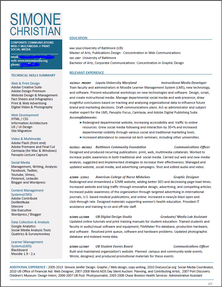
Here's a draft of my
2-column resume. Click
image to see full sized.
The only real issue for me was the length of her resume. The 4-5 years of professional experience that she listed was spread across 10 positions and took up the majority of 2 pages. She showcased internships and volunteer posts in the same category as her professional experience. Were I reviewing her application for a job, I would expect to see a more seasoned designer; just going on the amount of text.

I suggested that she omit some non-relevant content and that she make her body copy fit in a single-page format. Here are a few examples of some two column resumes that allow designers to present themselves succinctly.

On a more personal level, I made the decision to have a one pager for my resume but kept my CV a multi-page document. Besides personal preference, there are other reasons to consider a single-page, 2-column resume format: 1. you only design the first page, 2. reviewers only need to keep track of one page, 3. you get to showcase your ability to prioritize and layout several chunks of content in the single page, 4. you skip the necessity to create a complimentary layout for subsequent pages (this is something I had to do for my CV... as I generally create 3 viable design solutions, this was a time-consuming process for me).


Design by bobgun


Layout by jessiLenz


Mar 1, 2013

50 Year of Pantone: Color and Branding (infographic)

By On 08:22
Through color we express and experience emotion. Effective branding uses color to effectively reach the consumer, market and audience.


Dec 10, 2012

The Portfolio: Not Just for Creatives Anymore

By On 06:00

My buddy, Barbara*, works in marketing and does a lot of media writing. This year she gave a riveting AIGA talk about interviewing with a portfolio when not in the creative arts field. Today, a great article on Idealist.org loudly seconded her sentiment. It's good enough to share.

According to Barb and Idealist every professional should arrive at an interview with a portfolio in-hand; "we do more than just our job description" and a portfolio book is an excellent way to show it. A professional portfolio--or leave behind--gives the potential employer a great idea of our skills, abilities and range. It's also pretty impressive!

How Does it Look? This simplest presentation of your leave-behind is a spiral-bound book separated by tabs. These can be printed and bound, in quantity, at retail copy shops or by yourself if you have a spiral binder at hand). Be sure to select  a heavy weight paper and substantial cover stock. Spiral-bound books are not the only option. This publication can also be a highly polished design piece that profiles your creative skill as well. If you choose to go in this direction consider hiring a graphic design student, freelancer, or recent grad to help layout / design a polished look.


Here are a few examples of print portfolio books:

What Does it Contain? Your portfolio is a great supplement to the interview conversation. As you speak about your projects, accomplishments, or accolades, refer to the samples that you have in-hand. Here are Barbara's suggestions for basic content for this book:
  • Your resume or Curriculum Vitae
  • Listed technical skills, software, and hardware
  • Printed samples of your work or projects on which you've worked--with descriptions of the project, your role on the project, and other pertinent information
  • Writing Samples - if you have relevant, well-written pieces; include 2-3 samples of technical writing, public relations, media or editorial writing
  • Kudos and accolades on your work or performance from colleagues or employers

Why Not Go Digital? If making a print portfolio is outside of your means and expertise, create an online portfolio. There are several free sites that offer open formats for you to showcase a variety of projects. An online portfolio gives potential employers a look at your scope of skill, and also makes you look very web-savvy; this is more important across all industries. In addition to portfolio sites like: Behance, CarbonMade, Jobrary.com there are several blog format sites that allow for maximum flexibility; like Blogger, Wordpress, or Tumblr.


*her name isn't really Barbara.

Jul 16, 2012

Branding You

By On 10:00

How to design the right identity to market yourself

In recent discussion with a group of students I learned that a major stumbling block in completing a portfolio is creating a personal identity package in which the finished portfolio will reside. 
When in my 3rd year of undergrad, I was approached by a friend, in her final year of grad school and taking a portfolio class. One slow afternoon in the college design studio she asked me to help her brainstorm her personal identity package.

1. The design process starts on paper
The obvious isn't always the best solution
My first idea was to make a list of things, objects, images that her last name, Dana Marsh, evokes. At the end of this first exercise we scratched out 25 terms pertaining swamps, marshes, and water fowl.

This was a good start, but this list did not say anything about Dana’s personality or design style. We then made a better list: one with her design influences, her personality traits, personal style, and her favorite activities. We ended up with several words and phrases that would help narrow in on the target. We cleaned up the lists and crossed out all mention of beer, bourbon, and rum.

At the final tally, we knew that Dana’s design style was irreverent, and quirky. She was drawn to bright, bold typographic solutions. While not breakthrough revelations, the list in front of us would help create her final identity.

2. What’s your type?
Dana knew that she wanted a bold hand-drawn typeface with little embellishment but lots of personality. She poured through the Fontbook database and scoured dafont.com. When these resources were tapped out Dana grabbed a sharpie from my desk and scrawled out her full name several times on sheets of copy paper. After the 7th attempt, she had found her typeface. The next step was to create horizontal rules and hatch marks in the same style--in case she needed them for the design later. She then scanned and cleaned up her work digitally, ending up with several PSD files with transparency.

3. A color palette is worth a thousand words.To choose her colors Dana went back to her list. Bold and irreverent type isn’t harmed by a high-contrast palette. Since the logotype was black she chose to use pink to speak for her. To envision this vibrant hue, think bright neon high lighter marker. In the end the colors and type became a direct reflection of the woman I knew.

4. Putting it together
With the hard work done, Dana’s final task was to put it all together; create her collaterals and portfolio site. She already had the skill to create an effective presentation. So, she sketched out two different versions of her resume, cards, CD package in InDesign. Then she found a hosting site with the right look and enough user controls so that she could work with and got started. In the end Dana created a fabulous identity package that landed her a job within weeks of graduation.

Popular