Enter your keyword

Communications Design Industry Discussion, Inspiration, & Tutorials

Showing posts with label Layout. Show all posts

May 11, 2017

The Evolution of ENews

By On 10:01

I designed and sent out my first corporate e-newsletter back in 2010. The technology and the MagnetMail CMS were both fairly new to me. I was professionally familiar with the concept, but had never before had my designs virtually blasted into the inbox of over 10,000 professionals in one stroke of a keyboard! Years earlier, I was charged with layout of the quarterly (print) newsletter of the American Institute of Architects, a wholly different animal.

Today, I’ve just completed the layout of a new experiment in e-newsletters. My organization tasked me with turning a Google Site into the host and archive for our monthly news. I’m marrying website and newsletter here., now having the opportunity to hide expanded content in the eNews domain.  This is a far cry from the beginning of our marketing efforts…take a peek at the timeline:
From a multi-page PDF, to an online document, to today's site...
First, a print PDF that at times spanned 7 pages, Next 2-page Printable PDF, Now the Google Site


Enewsletters, while distinct in their layout and content are still built on the foundations of effective writing and basic HTML—things many design professions should be grounded in. What’s the difference between the e-newsletter, print newsletter, and a regular website?

Compare: Newsletter, E-News, & Websites

These three are all content marketing tools, simultaneously informational and promotional. However, they employ slightly different delivery methods.

NEWSLETTERS
The newsletter is largely a print publication, with multiple pages, multiple articles, and (usually) multiple advertisements, to financially sustain such a expensive routine undertaking. Printing costs money folks.

  • Benefits of a newsletter include, very importantly, the user experience. Newsletters are delivered to members, there’s a exclusivity in membership (… this is not something that just anybody receives)! Recipients of this newsletter can read and reread articles, dog-ear the pages, make notes in margins, use them to augment scholarly work, and save them for later…or even just place them strategically around an office or living room to look smart.
  • Cons of a newsletter: a major con is that while everything above it possible, you will rarely know if people do one or more of those activities. Paper and ink do not yield analytics.

WEBSITES
Websites are fantastic for sharing your company, organization, and ideas with your target audiences and anyone else interested in your topic—who stumbles across your site. It’s a fact that many of us who should be updating our website content on a regular basis, rarely do. Instead websites are repositories for much important, if static, information. We more often rely on social media for up-to-the-minute updates for our clients, audience, and followers.

  • Benefits of websites: your voice, your design, your rules! This is a huge benefit over having an online presence comprised only of social media. As for others, your website is a unique URL that can the address for seekers of knowledge, truth, or your expertise. The more it gets known, the more it is shared, and saved, and distributed by search engines. It can grow in popularity without any additional monetary output on the part of your audiences ...hopefully that makes sense.
  • Cons of a website: remember to update your website! Larger sites can become unwieldy and difficulty to keep up-to-date on a regular basis. Sad but true.

ENEWS
This medium relies upon two things we’ve already discussed, effective writing and websites. The enews letter is not a fully developed website with sub-pages, main and secondary navigation. Instead, it’s snippets of useful, interesting content that leads the reader AWAY from the newsletter TO your websites, or contact forms, or articles, or informational pages…things that invariably live on your website, related websites, or your social media platforms. They also rely upon pithy, interesting writing.

www.kb.mailchimp.com/campaigns/ab/about-ab-testing-campaigns
Effective writing is a science: Enews designers go through rigorous testing—of seemingly simplistic aspects of the content—to find a formula that works. In my career, I’ve worked with different communications teams to test various aspects of organizations’ newsletters for the winning combinations that yield a  greater rates of  opens, click-throughs, reads, subscribes (as opposed to unsubscribe), and shares… much of the important testing starts at the subject line. Poorly written subjects mean your email might never get opened. Effective e-News testing goes beyond that, of course, from the placement of images in relation to text, to different ways to present seemingly indistinct information.

  • Benefits of ENews: If you want to know how many of your audience is reading your newsletter, it’s all right there in your analytics. Enews publications also dive traffic to other places here you can track your audience, your website, and social media streams.
  • Cons of ENews: Brevity is the key here. Your enews article MUST be a textual sound bite—the appetizer that entices your reader to click to read more, learn more, or sign up! It’s possible to host a feature article in your enewsletter, but it’s a terrible risk that your readers will stop there and not interact with the rest of the analytics driven document. Needless to say, you want good writers working on the e-news, people who can turn a phrase….not the most verbose member of your team.


Learn more about testing Enews and mailing lists from Media Shift
Learn more about testing campaigns from MailChimp

Feb 1, 2016

New Year, New You

By On 11:43


Well, Me Actually...


I believe in starting each new year with a refreshed professional perspective:

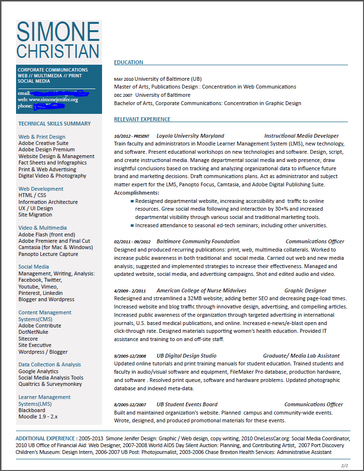
  1. For those of us working, this is easily accomplished by refreshing updating the resume.
  2. For others, in the midst of a job search, it looks more like updating the resume, cover letter, website, and online presence. 

I’m currently heavily engrossed in option one.

Many of you have seen my 2-column resume layout. This design made it possible for me to stick to a single-page resume in the past. And it’s been the basis of several of the resume redesigns that I’ve undertaken on behalf of other job seekers this year.

This year, I’m going back to basics. One-Column! This means I run the risk of spanning two (or more) pages. With this in mind I fearlessly embark on a new look for 2016! A quick note on my design process:

  •  Rewrite: update text phrases, and accomplishments 
  • Brainstorm: choose font combinations, sketch potential layouts, research what other folks are doing (you bet!) 
  • Mock-up / Comps: these are practically done, and are sent to a few discerning editor/designers for notes before I finalize anything. 

So far, two layouts—of the original seven have made it to the Comprehensive phase.


Note: Peers and students always ask about my more corporate/less creative field layouts of my resumes, and the answer is simple (and a two-parter). I rarely pursue positions directly in agencies or art departments, but instead in nonprofit arenas. There’s a gravitas of design that’s expected to get in there. Second, starting with a more universal, sedate layout can be pushed toward a more creative style easier than the other way-round.

Here are a couple other examples of 2-pagers that are relevant and well-designed
(Click on the image to view full-size):


Aug 4, 2014

Blog Headers

By On 09:39


Jul 4, 2014

This Week: Mobile App Update

By On 11:27
Okay, I'm working in Adobe Digital Publishing Suite (DPS) to create the next great university technology mobile app. All is going quite well. This week I put the finishing touches on two more articles and am almost ready to create the campus technology maps--this will be a bear!!!

For now, take a quick look at one page of the faculty technology article that has a fun little folio overlay made of 3 object states. Enjoy:

Text: Looking for professional development featuring the latest technology tools? You Got IT"

Dec 7, 2013

The Two-Column Resume Option

By On 06:36

Earlier this week, a recent graduate asked me to review her resume. It was well-laid-out and used typography quite effectively. I loved her clean, cool color palette. So, I didn't really have much to do by way of crit.

Here's a draft of my
2-column resume. Click
image to see full sized.
The only real issue for me was the length of her resume. The 4-5 years of professional experience that she listed was spread across 10 positions and took up the majority of 2 pages. She showcased internships and volunteer posts in the same category as her professional experience. Were I reviewing her application for a job, I would expect to see a more seasoned designer; just going on the amount of text.

I suggested that she omit some non-relevant content and that she make her body copy fit in a single-page format. Here are a few examples of some two column resumes that allow designers to present themselves succinctly.

On a more personal level, I made the decision to have a one pager for my resume but kept my CV a multi-page document. Besides personal preference, there are other reasons to consider a single-page, 2-column resume format: 1. you only design the first page, 2. reviewers only need to keep track of one page, 3. you get to showcase your ability to prioritize and layout several chunks of content in the single page, 4. you skip the necessity to create a complimentary layout for subsequent pages (this is something I had to do for my CV... as I generally create 3 viable design solutions, this was a time-consuming process for me).


Design by bobgun


Layout by jessiLenz


Aug 30, 2013

Do you Sketch Before you Design?

By On 15:54
I just participated in a conversation on the topic with colleagues. It was a bit like preaching with a choir, but I want to share some of the commentary here.

I recently had the chance to work with a newly graduated designer who habitually goes straight to the computer whenever a design project is presented. If needing to change gears or develop more design solutions, there was always the need to go back to the drawing board; I personally, found it an inefficient process.

When faced with a new design challenge I always whip out my pencil and sketchbook. This is owing to my fine arts background; it's how I brainstorm, storyboard, script, plan, and develop my ideas. Plus, my poor memory means that I take a lot of notes, so there's always a hard-bound sketch book in my hand.

Here's how some of my seasoned colleagues replied when asked, "Do you sketch before you design?"

"Absolutely! I almost never design on the computer. The computer is a tool and that's it. My creativity flows faster and easier with a pen/pencil and paper. Plus you have a reason to spend an insane amount of money on cool drawing utensils and books!" - PD

"There has to be some preparation before spending the time in design. UX items need to come into play and UX protype tools such as Axure let the designer plan out the site and give it a testing before going into the visual design work. Or, it can be as simple as a drawing in a notebook to plan out a page. So, a sketch is part of the process and can give you as a designer a clear vision." - MS

"Absolutely, I can usually get half-a-dozen concepts out sketching in the time takes my computer to get warmed up. Purely from an efficiency perspective it makes sense." - JS

"90% of the time I do. The other 10%, I do what I call block sketching. It is where I go into Illustrator and just create shapes and build them together. I do this to create a font or build a wireframe for a website. It's quick fun and doesn't take long to get the idea from your head to screen." - TS

"Design begins with the thought process that follows a thorough investigation of the client's needs and the market they're in. Generally for me that is word based, especially for branding. I distil everything down to what I refer to a key words, a very concise summary of the discovery process. In turn this is the start of creating visual proposals and working with the client as 'ownership' by the client is vital. Other projects may be layout and production only where the client has already compiled the material but lacks the ability, skill and experience to turn the material into a professional piece of literature, or other form of marketing or promotional material, exhibition or packaging. Sometimes it is a combination of both. The vital skill for me is drawing out the essence of what is required before any form of creative work begins. Do I draw or sketch first after this? Yes, the pencil or pen is much more flexible than the computer. Do I present this to the client? Sometimes." - RS

Although he didn't participate in the disucssion, Milton Glaser said this about jumping on the computer to create  design, "Computers are to design as microwaves are to cooking." Hey, the soup is hot, but is it good?


Apr 4, 2013

This Week : Strategic Plan Update

By On 07:25
I'm back from vacation and feeling rejuvenated! Before I hit the Costa Rican coast, I put the finishing touches on the Office of Technology Services Strategic Plan Update.  In addition to layout on this project, I also did a bit of copy editing. This is an activity that's a bit out of my comfort zone, but necessary to keep the page numbers down! T'was fun. Here's what we got back from the printer:

Layout - Strategic Plan Design

Layout - Strategic Plan Design

Layout - Strategic Plan Design


Apr 27, 2009

“Good Hair” Newsletter

By On 16:15

I actually got excited for the first time about my hair! I have had a natural since I was about 18–after my 4 year experiment with perms. Now I’m a 29 year old grad student in Baltimore with a fro and yet another reason to love my hair. In my Editorial Style class our final project is to create a newsletter targeting a certain group/niche audience and write for them. The actual physical newsletter ends up being an afterthought when the writing-editing-re-writes are done. Since it’s a group project I latched onto the group with the topic that held the most interest for me; it turns out that a fellow student had recently embarked on the journey to natural, healthy, nappy hair and wanted to share her experience. Thus, the hypothetical quarterly “Good Hair” was born.


In writing and researching my 4 articles, I found several resources that I had neglected:

  • youtube how-to videos
  • natural hair blogs and forums
  • salons that cater to unprocessed crowns
  • books that advise and support
  • other women with kinky dos willing to share their knowledge
  • information, information, information.

I got excited again. The attached jpegs are 4 newsletter pages. They are student work and contain ultra-low res borrowed images.

Feb 21, 2009

Fitness UB Magazine

By On 12:20

Awesome new year, awesome new projects. February has Groundhog Day, MLK Day, Prez Day, and Now Fitness UB Day.  My new zine all about health, fitness and nutrition for women launched on the 14th. It's a peach, here are a couple sample pages.


Popular