Enter your keyword

Communications Design Industry Discussion, Inspiration, & Tutorials

Mar 15, 2015

Tailored Resume - Whys and Wherefores

By On 06:26
Maybe you’ve heard that a tailored resume is one of the best ways to grab a hiring manager’s attention. It’s a fact that a one-size-fits-all, generic, general resume doesn’t cut it—remember, you’re facing a pool of hundreds (and potentially thousands) of competing applicants.

What Makes a Resume “tailored”?


Hiring managers are looking for the best fit for the needs of the job, team, and organization as a whole. Here are some core aspects that a tailored resume addresses. The list below will help you identify the information you’ll need to craft yours:

Responsibilities that match the job description - A good place to start is to demonstrate that you’ve already done the type of work the organization needs. Read through the full job description and pay careful attention to what the position entails. Include on your resume any of your work experience that most closely relates to those responsibilities.

Avoid wasting time and space with details that don’t relate to the job or the work of the organization—this means that yes, you can delete some items from your exhaustive list of duties. If you’re dying to mention them in your application, then craft a well-worded paragraph in the cover letter that outlines the important items that you’ve deleted.

Why? If you already have competency in those areas, you’ll be a quick study and able to hit the ground running in your new job.

How It’s Done / Example

Job description states: Serve as a significant role model for effective and appropriate work behaviors, procedures, and practices. Act as a liaison and advocate for participants.

On your resume, perhaps:
Advocated on behalf of approximately 960 students and 23 student groups as their primary representative to the faculty and administration.



Mar 6, 2015

Teaching Update…a Thank-You Note

By On 08:07

Last spring I tried out the flipped classroom approach to teaching, and got a slew of mixed reviews from my students. The first half of session was administered as a traditional undergrad class, then I moved to a flipped model after spring break. One of my students called me crazy--and she was right.

This season has been much better. With this model, it's obvious when students skip the textbook/video elements when we work in class, and I have time to really take notice. The real bonus is that I get to give everyone individual time without holding back the more advanced designers or rushing the novices.

Last week, as I walked around the room answering questions, giving notes, feedback and pointers, I paused to tell one on my more advanced students about her design (above). She was  appreciative of my notes but uncharacteristically monosyllabic. Then I got this email:

Hi Prof Christian-
I just wanted to thank you for being really nice to me today and for giving me a lot of positive feedback. It's incredibly refreshing to have a professor that shows that he/she really cares about students, and also to hear kind words about my work when I feel like my life is completely and utterly imploding….

...I just wanted to say thanks for making me feel welcome in your class.
This is just an excerpt. In reading the full message I got a teary eyed--because this exceptionally talented student outlined her fears and anxieties about not measuring up at what is, apparently, an extremely personally stressful time.

I remembered that in my last semester of grad school was one of emotional strain and upheaval (at one point I lost 10 lbs in 2 days-no exaggeration) and one of my profs, Amy Pointer, paused to talk about a portfolio piece that had me stressed. Her concern and positive feedback gave me the little push I needed to keep going--and stay sane long enough to graduate.

Mar 1, 2015

The Pen Tool is too Hard....

By On 07:37
Yes it is, but this is one of the most useful tools in the Adobe Suite–when it comes to control, creating custom clipping masks and shapes.

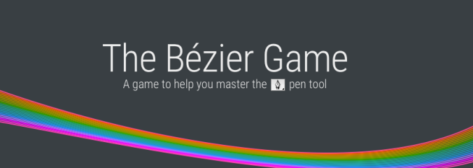
In working out a way to introduce my students to the highly intimidating bezier tool, I stumbled across this awesome interactive, real-time game. It gives you animated tool tips coupled with instant gratification.

Practice makes perfect. Check out the Bezier Game to get some practice:


http://bezier.method.ac
the Bezier game website

Feb 11, 2015

(another) Teaching Update...

By On 07:33
This semester my students have a wide array of talents and interests to bring to the classroom. When reviewing the results of my Google Drive Form /survey I learned that about a third of students are juniors or seniors, and many have experience with Adobe Design suite, a few more have already worked with non-linear, time-based media and motion graphics. Walking into the class, I jokingly commented that they could probably teach me a thing or two.

Anyway, one student with a stronger design background (but little based in Photoshop) submitted her first project, the narrative graphic collage. The first design, below is quite good for Photoshop newbie--her attention to detail is evidenced by the careful cutout/isolation of the air balloons that were taken from multiple sources). But then she took my minimalist design notes and created an improved final version


(I’ll chalk that up to excellent teaching and critique):
Version one uses the image elements, color balance, and
even the text to create a feeling of movement.

Updated version moves the text to a more traditional location with a
more traditional baseline. Too many indicators or movement are overkill.

Dec 28, 2014

Teaching Update: Spring 2015

By On 08:05
I’m back in the classroom in January, teaching Digital Imaging at my alma mater. I look forward to a new group of students with different skills and ability levels. Most of all I look forward to applying the flipped class model to working with Photoshop and Adobe Illustrator (my A-number-one-most-favoritest-golly-gee-I-do-love-it, design software)!

Last spring I got a chance to try it out when teaching InDesign and web design, and students were really receptive to that teaching style, even if they were a bit surprised by it. This season, I’ve already compiled a series of video resources—thanks to Youtube and Camtasia—and have put together our class blog with pre-scheduled articles. One thing that I’m adding to the mix is the class discussion forum—instead of using a Wordpress blog for peer feedback. It struck me that the pressure of writing in a public forum might be a little intimidating to some students. Hence the forum that’s in our LMS. I’m so jazzed.

Oh, right, what’s a flipped classroom, you ask? This:

Dec 12, 2014

Creative Commons Photo Round Up.....

By On 07:21
Note: Not all images shared from these sites are necessarily free-to-use. Be sure to review the license details before using any image that isn’t yours in your collage:
  • Flickr: Must check search options boxes for “Find Content to Modify, Adapt, and Build Upon”
  • Wikimedia Commons: Thousands of worldwide images licensed under Creative Commons.
  • stock.xchng: More than 350,000 free photo images, searchable.
  • dreamstime: Free section of a very large photo images archive. Excellent quality images.
  • morgueFile: More than 200,000 free photo images, searchable in several ways, including by color and topic.
  • WorldImages: About 75,000 international images, well-organized by content areas and searchable.
  • U.S. Government Images: Photos produced by U.S. Government employees are copyright-free. This site has a selection of links to different government agencies’ collections.
Stock Images can be expensive, those of us in the non-profit sector, education, and rapidly-shrinking in house design departments are well aware.  Here are some sites that can give you the free images that you need to really make your designs pop!
Public Domain images and materials are ‘publicly available’ and not covered by intellectual property or copyrights. Today, graphic a design and digital media is abundant, so there is a high demand for images for use in print, web, and multimedia.
Here are are four public domain sites to pin and save. Enjoy:
http://publicdomainpictures.net
http://commons.wikimedia.org/wiki/Main_Page
http://photos-public-domain.com
http://www.sxc.hu

This week: Branding Instructional Innovation

By On 06:32
It’s been busy around here! We had our final TechTalk PD session of the semester and I’m working on our 2-year strategic communications plan. That sentence is my inelegant segue…


Part of our strategic communications is a push to rebrand. I've been working on concise and informative mission and vision statements that define and support the branding. These statements are headed to the team for feedback and tweaking—if any.

Accompanying the text is a series of logo designs that I propose will represent our team of instructional technology experts. Click on the image to take a closer look:


Dec 1, 2014

This Week: Syllabus Solutions

By On 08:37
Course Design is graphic design, and graphic design is not strictly art. There are rules and guidelines that allow the novice or seasoned designer to create an effective page; course web page or commercial web page.

These principles of design include balance, proportion, rhythm, emphasis, and unity.

It means that the layout of the finished page has a harmonious mix of words and images that provides an easily deciphered page. If you want a primer on the principles of design take intro to graphic design or show up to day one of any class that I teach.

One of our English faculty emailed me with this problem ‘help, my students are having trouble understanding my syllabus.’ After reviewing the syllabus and course I saw the problem. Since this client wants a hand in the revamp of the course materials, I opted to roughly layout a few options (web and print)now and then meet with her after finals to refine.

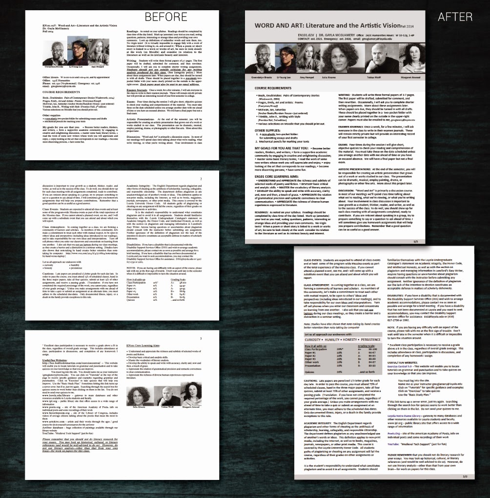
Below are before an after. Think about how balance, proportion, rhythm, emphasis, and unity work together to make one option more effective than the other:

Notice in the update that the 2-column layout is maintained. However, weighty elements are at the top of the
opening page, and all images are now uniform. Although hard to distinguish, subheads have a regular format
and are rendered in all-caps, bold. Lastly, the grading criteria is placed in a callout box to draw the reader...
 

Nov 25, 2014

This Week: Editing Video(s)

By On 08:12
In the past half-year or so I’ve lamented the fact that I have little time to do in-depth video production. That drought is over.

With growth on the horizon for my department and an organizational push toward getting the most from the technology tools that we now employ, I’ve been called upon to interview some folks. I got the assignment and the deadline last week—these need to be done really soon. Luckily I grabbed my favorite campus personality about a year ago and recorded a 30-minute interview and B roll of him strolling across campus and teaching his online course.


This week is dedicated to editing down 2+ hours of interviews, and an hour of atmosphere/B-roll into three, under-five-minute snapshots of how our faculty use technology in the and out of the class. The upshot of this double-quick assignment is that I get to hear the individual stories of how these folk approach the tools. What I’ve learned—and this is important for us in IT departments to hear—is that they are open to using these tools and pushing the limits of the technology to best fit their needs. They’re experimental and they’re open.

My goal is to have my final cuts done by Friday.

Then sometime on Monday, next week, my committee reviews them for content and offers any edits or input. And I spend that afternoon editing--if necessary. Then the final cuts will be hosted on our website by next Tuesday…

*Whew*


Nov 10, 2014

Productivity: There’s an App for That

By On 04:42
Actually, there isn’t.

Image Source : Owl ToDo List by ByGirlParty,
www.etsy.com/listing/61988820/owl-to-do-list-notepad-yellow-by
Building my weekly to-to list has never been a chore. As I’m the first person in the office, I take 30 minutes on Monday of each week to compile, audit, and edit my list before moving on to the next 60 minutes of social media management, then the next 60 minutes of research, then a snack, then an afternoon of graphic design, or trainings, or trouble shooting various software, etc. before my bike ride home.

This Monday morning list often proves to be the most important component to my productivity.

All of my past communications directors figured out that trick, and planned weekly team meetings early in the week, first thing in the morning. We’d meet briefly, add or subtract from our lists, and transition smoothly into the work week. This team activity also meant that we all got 30 minutes of weekly face time regardless of the workload. It was an excellent way to stay on track.

Now that I’m in IT, the tables have turned. In lieu of that important team building time we’re experimenting with building online to-do list boards (think Pinterest), and sharing these virtually with other team members. In essence, my Instructional Designer can login to this site, and view my tasks and schedule. She can add to or subtract from my list, and make notes on my boards. This App virtually * eliminates the need for us to ever meet again.

An online board that tracks lists, progress, and responsible parties on a project is a cool idea. It has the potential to streamline the way that both me and my team work, view progress, and remain accountable.

That said, losing the face time element of brief weekly meetings means losing these moments:

  • “I almost forgot to tell you,” or “thanks for reminding me of…”
  • Team members A&B attended a conference, and this is what they want to share with the team…
  • I’ve run into that problem with X before, this is how it’s resolved…
  • Did you know….

Today was my first day of using this app board to build my list. I took me more time than usual, as I’m transcribing from my paper notes into this tool, Trello. While not 100% optimistic of it’s efficacy, I’m interested to see what potential long term benefits this app offers…

...to be continued


* That was sarcasm


Nov 1, 2014

The Next Best App...

By On 04:39
After the  launch of the campus mobile apps, I was approached by a potential client asking for a new mobile app that shares mindfulness and relaxation exercises. WHAT!!

It's definitely a project that I want to build. My goal in this design is to get it done quickly. I hate to say it, but I  really want to see the finished product  and have it downloaded on my device and in my hot little hands.

There are a few snags or challenges that I must overcome with this project, however:

  • the existing color palette is not wholly harmonious,
  • the client's limited time and expertise in creating media for this project 
  • the general lack of supplemental media (photos, logos, audio, video)
  • did I mention the color palette?
So far in the timeline, I  have made the general outline and creative brief--it's been approved but the client, and there are about 2 dozen preliminary sketches in my notebook (on my desk, in my laptop bag, holding my page in a graphic novel I'm currently reading…everywhere).


Scans and screen captures are coming shortly--because I'll need help and lots of critical eyes on this one.

Oct 31, 2014

Guest Blogging is Great

By On 10:26
Speaking of some DIY professional development…

...Last week, I was asked to guest blog for No Impact Week, sharing my green (ish) lifestyle, my insights and general findings with the campus community. Frankly, I used this as a chance to present a slightly different writing style and to take a lot of pictures; I’m sharing the photos as creative commons in Flickr.

No Impact week really made me focus on the way that my lifestyle impacts my community and the larger world. I actually made some promises to myself, to be a stronger advocate for my planet.  A great experience:


Challenge Day 2: Trash...To be honest, in order to prep for today’s challenge, I did two things over the weekend: I cleaned my office (to collect a typical bagful of my work-related garbage), and went through the half full garbage bag in my kitchen at home.

Here’s what I learned. In addition to errant food scraps and miscellaneous non-recyclables, there was an extreme amount of used paper towels, tea bags, and plastic zipper bags…the shame of it all.


Popular