Enter your keyword

Communications Design Industry Discussion, Inspiration, & Tutorials

Nov 12, 2015

Stuff I’ll Miss About my Job (III)

By On 12:29
In summer it's easy to find a quiet
place to get work done.
It’s been 3 years at Loyola and I’ve definitely learned a lot about higher education, technology, instructional design and multimedia. One reason that I made the move to this small-ish private university was because I wanted the chance to work with more motion multi-media and video in my design work. Mission accomplished!

It's important to note: in 3+ years I've worn many hats; one of designer and communications manager, one of writer/ editor for print and digital publications  one of multi-media and web developer, one of software tester, and another of trainer / workshop presenter and designer of professional development on a regular basis, and also occasional podcast host.

In under a week I leave this post for my next big adventure. Without much more ado:


I'll Really Miss


  • Most of my awesome team.
  • Opportunities to do more. This is a blessing and a curse. As the sole graphic and multimedia designer in the IT department, I was tasked with a lot of cool, fun, dynamic projects; like this,
Designing event promotions was a large part of my work. This is my very last one.
Truly, a beautiful campus.
  • Flexibility in schedule. Which other companies out there will accommodate my early-bird waking schedule?
  • My extensive work wardrobe. It's a shadow of it's former self, today.
  • Lovely campus and peaceful commute! 

Stuff I Won't Miss Very Much, at all

  • Olfactory evidence of *Brian's lactose intolerance.
  • I stand byt this: Cube farms suck.
  • Sub-par communication. Who knew that nonprofits had figured out the right formula. Face-to-face contact is key.
  • Eye strain! Five days out of the last 365 I have come home from a long day of design with unbearable eye pain. No more, I say!
Now that that's all said, I'm truly excited about my awesome new job!
(Name's been changed)

Oct 26, 2015

This Week: Open House Invitations

By On 11:25
My department, the office of Educational Technology, is about to launch our new faculty innovation and production space, and we plan to do it with finesse! Yes, beautifully printed invitations that are hand delivered to some and mass emailed to others. At the event, we'll have try-before-you-buy new technology and continental breakfast, technology give-aways and boxed wine. It promises to be a fantastic networking event for our team and our core constituents.

Here're my roughs for this invitation:

(It occurs to me that yes, print is not dead, or dying. This is evidenced by the fact that whenever a client starts talking about exclusivity or a personal touch they always want printed collaterals-not web or multimedia.)


Mind you, the second side is mostly text and our new logo!

Aug 23, 2015

This Week: Website Redesign

By On 06:13
This week, I'm taking my own best advice; creative professionals need to have an accessible online presence and a place to showcase their best, recent work.

It's time again for me to update my website. In the last 3 years I've completed several campaigns, design projects, and PR writing gigs. It's been a busy thousand(+) days! My current website doesn't completely reflect these fresh new projects; they really should be collected in that location. Plus, there are 4 blogs that I maintain--this blog, a personal blog, and two educational blogs that I use for undergraduate courses. That's a lot of web assets! Hence the update.

While I still rely on a responsive design model for this site, my approach is more personal (updates should be completed byAugust 28).

Here are a few shots of what's to come:

The brand is creative, informal, and personal. A change from the last, a quirky take on academia.


In my current site I reference student work--posted on the educational blogs--but now I showcase them.

 If you haven't seen my last site update. Check out my last redesign--way back when.

Aug 18, 2015

Why Do I Need a CV?

By On 09:45
This week I met with a new freelance client who is stuck in the rut of a fruitless job search. We went through her identity package with a fine-toothed comb before I made the suggestion that she develop a Curriculum Vitae (CV).

She asked, “Why do I need a CV? I’m not in academia.” 

That much is true, she’s not. However, there are good reasons to have one. Especially for someone who will likely create and send out a dozen different tailored resumes this month. In her search, she’s looking for a variety of positions in the nonprofit sector—not specializing in one area. A CV will her to:
  1. Be Organized: The CV allows you to keep your skills, accomplishments, awards and experiences organized in multiple pages, under specific and relevant subheadings. If this document is thorough and well written, you can borrow huge chunks of text from it to update resumes for different jobs. This saves time. It’s like the master document from which you can borrow and add.

    This client’s thoughtfully laid out, comprehensive CV will have her project management, budget management, and event planning experience clearly delineated—and therefore easy to copy and paste into an application, interest letter, and/or resume.
  2. Be Prepared: In the past few years, more US companies have begun adding the words ‘…apply with your resume OR CV…’ Developing this comprehensive personal marketing piece can take hours, days, even weeks. In today’s market, that dream job that shows up online on Monday could be unlisted by Friday. This master document could easily move into the primary role in a personal identity package. Again, saving time.

At the end of our meeting, this intrepid young woman came away with homework. Use a CV Template to begin to get organized.


There’re several available online, covering content and design:
CareerOne: Australian website specializing in job posting and career search resources
Duke University: CV resource page for students and faculty
Pinterest: Several boards offer design options for you

Note: University and college career centers are often great resources for finding downloadable templates. Always be careful when downloading any files from the internet.

Jun 22, 2015

Adobe Illustrator: Identity Packages

By On 12:05
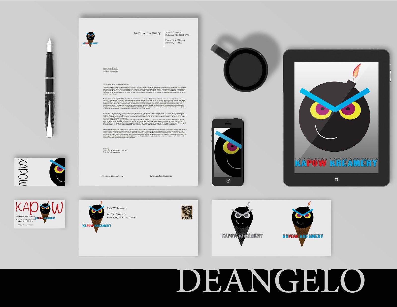
We've worked long and hard to get these pieces put together. They showcase a range of shape, color palettes, typography, balance, contrast, alignment, repeated elements, and proximity. We'll discuss these in depth when class next meets:


Jun 17, 2015

Tutorial: Create Simple Blog Header

By On 17:18

Using Adobe InDesign

Activity I: Working with Images - Header 

Create a Header image / Banner for your E-Newsletter:

We will reuse this image file when working with the various E-News creation tools.
Click to view full-size

a. Open Adobe nDesign and create a new document: Create New > Document 
b. Uncheck: facing pages, and Primary Text Frame
  • Width: 600px (type this in the field)
  • Height: 200px
Note: Notice that the sizes are converted to Points and Picas (typography units of measure)
  • Hit OK or Save


Shape tool is a Rectangle, by Default--but expands to several other shapes.


USE THE SHAPE TOOL

  1. Select the Rectangle Tool from the Tools Panel
  2. Click and drag a large rectangle that’s slightly bigger than your artboard. It has not color.
  3. Change the Fill Color: Open the Swatches Panel on the right > Be sure that the FILL is active, choose the green color swatch


ADD TEXT


  1. Select the Type tool in the right-hand tool bar
  2. Click and drag a large rectangular marquee above the green shape. This is your first Text Frame (notice the black cursor inside of this frame) > 
  3. type in this content:  the HUB (hit enter to create a line break) monthly e-news for loyola university Maryland educators

EDIT TEXT

  1. Double-click in the first line (this selects one word)
  2. Triple-click in the first line – All text on that line is selected
  • Change font-face to: Arial
  • Change font-style to: Bold
  • Change font-size to: 22pt

Now change the second line to Arial, Regular, 10pt

EDIT THIS TEXT FRAME


  1. Choose the black arrow tool from the tools panel and select the text frame (blue outline and corner anchors)
  2. From Top Menu > Object > Text Frame Options > check Preview 
  3. Inset > Use arrows to make the inset 0pt 8  > OK
  4. Use the black arrow tool to move this text frame toward the bottom of your artboard
  5. Drag on the white anchor points to stretch this frame outer margins to reach the left and right of your artboard.
  6. Got it?

COLORIZE THIS TEXT FRAME

  1. With the text frame still selected, open the Swatches Panel
  2. Make sure that the Container Icon is selected and choose PAPER from the swatches.
  3. Now select the Text Icon in the Swatches Panel and chose the Dark Blue Color swatch.
So far so good...


ADD AN IMAGE TO THIS DESIGN

  1. Go to Top Menu > File > Place > UNCHECK replace selected item
  2. Navitgate to one of the campus images and hit Open > Your cursor is loaded with the new image
  3. Click anywhere outside of your artborad and drag a rectangle. Don’t worry too much about size, you can adjust that
  4. Move this new image so that it aligns with the right-side margin of your art board.


Ideally, this image should be taller than your artboard. If it isn’t…

…use the black arrow tool and click on one of the white anchor points on the left of this image frame. WHILE THE IMAGE IS SELECTED, hold down Ctrl + SHIFT (or Command + Shift).. Drag left with your mouse.

When you’re satisfied, let go of the mouse. You can redo this change until it suits you.

Note: To undo any new edits, hit  Ctrl + Z (or Command +Z)

LET'S WRAP THIS UP

Image is moved to the back of the art.
  1. Move the image frame behind green rectangle
  2. Select Image > Object > arrange > Send to Back (Ctrl + Shift + { )
  3. Select the Green Rectangle with Black Arrow Tool
  4. Then choose the Gradient Feather tool from the tool bar (Shift + G)
The Cursor turns into a crosshairs > 
  1. Click on the region of the rectangle where the partially hidden image ends
  2. Drag to the right a couple inches.
  3. When you release the mouse, the rectangle with be partially transparent.
  4. Almost done: Select View > Preview in the tools Panel (all the way at the bottom). Look Good?
(It's tough to get a screen shot of the crosshairs cursor, sorry)


EXPORT THE FINAL DESIGN
  1. File > Export > Name it "header" > file type PNG
  2. (save location > enews Practice Folder
  3. Image > Quality= High 
  4. Resolution = 150 ppi


BONUS ACTIVITY: Quickly Optimize an Image for Web in Photoshop


  • Open Photoshop > File > Open >choose another image from practice folder
  • Under image size (lower-right), constrain proportions and choose 400px
  • File > Save for Web > Choose 4-up tab preview in upper-left 
Notice the different file sizes for the different levels of image quality
NOTE: Ctrl + 0 will fit the image into the window.
  • Select one of the optimized images and Save as ‘optimized.jpg’ into the Practice folder.
  • Close Photoshop (don’t save).

Okay, Let’s build an Enewsletter!!

Jun 8, 2015

Enews Options (for a small budget)...

By On 11:16

Not Just Nonprofits

I'm in the midst of researching an upcoming presentation and thought it best to share what I've learned.

In the half(+) decade since I began working with the various email marketing service providers and cloud hosted tools, little has changed in the realm of e-news. However, access to tools and resources is better. In 2009, we used MagnetMail, in 2011 we used Constant Contact, and today I swear by MailChimp.

I'm all for a free alternative, versus reinventing the wheel.

This week I'll meet with an on-campus client who is hell-bent on making an HTML e-newsletter that is distributed monthly. Their original design tool was MS Publishser. The finished HTML content was embedded into the body of an Outlook message. This, however presented a new problem with each email blast;  usually the content was transformed into a single image that went to the first URL on the page, without exception. 

This client has become convinced that they need to learnAdobe InDesign in order to create less worrisome e-newsletters and they want me to conduct these in-depth trainings in under 8 hours. Maybe there was an article on Wikipedia that explained how this is possible. 

In researching the conversion using InDesign (ID), I learned a few interesting facts:
  1. InDesign does not do this easily.
  2. The individual using ID should have some prior (and advanced) knowledge of HTML/CSS in order to make it work. 
  3. The thing about ID that makes it the ideal tool for graphic designers, total control over placement of content, makes it a terrible resource for the novice. Success relies on the skill and knowledge of the user. So, someone with no coding ability will not learn how to effectively create an enewsletter in ID...not in 8 hours anyway.
  4. Lastly, even after all of the boxes are ticked, and the syntax is correct, the user must then alter the CSS further to create a workable finished product.
This is my challenge. I love teaching ID and HTML. It takes my undergrad students half a semester to get a handle on either. Today and tomorrow I'm streamlining my course presentations and turning some of my hands on activities into 'homework'. 

Enter MailChimp

I've worked with this free tool off and on for 5+ years. Users don't need to worry about HTML/CSS or responsive design if they don't want to. WHEW!

However, the free option means limitations. Campaigns can only go to a mailing list of 2K, and the users of this service can only send 12,000 emails per year. That's a tough sell for my clients who are convinced that they will go over  the freebie amounts. In addition to the crash course I'm planning there will also be  20 minutes dedicated to an in-depth MailChimp hard sell!


Popular